12 Best Brand Guidelines Examples
If you click to purchase a product or service based on our independent recommendations and impartial reviews, we may receive a commission. Learn more
A strong brand is important. Your brand refers to the experiences a user has with your business and the touchpoints where you interact, including everything from your logo, color scheme, and tone of voice.
A strong, clear, and cohesive brand is the foundation for a successful business, but how can you ensure that your online business has a clear brand that runs through every customer touchpoint? With brand guidelines, of course.
The size, nature, and aims of your business will impact the brand guidelines you need to build your brand online. In this article, we’ll take a look at what brand guidelines are, why you need them, and some of the best brand guidelines examples.
What Are Brand Guidelines?
Brand guidelines are essentially a rule book on how your business presents itself to the outside world, covering your wider brand strategy.
They include all of the visual elements that a customer sees, such as your logo, color scheme, and image style, as well as communication elements, like tone of voice and key messaging.
Your brand guidelines contain the identity of your brand and pinpoint what to do and what not to do when it comes to communicating that brand to users.
Why Do I Need Brand Guidelines?
Brand guidelines ensure that the image your brand presents to your audience stays consistent.
A consistent brand helps to build customer loyalty and retention. It also allows users to instantly recognize your brand and pick it out from the crowd.
Good brand guidelines ensure everyone on your team is presenting your brand in the right way, helping to improve not only external communication but internal too.
12 Best Brand Guideline Examples
Now, let’s look at these 12 brand guidelines examples to see how these brands are getting it just right.
Slack
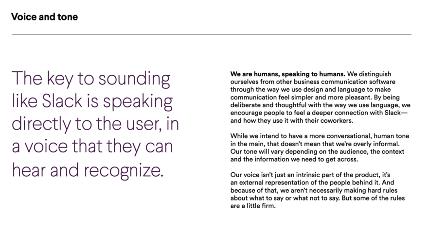
Project management tool Slack has a great set of brand guidelines. Found within its media kit, the brand guidelines cover everything from communication style to image cropping requirements.
The brand guidelines include a lot of information, but the use of colorful graphics and white space prevents the resources from overwhelming readers and ensures users can find the information they need.
The element that makes Slack’s brand guidelines stand out is the use of comparative lists. For each point within the guidelines, Slack includes examples of improper use cases alongside acceptable ones. This helps to simplify the content. You can see this in action when Slack discusses its logo, using a visual list of off-bounds styles and edits.
Starbucks
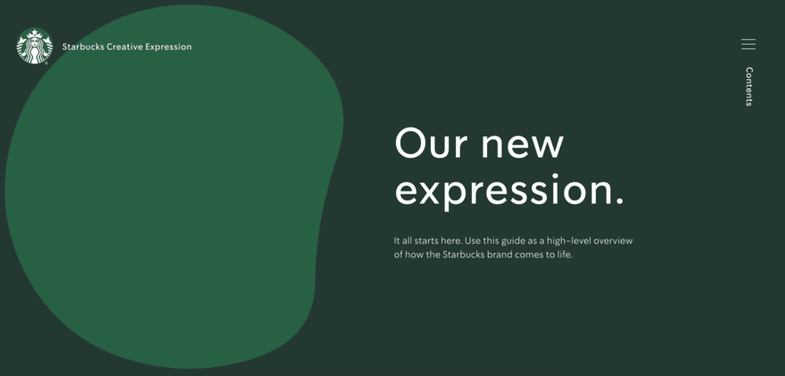
Starbucks is one of the most iconic and instantly recognizable brands in the world, so it’s no surprise that it has a set of great brand guidelines.
Its interactive brand style guide uses many of the brand’s core elements, such as the iconic siren logo and green and white color scheme.
The guide is visually focused, making it easy to see exactly how certain elements should and shouldn’t be used.
One of the best parts of the Starbucks brand guidelines is the inclusion of case studies and examples that show how different brand elements should be used for a range of scenarios, such as seasonal campaigns and product launches.
Urban Outfitters
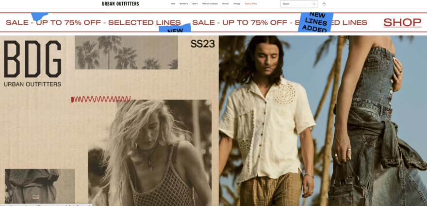
Urban Outfitters provides edgy designs and quirky styles to customers and its brand guidelines are no different.
The brand guidelines focus on the visual representation of the brand, including preferred photography styles and correct logo usage.
Urban Outfitters aims to stay current and on-trend by regularly refreshing and updating its branding, even as often as every six months, meaning detailed brand guidelines are essential.
It also includes a section on the brand’s “ideal customer” to help with campaigns and targeted messaging.
Zendesk

Zendesk refers to its brand guidelines as “Brandland”, and it has one of the most advanced and detailed brand guidelines examples in this article.
While there is the usual focus on logo usage and color schemes, Zendesk takes it further by providing details on elements such as copywriting, photoshoots, and animation styles.
The guidelines are incredibly detailed, with each section including multiple subsections, and users have access to information on every single possible element of the brand.
Interestingly, the brand guidelines also feature messaging on what the Zendesk offices should look like.
Asana
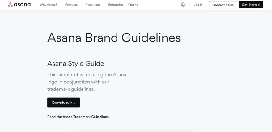
Sometimes you look at a brand’s logo and wonder how on earth they came up with it. Asana ensures that its brand guidelines clearly explain the reason and messaging behind its three-dot logo.
The three dots represent the limitless potential of human collaboration – they’re meant to convey a sense of clarity and balance.
This deeper explanation of brand decisions runs through Asana’s brand guidelines. The brand focuses on the why, explaining each choice and guideline in depth.
Shazam

Shazam is one of those apps that once you’ve downloaded it, you wonder how you ever lived without it. The app works using voice recognition and allows you to identify songs you hear literally anywhere, from in a shop to on the radio.
What makes Shazam so popular is how easy it is to use and this simplicity also runs through its brand guidelines. The guidelines focus on different use cases, including how to use the brand’s logo correctly and how to correctly add a watermark to existing brand imagery.
Shazam’s brand guidelines stand out though because the brand cleverly adds humor to its identity guide, keeping things engaging for users while being in keeping with the brand’s wider fun persona.
Audi

Audi is a household name and with a presence in so many countries worldwide, its brand guidelines are incredibly specific.
Audi has multiple sets of brand guidelines, each for different usage of the brand, including corporate branding, user interface, communication media, and dealerships.
Thanks to its global status, Audi is a brand often imitated, meaning the actual brand guidelines are very specific, going into intricate details such as ratios and alignment rules for using the company logo.
Uber

Ride-sharing app Uber has aimed to keep its brand guidelines as simple and as clear as possible.
Situated on a dedicated website, each different section features a visual overview of elements, including logos, colors, typography, and tone of voice.
These overviews include best-in-class examples to allow users to easily see how they should be conveying the brand. There’s also a focus on depicting the brand in motion, a clear link to the fact that Uber is a car ride app that literally “moves people”.
Spotify

While you may think Spotify uses a simple green color scheme, did you know the brand uses three specific shades of green within its branding? Well, you do now!
The streaming platform’s brand guidelines break down the specific color codes that should be used, as well as other visual elements including logo usage and album artwork.
A clever aspect of the brand guidelines is that they allow users to download an official version of the Spotify logo, meaning Spotify can control what logo is being used to represent its brand. This is particularly useful for third parties who may want to feature the Spotify logo within their own material.
YouTube
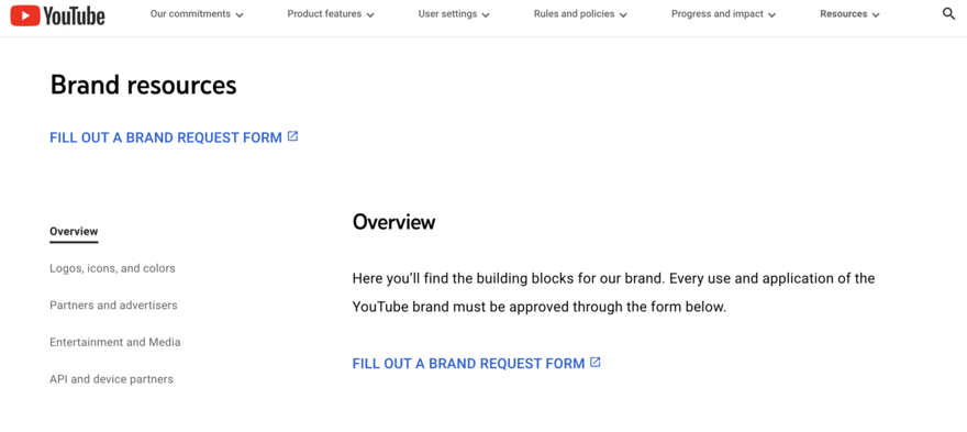
YouTube refers to its brand guidelines as “Brand Resources” and you can access them via the main YouTube website.
Featuring four brand elements, the guidelines are concise and simple. YouTube’s brand guidelines focus on these areas: logos, icons, colors, and do’s and don’ts.
Even though YouTube is such a massive brand, its brand guidelines are some of the most simple out there. Short and sweet, the guidelines focus on how to use logos and color schemes.
If you have a more in-depth or specific request, you’ll need to submit a usage request to YouTube.
The simplicity of these brand guidelines makes them a good example for those looking to just cover the bare minimum.
Dropbox

Dropbox’s brand guidelines are available on its website, referred to as “Brand Materials”.
The style section of the guidelines is simple, explaining how to use elements such as logos and colors correctly.
There’s also a focus on tone of voice and written communications, as well as motion and photography.
What makes the Dropbox brand guidelines stand out is a section dedicated to user interface and experience, ensuring that the experience a customer has with the business matches the wider branding.
Netflix
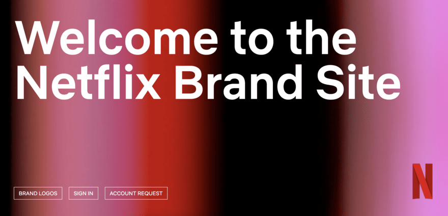
The iconic red “N” and the da-dum sound as you log in to Netflix have become mainstays of popular culture thanks to the ever-growing popularity of the on-demand platform.
What’s interesting is that despite being such a major brand, the Netflix brand guidelines are incredibly simple. In fact, they don’t go much further than focusing on the logo, N symbol, and red color scheme.
This is largely due to how recognizable the Netflix branding is, customers only need to see the logo or symbol to identify the business.
Netflix’s brand guidelines are a great example of keeping your messaging and guidelines in line with your brand’s actual requirements. If you don’t need extensive brand guidelines, you don’t have to have them.
Best Brand Guidelines: Summary
These 12 branding guidelines examples all showcase not only the importance of having great brand guidelines but also how you need to work out exactly what kind of brand guidelines your business needs.
Perhaps you’re like Asana and want to focus on the “why” behind your branding decisions, or maybe you want to control every minor detail like Audi, or you may be like YouTube and Netflix who prefer a more streamlined and simple approach.
Either way, there’s no right or wrong strategy to creating your brand guidelines, but ensuring you’ve done so will enable you to present and communicate your brand to users effectively which will help encourage custom and build customer loyalty.
Now you’ve finished this article, why not check out some of our other branding tips with our how to build a brand article or our guide to rebranding your business?
Leave a comment