15 Best Checkout Page Examples
If you click to purchase a product or service based on our independent recommendations and impartial reviews, we may receive a commission. Learn more
When designing your ecommerce website we know you’ll pay close attention to your homepage and product pages, but what about your checkout page?
The checkout page of your website is one of the most important pages and yet often it gets overlooked and put together as an afterthought.
A checkout page is where you convert a visitor into a customer and it needs to offer a seamless experience for all levels of computer literacy.
There are thousands of checkout pages online that are already generating millions of dollars of revenue, even some made with free ecommerce website templates.
We’ve put together some of the best checkout page examples that you can learn from when building your own online store.
What Is a Checkout Page?
A checkout page is a page on your website where the checkout process and transactions occur. Once the customer clicks the add to cart button on your product page and has finished shopping, they need to pay and enter details to receive their items. This is where the checkout page comes in!
It’s also where customers can see shipping and payment information.
Checkout pages collect information from customers that are essential to complete their orders including:
- Chosen shipping method
- Delivery address
- Billing details
- Payment method
There are two common types of checkout pages that you can use for your online store.
One-Page Checkout – one-page checkout speeds up the whole process and makes placing an order super simple for customers. Customers can find all of the data entry points and information they need on one page, and don’t need to navigate back and forth between pages to confirm they’ve inputted the right information.
Multi-Page Checkout – multi-page checkout is where the checkout process occurs across multiple pages. Although this can make the process slightly longer for customers it does have some advantages, mainly that if a customer abandons their cart mid-way through the checkout process, you’ll still have access to the data they entered on previous pages.
What Makes a Good Checkout Page?
If a customer has made it as far as your checkout page then you’ve clearly been doing something right. Attracting customers to your online store has been a success, now you just need to make sure that you don’t lose them at the final hurdle.
To help you out we’ve listed below some of the critical elements that make a good checkout page for you to apply to your own ecommerce site.
Simple Design
Keep the design of your checkout page as simple as possible in order to make the checkout process easy for customers.
Try not to get carried away asking them for too much information – stick to the basics such as name, address, email, and payment details.
Guest Checkout
Forcing customers to create an account in order to checkout is a sure-fire way to make them abandon their carts and leave your online store behind.
Always offer customers the option of checking out as a guest to ensure you don’t lose their custom.
Trust Signals
Trust signals are a great way of making users feel safe handing over sensitive data to make a purchase. Always include a section that makes it clear you’re keeping customer data safe and secure.
Minimal Distractions
Keep distractions to a minimum to ensure customers can carry out the checkout process correctly.
A great way to ensure you aren’t distracting your customers is to use a heatmap. Heatmaps allow you to track visitor interactions on your website and the areas they’re clicking on the most.
This gives you the chance to see if there’s anything on the checkout page that’s distracting them away from completing the purchase.
Mobile Optimization
Just like the rest of your website, having a mobile-optimized checkout page is essential.
More and more people are choosing to shop online from mobile devices, which means you can’t afford to lose them thanks to a poorly optimized checkout page.
Order Edits
Sometimes a user will want to customize their order once they have reached the checkout page. Giving them the chance to edit order quantities, sizes or colors prevents the risk of any customers dropping off your site.
Find Out More
Discover more Checkout Page Optimization Tips in our full step-by-step article, or learn more about optimizing your site for mobile use.
Best Checkout Page Examples
Now let’s take a look at 15 of the best checkout page examples that you can use to help inspire your own checkout page design.
#1. Etsy

Etsy has grown to become one of the biggest online marketplaces for individual sellers out there so it’s no surprise that it’s nailed the checkout page.
Etsy has one of the simplest checkout pages on the internet, asking users for just five pieces of data to place an order.
The multi-page checkout process has no distractions and a simple design that also allows users to checkout as a guest.
#2. Walmart

Walmart’s checkout page is a great example of offering users multiple options while still keeping the process streamlined and simple.
Customers are able to pick between having their items delivered to them or picking them up from their chosen Walmart store. Even with this added addition to the checkout page, Walmart’s checkout process is still complete within three easy steps.
Users are able to checkout as a guest and will be notified if they’ve made a mistake when inputting their data.
#3. Nike

The checkout page for Nike ticks many of the best practice elements we listed earlier in the article.
The checkout page itself is simple and sleek and has minimal distractions for users. Guest checkout is also available and the order summary is displayed at all times during the checkout process.
Each time a customer inputs their data into a data field they’ll receive a green tick and be notified straight away if they’ve made an error.
Customer’s to the Nike store are also presented with multiple different payment methods on the checkout page, helping to keep everyone happy.
#4. Best Buy

Arguably the thing that makes this checkout page example stand out is its simplicity. Best Buy only asks customers for shipping and contact information before allowing them to proceed to payment.
The checkout process is divided into multiple pages to help avoid clutter on the page, ensuring everything is aimed at providing the customer with a seamless checkout experience.
Best Buy’s checkout page also features a progress indicator so that customers can easily see which step of the checkout process they’re at and they can seamlessly navigate between stages.
#5. Flo Living
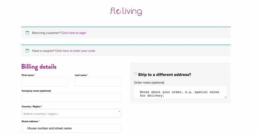
Flo Living is a women’s health brand that provides supplements and nutritional information aimed at encouraging women to lead healthier lifestyles.
The Flo Living checkout page is super sleek and simple and has a nice feature that allows returning customers to skip having to enter their data again and progress straight to payment verification.
Flo Living still manages to keep the checkout page on brand by using its brand colors, while drop-down menus and autofill boxes make the checkout process as simple as possible for customers.
#6. Omega

Luxury watch brand Omega has ensured that its checkout page is in keeping with its elegant and understated online branding.
The checkout page is simple and has no distractions, while the one-page process ensures checking out is easy for customers.
Users also have access to all of their checkout information on one page, making it easy to spot any mistakes or amend orders, and the accordion-style checkout guides customers seamlessly through to completion.
#7. Samsung

As a leading technology brand, it should come as no surprise that Samsung’s checkout page is leading the way when it comes to innovative and optimized checkout solutions.
The page features multiple trust signals that are crucial for customers who are making what are likely to be expensive purchases, and also supports various payment methods.
Users can modify their carts from within the checkout page and also add a promo code to receive a discount.
What really makes the Samsung checkout page stand out, however, is the wish list feature. Users are able to add items from their cart to a wishlist which they can come back to later to complete their purchase.
#8. Peloton

Peloton provides luxury fitness equipment and classes and thanks to a boom in home workouts during lockdown, is fast becoming the fitness brand on the market.
The Peloton checkout page is incredibly clever as it needs to serve two different customer bases: the one-off equipment purchasers and the class subscription customers.
The checkout page lets users make either a one-time purchase, sign-up for a subscription, or both, and accepts various leading card and payment options.
Peloton products aren’t the cheapest on the market, which makes the most clever feature of its checkout page the monthly cost breakdown of items, allowing customers to understand the value they’re getting for their investment.
Peloton also offers a 100-day free trial when customers are purchasing a piece of fitness equipment, which is the perfect trust signal to encourage users to sign up for fitness classes without making a financial commitment.
#9. Sigma Beauty
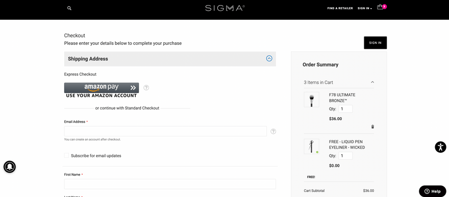
Sigma Beauty is a great example of a simple and easy-to-follow checkout page.
The beauty brand presents just two steps to customers to complete the checkout process, delivery, and payment.
The Sigma checkout page also presents users with multiple different shipping options, giving customers more control over when their orders will arrive and how much they pay in shipping fees.
Sigma also allows users to save their checkout items for a later date, meaning they can revisit the website and immediately find the items and checkout.
#10. Chubbies Shorts
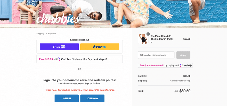
Chubbies Shorts is a great checkout page example for the fashion sector.
The checkout page features everything customers need to know including an order summary and shipping options. Plus, users are able to edit the size, colors, and quantities of their selected items directly from the checkout page.
An editable cart is especially useful for fashion retailers where customers often change their minds at the last minute or can be unsure of what size to purchase.
A great additional feature to this checkout page is the ability for customers to sign up for text alerts to keep them updated on the status of their order.
#11. Crate and Barrel
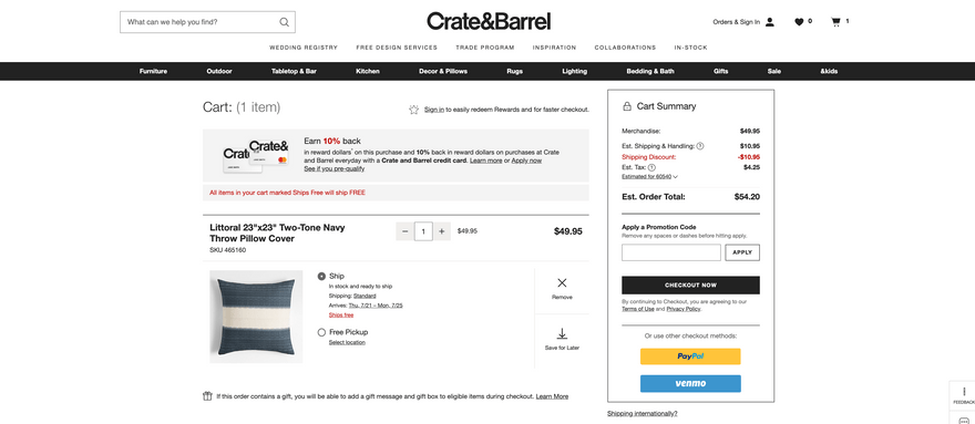
Crate and Barrel is a great example of a brand using omnichannel selling strategies within its checkout page.
The checkout page showcases Crate and Barrel’s ongoing commitment to its bricks-and-mortar store by offering users the option to collect their orders from the store.
Crate and Barrel also accepts multiple different payment methods, which is a great way to drive conversions.
The checkout page features a section highlighting how easy it is to return an item, a great trust signal to encourage users to make a purchase.
#12. Everlane
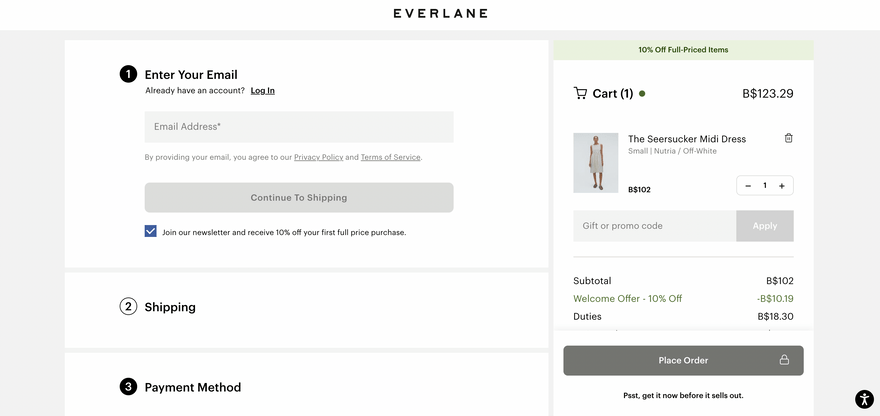
The checkout page for fashion retailer Everlane uses a step-by-step approach and has an expandable menu for each data entry point.
This helps to make the checkout process simple for customers because they can input their data in their own time and avoid being overwhelmed with too much information.
There’s also a handy “review order” tab right before customers place their order, allowing them to confirm all elements are correct before they commit.
Another element that makes Everlane’s checkout page particularly good is the ability to use PayPal payment, meaning customers don’t need to create a separate Everlane account to make a purchase.
#13. Happy Socks

Happy Socks is exactly what it sounds like, a brand that sells socks to “make you happy” with an array of vibrant designs and prints.
It’s not just its socks that make us happy though, its checkout page does too.
The Happy Socks checkout page is different from most – rather than being a brand new page, it’s a tab that opens on the page the customer was currently viewing.
This allows for a super quick checkout process and enables the user to keep viewing the product page while they check out.
#14. Glossier

Skincare brand Glossier’s checkout page is intuitive and uses a unique question format.
The checkout page asks users a series of questions such as “where is this order going?” and “what’s your payment information?” in order to extract all of the information the brand needs to complete a customer’s order.
This clever format helps to keep the checkout process simple and informal and ensures customers aren’t overwhelmed with too many data entry points at once.
The Glossier checkout page also features a static order summary so that customers can refer back and ensure all details are correct before confirming their order.
#15. Dollar Shave Club

Dollar Shave Club is a subscription-based men’s toiletries brand.
The whole concept of the brand is keeping things simple and uncomplicated for men looking for quality toiletries and its checkout page follows the same easy-to-understand theme.
The autofill capabilities of the data entry points make checking out as easy as possible while the advertised 30-day money-back guarantee is a great trust point to encourage users to sign up for a subscription.
Best Checkout Examples: Summary
What these checkout page examples should have highlighted to you is that every single page of your website should be optimized if you want to achieve as many conversions as possible.
While checkout pages should be kept simple and feature minimal distractions, that doesn’t mean you should see them as an afterthought.
Instead, you need to think carefully about ensuring your checkout page ticks off as many of these best practices as possible:
- Simple design
- Guest checkout capabilities
- Trust signals
- Minimal distractions
- Mobile optimized
- Option to edit order details
Now that you understand the importance of checkout pages and have learnt from these checkout page examples, why not check out more of our articles including this one on how to scale your ecommerce business?
Leave a comment