11 Inspiring Informational Websites Examples
If you click to purchase a product or service based on our independent recommendations and impartial reviews, we may receive a commission. Learn more
Creating a strong online presence is important for your business, and so you need to build a website that’s memorable, unique, and give your visitors all the vital information they need. But what makes a good informational website and where should you start when designing your own?
If you’re feeling overwhelmed, don’t worry – we’re here to help! With the abundance of website builder templates available today, you have more options than ever to create a professional-looking site quickly and easily. We’ve also broken down the key components of an informational website and cherry-picked 11 of the best examples to give you tons of inspiration for building your website. Read on below!
What’s an Informational Website?
An informational website does what it says on the tin: it provides information! This information is designed to highlight all the crucial must-knows about a business, and should educate, inform or solve a problem.
Informational websites can use articles, videos, infographics, games, or photos to do this, but there are a few solid must-haves you should tick off when creating your own website:
- Mobile-first design (because who doesn’t love scrolling on the go?)
- User-friendly navigation (steer clear of a digital maze)
- Engaging content that speaks to your audience (keep your readers hooked)
- SEO game on point (Google, here we come)
- Lightning-fast load times (no-one likes a slow website)
- ADA (Americans with Disabilities Act) compliance (ensure your site is accessible to as many readers as possible)
Informational Website Examples
It’s one thing to know what you need to include in your website design, but pulling all of these elements into an attractive and cohesive design is another thing entirely. Luckily, you’re not on your own. Below, you’ll find 11 of the best informational website examples, plus a breakdown of what’s so great about each of them.
Rest assured, these website examples were all made using website builders like Wix, Squarespace, and Webflow. This means that you’ve got access to all the same tech, so making something just as good is within easy reach.
1. The Minimalists (Squarespace)
The Minimalists is a fun go-to blog for embracing a minimalist lifestyle, serving up practical tips and resources for when you’re ready to keep things simple.
- Design: The clean, sleek design is right on-brand. It uses plenty of white space, a subtle color palette, and no-fuss typography.
- Noteworthy Features: The podcasts have an easy-to-spot subscribe button, are well organized with direct episode links, provide episode-specific links to help guide the listener with minimalist lifestyle resources. The courses are accessible for everyone no matter what their set-up or familiarity with online education. There’s also a store that features products that are minimalist-approved.
- Content and UX: Interesting articles and relatable stories, videos, and podcasts to keep you hooked. It’s also easy to navigate.
- Lessons and Tips: Let your design reflect your brand’s essence, and give a mix of content to get as many people interested as possible.

2. Smitten Kitchen (Wix)
Smitten Kitchen is a food lover’s paradise, offering mouthwatering recipes and photos that are sure to make you drool just a little.
- Design: It’s warm and inviting, with the recipes and food acting as a main focal point.
- Noteworthy Features: The recipe index breaks down the recipes into multiple categories for easy reference. There’s a cookbook section that links to the online store, and a useful newsletter that features news and tips that add value to the user experience..
- Content and UX: Detailed recipes give step-by-step instructions alongside anecdotes that bring the food alive. Plus, the clean layout makes navigation simple.
- Lessons and Tips: Use high-quality images to entice visitors, and share personal stories to relate to your audience.

More Information
- Interview with Kentucky Native Plants Project: Read our full interview with another informational website built using Wix
3. HowStuffWorks (WordPress)
If you’re a super curious person, the HowStuffWorks website explores how everything works, from technology and science to culture and history. A bonus is that the explanations are easy to understand.
- Design: Clean and modern, highlighting the fascinating content.
- Noteworthy Features: The quizzes are one of our favorite features- not only are they broken down into categories, but they encourage interaction and gamify the user experience. The website also features a coupon and offer page which not only entices customers, but provides backlinks to their partners.
- Content and UX: Well-researched and engaging articles break seemingly complex subjects into digestible chunks. Navigation and layout are straightforward.
- Lessons and Tips: Your audience will appreciate explanations that are easy to understand, while varying your content will hold their interest.

4. Nerd Fitness (WordPress)
Nerd Fitness helps self-identified nerds get into shape through fun and effective workouts, nutrition advice, and community support. It’s fun and unusual, occupying a clear niche.
- Design: This is a playful, comic-inspired design that really shows they know themselves and their audience.
- Noteworthy Features: There are easy-to-spot Call-to-Action buttons for upcoming events, which take the audience to an email sign-up spot. The blog articles are organized in a logical way, which is great for navigating. And it uses customer testimonials, which gives impactful social proof for newcomers.
- Content and UX: Engaging, easy-to-understand fitness and nutrition content is everywhere. UX is smooth because it’s such a simple and well-organized site.
- Lessons and Tips: Lean into your brand’s personality, have fun, and create a sense of community for your audience. People love to feel like they belong.

5. The Oatmeal (WordPress)
Using comics, quizzes and articles, The Oatmeal is jam-packed with a delightful mix of humor, education, and entertainment. It uses white space to make its content stand out and its fun illustrations ensure there’s never a dull moment!
- Design: Quirky, hand-drawn illustrations and a minimalistic layout give it a unique feel.
- Noteworthy Features: There’s a merch store, a popular catelogue section, and a newsletter subscription element.
- Content and UX: The content is very visual, with little text, making navigation easy. Plus, the comics are hilarious and thought-provoking, too.
- Lessons and Tips: Inject your brand’s personality into your design, and don’t be afraid to experiment with unusual content formats.

6. Canva Design School (Webflow)
We’re big fans of Canva for projects, and Canva Design School is your one-stop shop for mastering design skills, offering tutorials, tips, and ideals for making your own amazing visuals.
- Design: Vibrant, bold colors and a sleek, tiled layout really show off what good design can do.
- Noteworthy Features: The design spotlight drop-down menu at the top separates the types of content that users will want to make including visuals, photos, print and marketing. There’s also an excellent support center, with a search bar to help users find a solution faster.
- Content and UX: Everything’s so easy to follow. Tutorials with links right on the landing page, articles, and stunning visuals (we wouldn’t expect any less!) make learning design so fun. Navigation is straightforward.
- Lessons and Tips: Visuals will make your website pop. And when you offer up learning resources that meet a variety of audience needs, you will keep your audience coming back for more each time they need to learn something new.

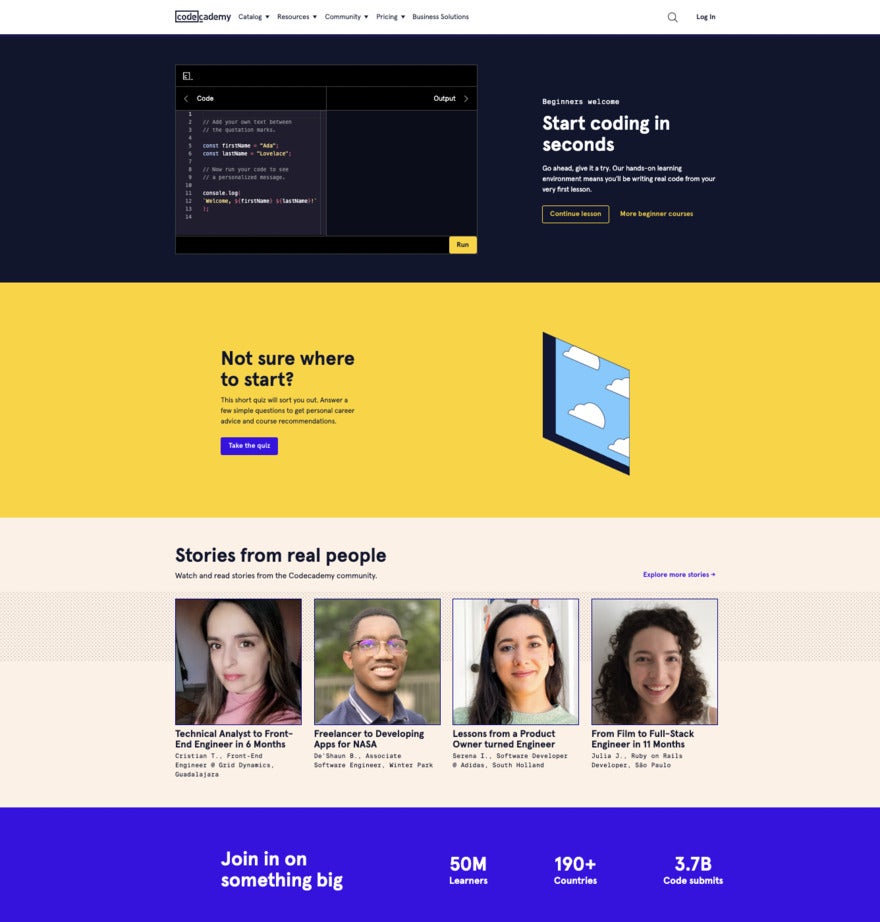
7. Codecademy (Webflow)
Codecademy is all about empowering people to learn coding through interactive online courses in various programming languages. It’s a super generous space where people who know what they’re doing share their knowledge with those who are hungry to learn.
- Design: A clean, modern feel with pops of color.
- Noteworthy Features: Interactive coding courses are well-organized and helpful. There are links to Codeacademy’s fun social media content, which entertains the audience. The website also features a progress tracker which encourages further interaction. A good community forum bumps up the interactivity of the website.
- Content and UX: Codecadamy make everything so easy with step-by-step lessons, hands-on practice, and real-world projects. Navigation is intuitive.
- Lessons and Tips: Practical, hands-on learning opportunities will appeal to readers, along with the chance to join a supportive community.

8. Zen Habits (WordPress)
Zen Habits is a treasure trove of mindfulness and personal growth resources, with content on simplicity, happiness, and productivity.
- Design: It’s uncluttered and we love the white space and clean typography.
- Noteworthy Features: The site offers high-value content which requires an email sign-up to access. The archive is not only organized by date, but there’s also a search bar to help users find what they need.
- Content and UX: Inspirational articles, personal stories, and useful tips are designed to delight the audience, alongside the smooth navigation.
- Lessons and Tips: Match your design to your brand’s values, and, again, it’s all about personal stories.

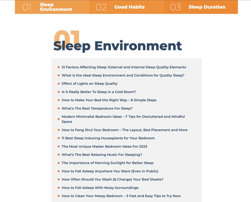
9. Sleep Advisor (Wix)
Sleep Advisor is dedicated to helping people achieve better sleep through expert advice, product recommendations, and sleep-related research.
- Design: It has a calming, soothing design, featuring relaxing colors and clean typography that sets the tone for a restful experience.
- Noteworthy Features: There’s a countdown in the banner to events – this creates urgency in the user. The landing page has organized everything from menus, search bars, CTAs, sleep product reviews, and articles so that the audience doesn’t have to do a lot of searching to get to what they want to see.
- Content and UX: The articles are well-researched, and the reviews are reliable. The navigation is so easy you’ll be able to do it in your sleep.
- Lessons and Tips: Pick a design that makes the most of your site’s mood and purpose. Thoughtful and in-depth articles will build trust with your audience.

10. Quotient Social Influencer Network (Squarespace)
If you want to be an influencer, the Quotient Social Influencer Network website is a great place to start. This highly-interactive site has resources, tips and tricks to help you gain traction and a loyal audience. It also lets you get into practice by contributing ideas to influencers.
- Design: It’s got eye-catching colors, engaging photos and graphics, and a simple, clean design.
- Noteworthy Features: The refer-a-friend feature allows the audience to benefit from the program but also builds the email list. There’s also a very interesting feature which allows readers to contribute ideas for influencer campaigns and when their idea piques an influencer’s interest, they get to work on it!
- Content and UX: The logo navigation makes it simple to use, and there is an abundance of influencer how-to content to keep users coming back.
- Lessons and Tips: Simplicity works even, even with a topic as varied and broad as influencers of the world.

11. Treehugger (Webflow)
Treehugger is on a mission to make sustainability irresistible to everyone. The site gives eco-conscious readers the latest news, tips, and product recommendations to live green.
- Design: A fresh, earthy design featuring natural colors to make the most of the eco-friendly vibe.
- Noteworthy Features: The product reviews help the audience decide what types of sustainable products will suit their lifestyle. The social media links at the top provide the numbers of follows which gives them social proof and a don’t-miss-out feel.
- Content and UX: This site has both the beauty and the brains: everything is useful and attractive! The navigation is also intuitive and the layout is easy to follow.
- Lessons and Tips: This site is proof that you can put your core values into your design and keep your audience’s needs at the forefront of your brand.

Conclusion
And that’s it! We hope that after browsing our 11 best informational website examples, you’re now newly inspired to get going and design your own!
Before you do, though, there are a few things to remember when it comes to building your informational website. Firstly, keep your audience in mind throughout the whole design process, and don’t forget to embrace your brand’s unique personality and use it to your advantage. Finally, focus on delivering an engaging, trustworthy, user-friendly experience that will delight your audience.

Leave a comment