3 Simple Criteria To Help You Choose Your Website Template Design
If you click to purchase a product or service based on our independent recommendations and impartial reviews, we may receive a commission. Learn more

Don’t you feel that the more free website templates you look at, the more they look the same?
Let’s just get this out of the way… you’re not the best designer around — and you’re not weird.
It’s quite common to feel overwhelmed when it comes to picking the right design for your website.
Choosing a template to design your website can either be a lot of fun, completely overwhelming, or for most people – somewhere in between.
While most website builders and ecommerce platforms offer a wide variety of designs for you to choose from – and some even offer third party premium templates that you can purchase – it’s easy to drown in a sea of seemingly endless options, especially if you don’t have a sharp eye for design.
Here’s the good news – this daunting process can actually be simplified!
We have developed a set of criteria we use when making template design suggestions, to help you sift through all the design options.
Here are the 3 criteria you should ask yourself that will help guide you to finding the right design for your website:
- Content Width Design
- Home Page Header Design
- Menu Bar Design
Keep reading as we expand on these key points.
Before we start, if you don’t know where to look for design templates, here are some website builders that offer them for free if you sign up:
Wix – they have over 500 free designs across a very broad number of industries.
Squarespace – they have a lot fewer designs, but they look really good.
1. Which Content Width Should I Choose?
“Full-width content area works well for creative, contemporary designs. Boxed-width content area is more suitable for traditional, business-oriented designs.”
Broadly speaking, most template designs nowadays offer you 2 types of content width:
(1) Full-Width and (2) Boxed-Width
Full-width is when the background image stretches the full width of your computer screen – from the left edge of your screen all the way to the right edge. So it gives the feeling that your website content has no boundaries.
Boxed-width is when your content has a visible frame to the left and right side of the screen. So it feels like the content is “boxed” into a set area.
Here are a couple of illustrations for you to see:
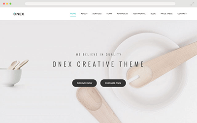
- Very popular type of website layout.
- Works very well for mobile responsive templates and graphic heavy websites.
- Wider width allows you to fit more tabs in your menu bar.
- As the background image auto adjusts to fit the screen, the positioning of the content on top of the image may shift depending on the size and screen resolutions of your visitors’ computer screen. Some people may find this annoying.
Note: When using a responsive design, be mindful that the content orientation and alignment may change depending on the web browser or device the website is being viewed on.
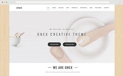
- Traditional website design with a professional, business-oriented feel.
- Provides a fixed width for the content. This allows the content display and position to remain relatively the same across different monitor sizes and resolutions, so you don’t have worry about different people having different visual experiences
- Boxed-width design works best if you want your content display to be consistent and more predictable across all monitor sizes and resolutions.
So think about how you want your website to feel.
Do you want to portray a more creative, contemporary design? If so, a full-width design will work well.
Do you want your website to feel more traditional, more business oriented? If so, lean towards a boxed-width design.
Keep in mind that this is just a broad rule of thumb. A business website can still work well with a full-width design, and vice versa. But if you don’t know where to start, our suggestion above is a good way to get started.
2. Which Home Page Header Layout Works For Me?
“Choosing the right header design for your home page is more of a strategic decision than a design decision. It depends on what type of business you have.”
The majority of the websites’ home pages have some sort of a header design. It’s the section towards the top of your home page, usually the first thing your visitors will see when they visit your website.
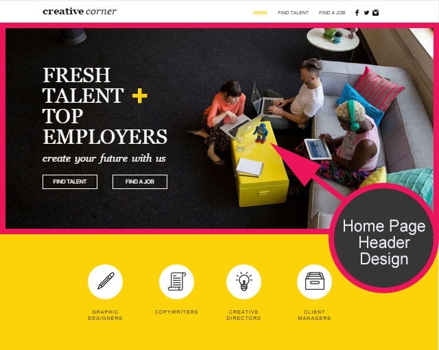
Most website templates are designed with a homepage header of some sort. These headers can contain static images, slideshows, or even play videos.
However, don’t be distracted by pretty pictures or flashy designs – meaning, don’t mindlessly pick the type of header design that you are the most impressed with!
It’s crucial to consider whether the homepage header you select would ultimately help or hurt your business.
Which header design you pick is a strategic decision, more so than a design decision.
A carefully designed homepage header will successfully communicate your core message to your visitors. It’s the first thing your visitors will see, and you have a very short period of time to make a good, first impression.
Your visitors will more often than not, make snap judgments on whether they are interested in staying on your website, or hitting the “back” button and leave your website.
Your header section needs to create awareness and understanding of what you’re all about, rather than to simply look nice.
Now that you understand a header’s role and its significance in helping your visitors to better understand you, how do you choose?
Different types of headers work best for different types of websites.
We’ll show you the common types of headers and what kind of business would benefit the most from each:
1. Static Header Image with No Content
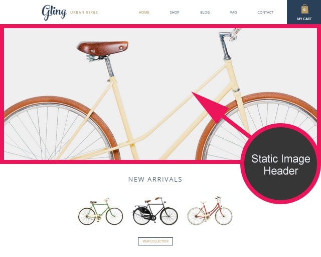
Who should use this?
Static image header should ONLY be used in websites that rely heavily on beautiful photographs to attract customers — portfolio, hotel, restaurant, some physical products or graphic intensive websites.
For example, if you own a bed & breakfast business, your website should welcome your guests with a captivating image of your accommodations. How your business appears on your website will directly impact your visitors’ decision to stay at your bed & breakfast.
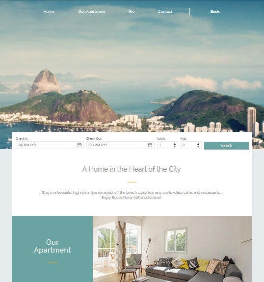
In this case, it makes sense to use a template design that has a large or full-page static header image because you want to create an amazing visual first impression to your visitors.
The visual “message” can translate into the type of experience they may have if they stay at your accommodations.
Who should not use this?
If your business requires text to explain what you do and how you can help your customers, relying solely on a static header image is not ideal.
A static header image can take up a lot of valuable space “Above-The-Fold” – basically, the screen area that your visitors see when they first land on your website.
So if your business requires some text to explain who you are and what you’re all about, then relying solely on a static header image (without content in the image) might leave your visitors slightly confused as to what you do.
Relying solely on an image to communicate what your website is about might work well for businesses such as restaurants, hotels, or businesses that have more to do with “lifestyle”. But it doesn’t always work for a lot of other businesses. For these sort of businesses, you’ll need to rely on more than just an image.
Ask yourself this question – Is your website easily explained through a simple image without any text?
2. Static Header Image with Content
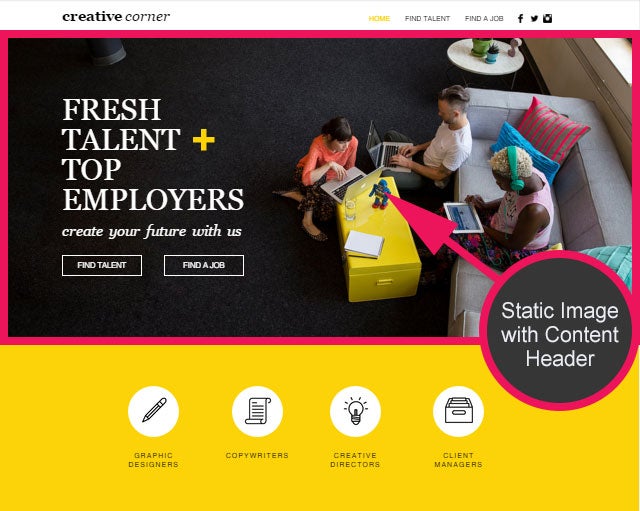
Who should use this?
All websites can benefit from this type of homepage header design — This the safest choice if you don’t know what to choose.
A static image header with content gives you 4 essential elements that can effectively describe what your business is about, directly Above-The-Fold:
- Headline
- Supporting paragraph
- Call to action (what you want your visitors to do next)
- Supporting image
The header image should play a supporting role rather than be the main focus. It should display your headline, subparagraph and primary call to action along with an image that reinforces your business mission.
3. Slideshow Header with Content
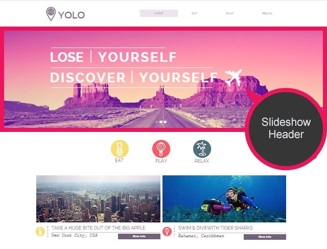
Who should use this?
A slideshow header works best for businesses that cater to a variety of customer types or have multiple core services or products.
If your company has different solutions for numerous customer demographics, a slideshow header allows the products / service offerings of your business to be showcased in an organized way.
Example 1: Wix targets people who need website for different purposes
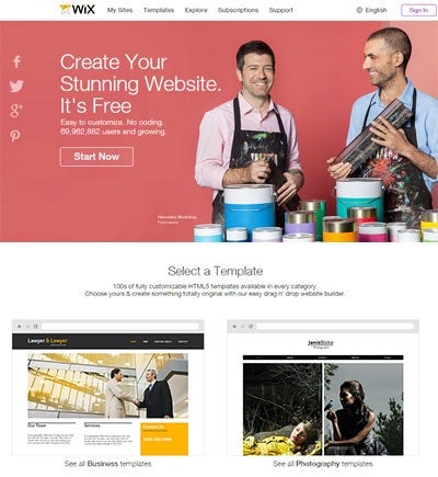
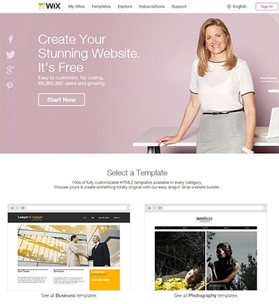
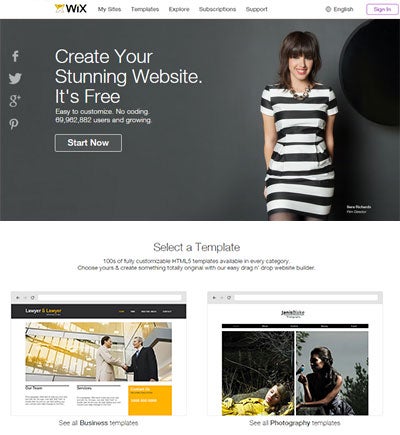
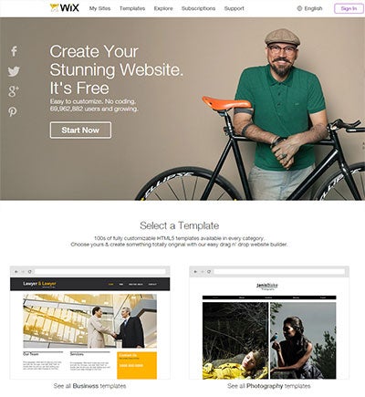
Example 2: ThemeKingdom offers themes for different type of businesses
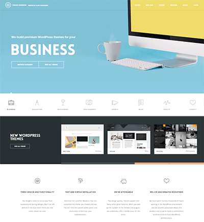
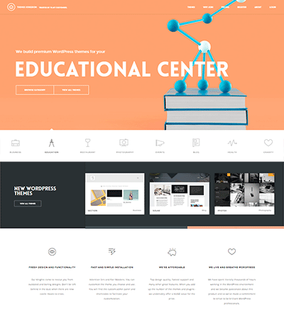
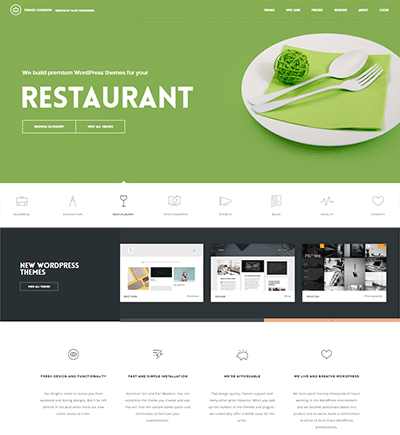
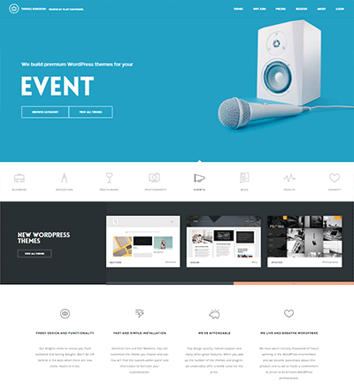
So if your business targets a few different groups of customer-base, or if you have a variety of product / service offerings, then a slideshow based header might work well to target the numerous classes of customers, or to showcase the variety of your offerings.
4. Video BACKGROUND Header
Who should use this:
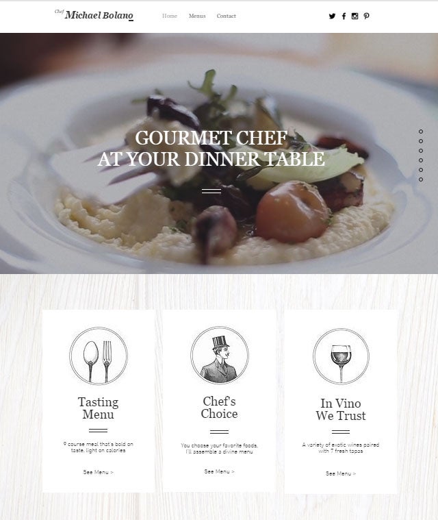
A video background header works well to explain your business mission by featuring the scope your business process in an engaging way.
Moving images or videos are very effective in grabbing people’s attention, so it is no surprise a lot of successful websites use video backgrounds to improve the engagement levels and brand awareness.
Most small businesses can benefit from video background headers when they are used correctly.
Here are some tips to keep in mind if you decide to use a video background header design for your website:
- Use contextual video that carries a message – don’t pick random videos. Pick videos that support your mission, message, or mood. This especially effective if you are a lifestyle brand.
- Use a unique video rather than a stock video to give your website more personality and to create a connection with your audience.
- Use high-quality video that has high production value – don’t use videos that have low visual quality as it reflects poorly on your business.
- Keep the video short and video file below 6MB. A large video file can drastically slow down your website’s loading speed.
Here are some examples of websites that use video headers very effective:
Detailed Video Background Guide – see this guide if you’re interested in more discussions on how you can implement a video background on your website to make it look much more professional, and to further improve your brand.
3. Which Menu Bar Design Should I Choose?
“The menu bar might not look important, but it actually impacts how your visitors perceive you and your brand.”
Many people tend to send their focus in the wrong direction when choosing a website template. The design is important, but the utility of the design trumps the esthetics every single time.
One of the most undervalued elements of a website design is the menu bar design. This includes the menu bar types, position, and layout.
It’s important to choose one that fits your business’ needs.
Why is menu bar design such an important part of your theme?
The menu is the primary tool that your audience will use to navigate your website. It creates a road map to guide your visitors around your website and where they should focus their attention.
If a visitor visited your website and couldn’t figure out where to find the information they are looking for, then your website basically failed miserably… no matter how good it looks!
1. The Do’s & Don’ts of Menu Bar Design
Do’s:
- Choose a clean, simple design that makes your menu tabs easy to read and access.
- Use a color that’s easier on the eye as your menu background (nothing too sharp or flashy ). Highlight the menu tab text with a contrasting color to make them stand out. (See boxed section directly below if you’re not good with choosing colors.)
- Create a hierarchy for your pages. Layout your pages in decreasing importance from left to right (the most important pages goes to the left side).
Don’ts:
- Don’t clutter your menu with too many page tabs. Only display pages that are essential to your business. It’s easy to keep adding more pages as you’re passionate about your business. But this may overwhelm your visitors.
- Don’t use distracting backgrounds that make menu tabs hard to read. Some people like to add fancy background images / patterns to menu bars. Don’t do that!
- Don’t use small font sizes or overly fancy font designs that make it hard for your visitors to read. It can be annoying!
Choose the Right Color Scheme Like a Designer – Not good with picking colors? Or not sure which color combinations will work? See this guide.
2. Choose YOUR Menu Bar Position
Understanding how you want your website visitors to experience your website will guide you to the type of menu bar design you should pick.
1. Fixed Position Menu Bar (menu bar is permanently fixed at the top of the page)
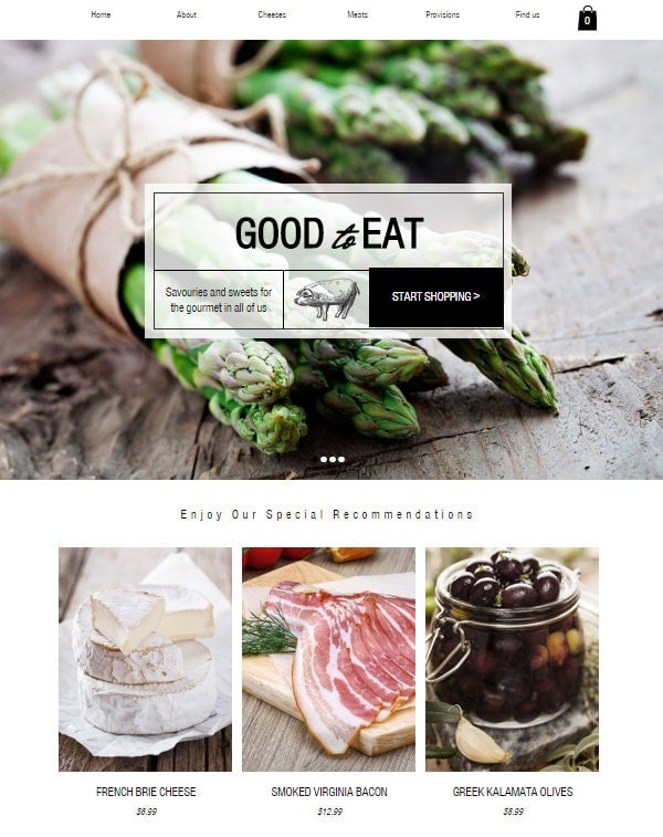
This works best for websites with a lot of content (basically very long pages). Fixing the menu bar to the top or side of the page allows your visitors to quickly switch between pages without the need to scroll back to the top.
If your website doesn’t have long pages (not content heavy), then having a fixed menu bar at the top of the page becomes less effective (and slightly pointless). You’ll have more template design options at your disposal if you don’t use a fixed-position menu bar design. Consider whether your website truly needs this feature.
2. Top Horizontal Menu Bar
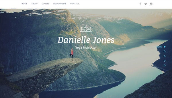
80% of websites use this traditional style of menu bar design. It’s popular because it is effective.
People are conditioned to go to the top of the page when they are looking for the menu bar. The width of the menu bar is limited by the width of the browser.
It’s a very classic menu bar design, and you can’t go wrong with this style most of the time.
3. Side Vertical Menu Bar
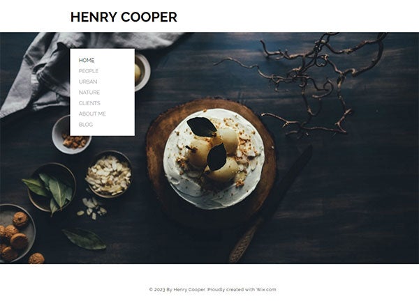
Having a menu bar on the side is quite popular with graphic-intensive websites (such as a portfolio, restaurant, salon, spa, etc.).
Vertical menu bars are particularly effective if your website has a lot of menu tabs to display, or have menu bar titles that are longer than usual.
Beware that some website templates have “fixed” vertical side menu bar, so there is a limit to how many tabs you can add. Some design templates have a scrollable vertical menu bar, so the number of tabs you can display is limitless.
4. Bottom Horizontal Menu Bar
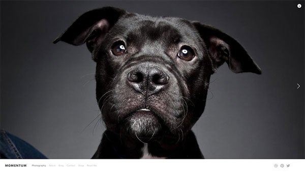
This menu bar layout is not too common. It works exceptionally well for graphic intensive websites where you want your visitors to focus on the immediate content, instead of instinctively start searching for the menu bar.
When the menu bar is placed at the bottom of the page, it eliminates any visual distractions and forces your visitors to focus on the immediate content in front of them. You will see this menu bar design in photography and portfolio websites (interior design, architecture, artists, and etc).
This style of menu bar also works well if you place a lot of links in the content area to guide your visitors around the website. This way, you are less reliant on the menu bar, as you guide your visitors to different pages with on-page links.
3. Logo PositionING
Logo positioning is not random. How your logo is positioned actually says a lot about the goal of your business.
1. Logo placed on the same level / line as your menu bar
This design works best for websites that place more focus on promoting their products or services, and less focused on business branding. As the logo is on the same level or is contained within the menu bar, the size of the logo is limited.
This is also a design that is mostly used by B2B (business-to-business) types of businesses where branding and marketing are less of a focus than retail businesses.
Of course, the logo (branding) is still important, but just less pronounced as the size of the logo is limited by the menu bar.
2. Logo placed in the center with the menu bar (either below or above it)

If you are focused on creating a brand identity, this is the most effective design choice as your logo is more prominently displayed.
There is less restriction on the size of your logo, so your visitors are more likely to pay attention to it.
This logo layout is quite popular amongst retail businesses as they use various marketing techniques to create a brand identity and to promote brand loyalty.
So think about how you want your logo to be positioned. Are you more focused on branding? If so, placing your logo above or below your menu bar can help you accomplish that goal.
If you’re not sure how to go about designing your logo, why not use an online logo generator like Tailor Brands? This is a handy, professional tool that does the hard work for you by creating tailored logo designs. You can even customize your logos to ensure they’re on-brand. When you choose a premium plan you also get access to an awesome range of extra tools, from social media logo sizes to a branded business deck.
You can save 25% on any Tailor Brands premium plan with our exclusive discount code – simply enter the code WBE25 at checkout to enjoy your discount!
How to Create a Logo (in Less than 1 Minute) – see our guide on how to create an attractive and professional looking logo – even if you don’t have any design skills
Pick Your Website Template Design – Let’s Apply What We Discussed
Now that we’ve discussed the 3 criteria to helping you pick the right website template design, let’s put the process into practice so you can start figuring out what works for you and your business.
We will also show you 2 examples so you can see how the process can work for you. We’ll also give you a couple of good sources of where to start looking for templates below.
Step 1: Pick the best combination for your website:
- Content Width Design
- Full-width – more contemporary look
- Boxed-width – more traditional look
- Home Page Header Layout Design
- Static Image (No Content) – if a single image can effectively tell the story of your brand
- Static Image (With Content) – if you need text headlines to explain what your business does – most common
- Slideshow – to highlight several customer types you are targeting or various products / service offerings you offer
- Video Background – if a video works well to tell the story of your brand. See this detailed guide on how to the do’s and don’ts of setting up a video background on your website, including where to find videos or templates with video background built into them.
- Menu Bar Design
- Make sure it is easy to read – plain background color and plain fonts with contrasting color
- Menu Position:
- Fixed Position – if you have long scrolling pages. Easy for visitors to find the menu bar.
- Horizontal (Top) – for website with limited menu bar items (less than 8 items) – most common position
- Vertical (Sidebar) – for graphic-intensive designs with a lot of menu bar items
- Horizontal (Bottom) – for graphic-intensive designs where you want visitors to focus on content right away
- Position of Logo:
- Same Level as Menu Bar – less branding & allows more room for content
- Above or Below Menu Bar – more branding effect as logo is larger but reduces space for content
Examples:
Restaurants: High-quality images and videos are the windows to the customers’ stomachs.
- Content Width – Full-width content design as it feels more contemporary and really highlights the graphics
- Header Layout – A static image without content to display the most mouthwatering images of your restaurant’s dishes.
- Menu Bar Position – Horizontal Top or Bottom, or Vertical Sidebar can all work well.
- Logo Position – Choose centered logo above or below the menu bar to emphasize on branding.
Personal Trainer: Offer a clear description of your services and benefits.
- Content Width – Full-width content design to show image / visual impact of benefits of being fit.
- Header Layout – A static image with content to include a headline, sub-paragraph, and call-to-action (explaining what you do, benefits, and how to sign up).
- Menu Bar Position – Horizontal Top (fixed position also works if you have more content) as a vertical sidebar or horizontal bottom could be a bit too creative / artsy.
- Logo Position – Same level as menu bar to create a professional look and to have a shorter menu bar design.
Now that you have a preliminary idea of what you’re looking for, you can start browsing through template designs again, but with the benefit of being able to sift through designs that don’t match your criteria.
Narrowing down your list will take some time, but at least you now have some sort of direction.
Step 2: Narrow down your list to 1 or 2 choices
Once you’ve compiled a list of potential design candidates, it’s time to choose one or two templates you like the best.
However, it can still be challenging to make a final decision without first taking the website templates for a “test drive”.
If you are using free design templates, then try to insert some content in each design so you can see which one you prefer. Given that the templates are free, this gives you the opportunity to work with each template to test them out.
You never know which one you prefer until you actually work with them – just like test driving a car. It will be well worth your time.
If you are using a paid design template, you may not be able to test out the design. If that’s the case, we advise you to study each template’s demo site and descriptions extensively, in order to decide if that design may potentially work for you.
It will be a bit of a gamble, especially that a paid design usually cost anywhere from $50 to $150. But if you find something you really like, and perform your due diligence on it (short of actually trying the design), it might be worth the risk.
Don’t know where to find free design templates? Some drag & drop website builders offer you free designs.
Wix – see their designs
Wix has over 500 designs across a very broad number of industries so you will find templates that match your business. They are very flexible so you can heavily customize your design without knowing how to code. You can see our review of Wix and how they can easily help you build a website.
Squarespace – see their designs
Squarespace has some of the most polished designs available today. They don’t create a lot of templates, but their designs can make your website look as if you’ve invested thousands of dollars into building it. See our review of Squarespace here.
Conclusion & Key Take Aways
Choosing the right website template design is like buying a house – confusing at times, and you’re afraid you’ll make the wrong choice.
You likely won’t find that one perfect design template that will satisfy your 10-page wish list. That “unicorn” design probably doesn’t exist unless you are willing to spend thousands on website costs.
Side Note: If your business is not generating a lot of money yet, we highly advise you against hiring a website designer (see our arguments here).
However, if you take a systematic approach, such as implementing the 3 criteria we described above, this can help you narrow down your choices from hundreds of designs down to perhaps a handful. That in itself is a major victory, right?
From there, you should test them out if they are available for free.
Here are a few highly recommended website builders you can start with, who all offer you design templates for free.
Haven’t heard of them? We’ll show you the simple rules we use to pick the best website builder for you.
Remember: Select a design based on what your website needs, rather than simply what you think looks “pretty”.
Other Guides:
- High Quality Images (Free / Paid) – If you don’t have any of your own images to start with, here are some great ones for you to get started with.
- How to Edit Your Images Like A Pro (Without Being a Pro) – Here are a few easy-to-use image editors that can help you make amazing edits to your pictures.
- Creating Your Own Professional Logo – check out a few tools (free / paid) to help you create your own logo – without hiring a designer
- How to Pick the Best Font Design for Your Website – Most people don’t think about picking the right font. Here’s a hint – top designers do. See why.
- Choose the Right Color Scheme Like a Designer – Not good with picking colors? Or not sure which color combinations will work? See this guide.
- How to Create an Awesome, Professional Looking Home Page – You don’t have to be a gifted designer. Follow our formula to create your home page.
- Coding for Beginners – Learning even a little bit of coding can be useful when customizing your design. Here are some awesome resources we used when we first started out.
Found This Guide Helpful?
Question – Did this guide benefit you? Leave a comment below.
Do you know anyone who can benefit from this guide? Send them this page or click on the share buttons on the left.
You’ll be helping us out by spreading the word about our website, and you’ll be helping them out!


46 comments