Splash Page: What Is It and Do You Need One?
If you click to purchase a product or service based on our independent recommendations and impartial reviews, we may receive a commission. Learn more
Websites can be powerful marketing tools, and splash pages shouldn’t be overlooked. Taking care with the structure when building your website in the best way possible will help you streamline visitor journeys, and ultimately allow you to drive better results.
In this article, we explore splash pages, why they can be so beneficial, and how to apply them to your own website.
What Is a Splash Page?
First things first. Let’s dive into exactly what we mean when we use the term “splash page”.
Splash pages are a little like pop-ups, and there are a few elements that make a splash page unique:
- It’s presented automatically when you open a website
- It requires you to manually close it to get to the main website
- It’s used to either offer essential information to visitors or collect user information
However, just like pop-ups, you need to be careful with splash pages because they can create a negative user experience if not used correctly.
Only use your splash page to offer key information or to provide visitors with a high level of value in exchange for data.
For example, splash pages may be used to:
- Collect age information (for age-sensitive websites)
- Provide a warning (for websites with sensitive content)
- Offer a discount, download, or reward (in exchange for data such as an email address)
- Give website requirement information (such as software you need to view the website)
- Encourage sign-ups to your newsletter
- Make an announcement (such as sales or product launches)
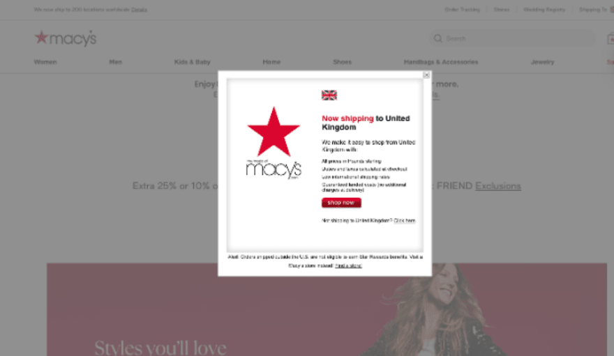
- Direct traffic (such as asking the user if they would like to view the country-specific version of a website)
Take a look at this example of a splash page below:

The Difference Between a Splash Page, a Homepage and a Landing Page
At this point you might be thinking that a splash page looks great, but do you know the difference between a splash page, landing page, and homepage?
We answer this question below:
| Splash Page | Homepage | Landing Page |
|---|---|---|
| One specific purpose (collect data or communicate essential information) | Multiple purposes | One specific purpose - collect data (via lead magnets such as contests, ebook downloads or webinar registrations) |
| Designed to be navigated away from (to homepage) | Designed to navigate to various parts of the website (lots of links) | Designed to keep attention (usually no links) |
| Layered over homepage | Separate from homepage |
The Pros and Cons of a Splash Page
Is a splash page right for you? We cover some of the positives and negatives of using this website tool below:
Pros of Using a Splash Page
Attention Grabbing
Splash pages are a great way to grab the attention of your website visitors. This is because visitors can’t run from your splash page. It will automatically appear once they open your site.
In reality, there are few opportunities to gain customer attention to the same degree as a splash page. Even pop-ups, which function in a similar way, allow visitors to close or navigate away from your site before the message is presented to them.
Communicate Key Messages
With all of the attention it commands, a splash page is by far the best way to communicate key messages. This is especially important in cases where those messages are essential to the user experience.
For example, websites that require age verification have little option but to use a splash page of some sort. Equally, if there are technical requirements to even access a website, then using a splash page to inform visitors will help generate a smooth user experience.
Drive Results

What is most important to your business right now?
Driving sales? Getting email sign ups? Ensuring a smooth customer experience?
Whatever it is, that’s exactly what you should be using your splash page for. Your splash page ensures that your most important aim, whether that be collecting data or telling people about an upcoming sale, is seen by every single website visitor.
Cons of Using a Splash Page
Frustrated Visitors
The big downside to using a splash page is the potential to frustrate visitors.
When someone visits your website it’s usually for a reason. They’re looking for information or want to make a purchase. So, when you throw a splash page at them, you’re adding an extra step that they need to complete in order to achieve their ultimate goal.
This can slow visitors down and ultimately frustrate them. In turn, this increases the likelihood that they’ll leave your site without completing any action.
However, you can mitigate this risk by ensuring that your splash page is either 100% essential or provides visitors with a very high level of value.
What To Include in a Splash Page

You’ve probably already figured out how to host a website, and you’ve built a brilliant website for your business. Now you’re here learning about splash pages! So, what makes a fantastic splash page?
We’ve already mentioned (several times) that a splash page should be used to communicate essential information or offer visitors a high level of value in exchange for data. Once you have the right message, you can start to think about exactly what you want to include on your splash page.
Luckily, a great splash page is all about keeping things simple. Here are a few ideas about what to include:
- A simple design
- A small amount of high-impact copy
- A relevant, interesting, and high resolution image to grab attention
- A powerful Call To Action (CTA)
- A link or “close” button to take viewers to the main website
Although simple, taking time and care to make sure that every element of your splash page is perfect will help you drastically improve results. Want more inspiration? Take a look at these splash page examples.
Advice from the Experts
Top Tip: When using splash pages, it’s important to monitor your website analytics to ensure that it’s actually driving the desired results without impacting your site negatively.
Splash Pages: Summary
It’s clear that splash pages can be a great way for websites to communicate important messages and drive the most valuable results. This guide has walked you through everything you need to know about splash pages, including the positives and negatives of the feature, and top tips on what to include when you create your own. As a reminder, keep things simple, essential, and attention-grabbing.

Leave a comment