Wix vs Weebly in 2024: Discover Why Users Prefer Wix
If you click to purchase a product or service based on our independent recommendations and impartial reviews, we may receive a commission. Learn more
Wix and Weebly are two of the biggest website builders to compare. However, they both offer vastly different things and each one is suited to a particular type of user. So how are you supposed to know which one is better for you?
Well, there’s no need to worry because we’ve done the hard work for you, comparing these two website builders to see which one comes out on top. Spoiler: it’s Wix.
But that’s not to say that Wix will be best for everyone. In fact, Weebly has its advantages, too. So if you want to know exactly what makes Wix shine and figure out which is the best fit for you, read on!
Wix vs Weebly: Recommendations
To give you a head start, we’ve summarized the main reasons why you should use Wix or Weebly based on your unique needs:
| We recommend Wix if… | We recommend Weebly if… |
| You want full creative control. Wix's builder comes with numerous design tools and website features, so you'll have plenty of ways to customize your website. | You want to sell for free. Weebly is the only website builder that will let you create an online store for nothing. |
| You want more robust and scalable ecommerce features. On the Core plan and above, you'll be able to accept payments and sell up to 50,000 products. | You aren’t bothered about advanced customization. Weebly's tools aren't as complex as Wix's, but they do get the job done. |
| Marketing tools are a key part of your online strategy, since the builder comes with email marketing, social media marketing, and SEO to help you grow your website online. | You’re on a tight budget. Its cheapest plan is $10/mo (billed annually), which is significantly cheaper than Wix's cheapest plan at $17/mo (billed annually). |
Wix vs Weebly: Comparison Table
Need a few pointers on Wix and Weebly’s key features? Here’s a quick rundown below:
| Wix | Weebly | |
|---|---|---|
| Starting Price | Prices start from $15.30/mo (billed annually) if you use the code ‘TAKE10’ at checkout | Prices start from $10/mo (billed annually). |
| Ease of Use | Wix's editor can be overwhelming at first due to the range of features available, but it does get simpler once you get used to it. | Basic and pared back, Weebly's drag-and-drop editor makes it easy to set up – even if you're a beginner. |
| Editor and Templates | With Wix, you'll find over 800 templates and will have plenty of creative control over your website's look. | Weebly's templates are limited, especially in comparison to other builders on the market. You'll find a small selection of plain and outdated templates, while customization options are sparse. |
| Ecommerce | Wix is ideal for ecommerce businesses that want to scale. The Business and Business Elite plans are best for larger stores. | Weebly lets you set up and sell for free, which is great for businesses who are just starting out. |
1. Best For Setting Up: Wix
The Winner
Wix gives you more options when setting up
We’ll start with the basics – signing up to your chosen website builder and setting up your account. Luckily, both builders take a similar approach to this and it’s a pretty straightforward one.
How Do I Set Up With Wix’s Editor?
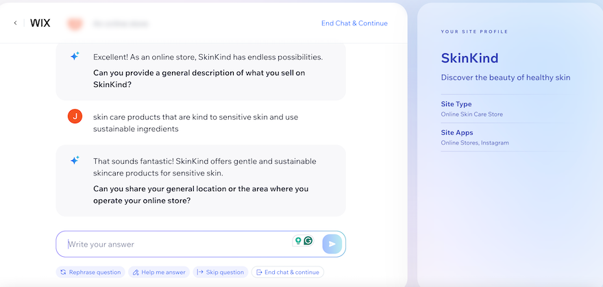
There are two options when setting a website up with Wix, but before we reached that stage, we were given the chance to tell Wix’s AI about our business and website. This is optional, but if you do choose to use Wix’s AI, you’ll be redirected to a chatbox where you’ll answer a number of questions about your business and your website. This information will then be used later on to select appropriate pages for your site and populate it with relevant text.
If you’d rather not use the AI, that’s not a problem. You can add this information manually later on.
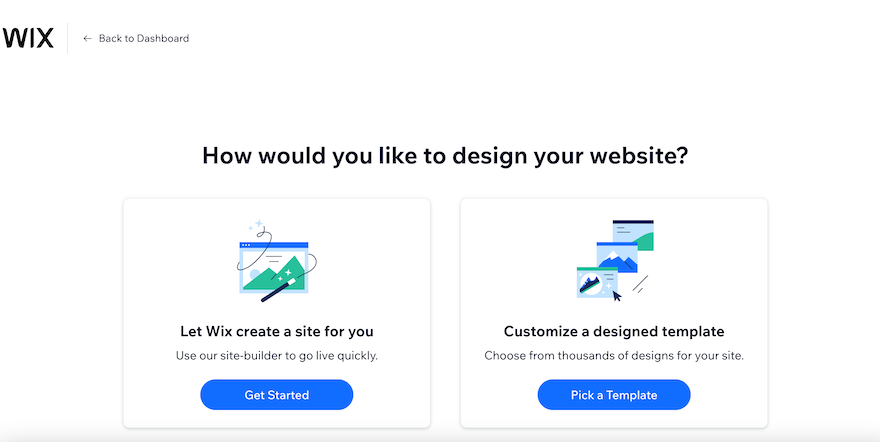
After this, we were then presented with two options: use AI to build our site, or pick a template and do it ourselves. If you choose to use AI, Wix will build the site for you, based on answers to specific questions. This option is perfect if you’re short on time or not very tech-savvy. The best part is that you’ll still be able to edit elements of the site afterwards so that it’s completely yours.
If you want more control, you can take the second option and do everything from scratch yourself. We chose this route for our test site and were invited to tell Wix about our business, after which we could choose a template from over 800 options.
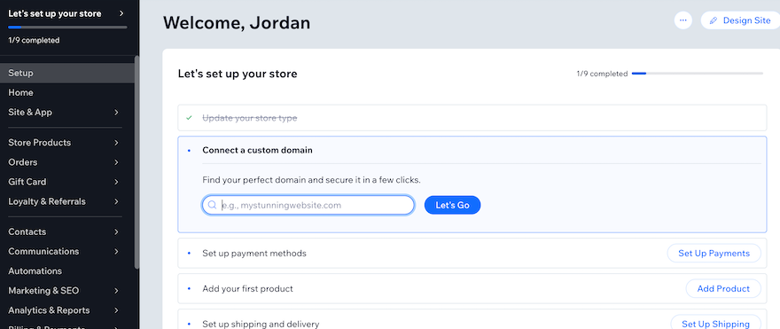
Once we went through these initial steps, Wix took us to our dashboard. There’s a lot of information on the dashboard, and at first we worried that it might feel a bit chaotic, however, Wix uses a checklist to keep everything streamlined. The checklist showed us a list of tasks to complete while setting up our website, the first of which was adding our domain name. You can choose to follow these prompts or use the “Design Site” button in the top right corner to dive straight into the creative stuff.
- Want to learn more about Wix? Then see our Wix review for plenty more information.
How Do I Set Up With Weebly’s Editor?
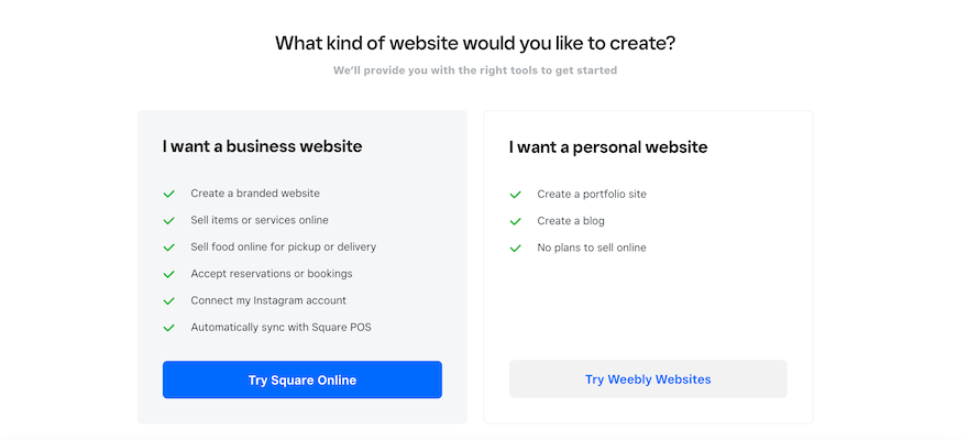
Before accessing the editor, we had to sign up with Weebly first, which followed a similar process to Wix. Once we’d hit the “Sign Up” button on the homepage, we were invited to enter some details about our business. We were then directed to a screen asking what kind of website we wanted to build.
This is where Weebly diverges from its competitor slightly. We were given the choice of building a business website with Square Online, or a personal website with Weebly. This is because, in 2018, Weebly was purchased by Square, and ecommerce is Square’s area of expertise. So whereas Wix offers ecommerce tools as part of its overall package, Weebly splits this feature out and the platform will encourage you to jump over to Square Online.
However, don’t be fooled into thinking you have to use Square Online if you want to sell. The process can feel misleading because of Square’s agenda, but take it from us – you can still use exactly the same ecommerce tools on Weebly as you can on its parent platform. So for our test site, we went ahead and selected the “Personal Website” option.
Weebly doesn’t offer an AI builder like Wix does, which is a downside if you don’t have the time to spend hours creating a website from scratch. Instead, we were directed to the template catalog to choose a theme for our website and then straight into Weebly’s editor to start building.
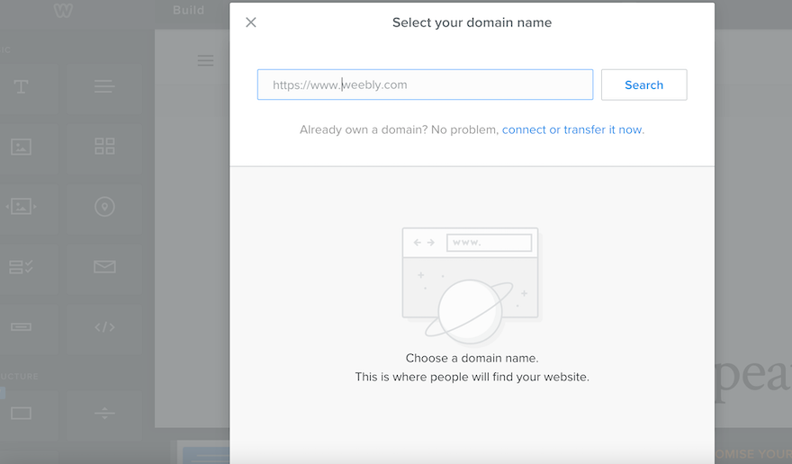
Like with Wix, the first thing it will prompt you to do is connect your domain name. This will appear in a popup so you won’t have to go searching for this, which makes the process much easier and saves you time. However, if you don’t connect your domain straight away, the popup will keep appearing, which can get pretty annoying and distract you from actually building your site.
2. Best for Pricing: Weebly
The Winner
Weebly has the cheapest pricing plans
Wix offers four different paid pricing plans in addition to its free plan, whereas Weebly only offers three. Below are details of the plans for each:
Wix Pricing Plans
| Plan | Price Per Month (Billed Annually) |
|---|---|
| Light | $17 |
| Core | $29 |
| Business | $36 |
| Business Elite | $159 |
Weebly Pricing Plans
| Plan | Price Per Month (Billed Annually) |
|---|---|
| Personal | $10 |
| Professional | $12 |
| Performance | $26 |
Is Wix or Weebly Better Value for Money?
At first glance, it’s clear that Weebly’s pricing is cheaper in terms of face-value spend, making it better value for money overall. Not only that, but Weebly is the only website builder that allows you to sell for free. This is a big bonus for small businesses looking to get their online store off the ground.
Of course, there are some limitations when it comes to Weebly’s free plan. For example, you’ll have to put up with Square branding on your website and, although you can sell an unlimited number of products, you won’t be able to sell any digital items. Despite this, it’s still a great way of selling online without having to spend a cent.
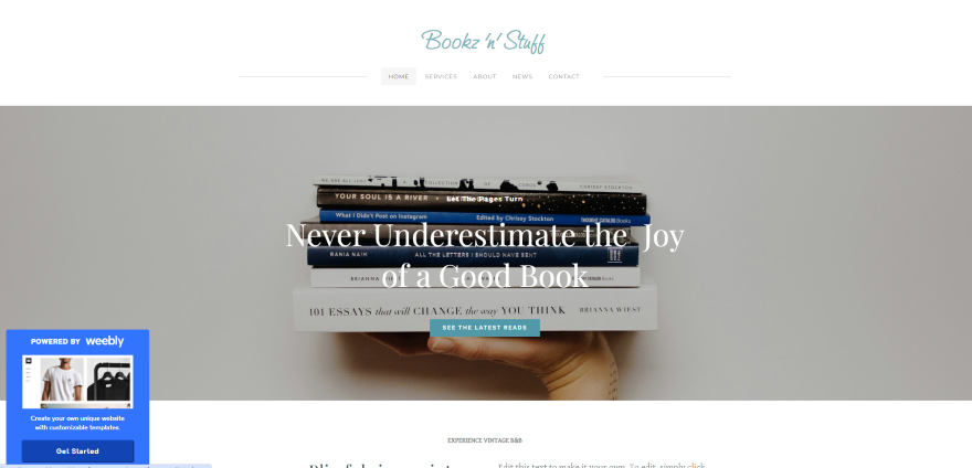
Outside of ecommerce, however, Weebly struggles to hold its own against Wix’s seemingly never-ending list of features on all of its plans. Put simply, Wix has something for every single type of business. Whether you want to take hotel bookings, restaurant orders, or sell your art online, Wix covers all bases.
If you opt for one of Wix’s pricing plans instead, you’ll need to sign up for the Core plan at the very least if you want to accept payments online. This will allow you to sell up to 50,000 products including digital downloads and subscriptions, as well as providing abandoned cart recovery.
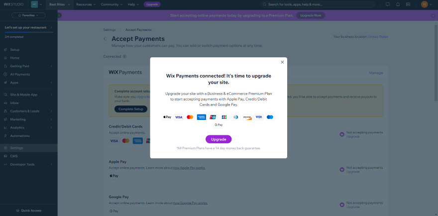
For this reason, we recommend the Core plan as the best value for money out of Wix’s four tiers. It gives you access to all the features you’ll need to do these things. We don’t recommend Wix’s Light plan, however, because you barely get anything for the money you pay.
For Weebly, our preferred plan is the Professional plan. For only $12 per month, you’ll get a free custom domain, be able to remove Square branding, enable popups, and get access to phone support which isn’t available on the cheaper plans.
Plus you’ll have unlimited storage, which Wix only offers on its most expensive Business Elite plan which is over 13 times more expensive than Weebly’s Professional plan.
Both Wix and Weebly come with large app markets, where you can add tools and features to your website using third-party integrations. However, it’s worth bearing in mind that these third-party apps often come with an extra cost and you’ll have to sign up for a subscription that’s separate from your website builder plan. As a result, these costs can quickly rack up, so we recommend choosing a website builder like Wix that comes with most of the tools and features you need already built-in.
3. Best Editor: Wix
The Winner
Wix has the most flexible drag-and-drop editor
When building your website, the creative part is one of the most important bits of the process. That’s why it’s crucial that your chosen website builder has an editor that is easy to navigate and use. Both Wix and Weebly use drop-and-drag editors, but there are some key differences between the two.
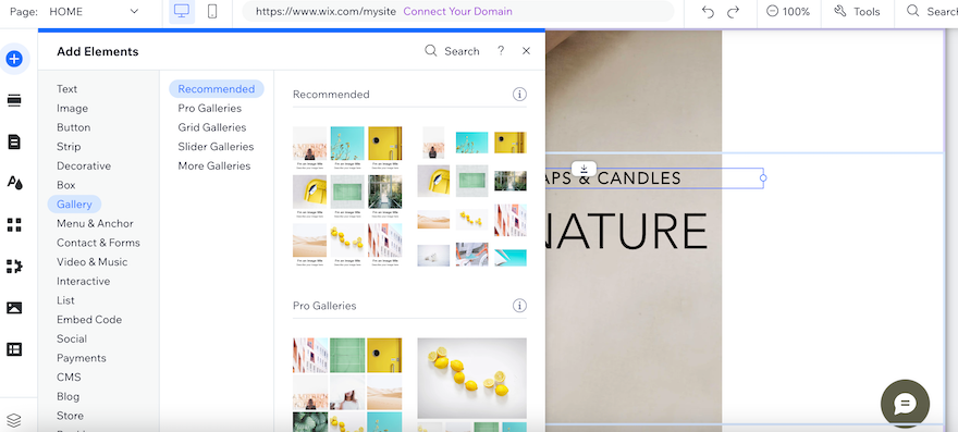
With the Wix editor, we found we could drag any element we wanted virtually anywhere. The editor had a handy grid guideline that showed us where the edges of the webpage were so we could make sure we weren’t cutting any images or text off, but other than that, we were free to be as creative as we wanted.
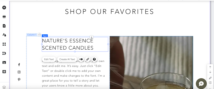
If you’re someone who likes to work within clearly defined boundaries, however, this can be confusing and overwhelming. Quickly, your webpage might become cluttered and messy and you can easily lose the stylish aesthetic you were hoping for. If this sounds like you, you might find the Weebly editor more to your liking.
Weebly works in rows, so although we were able to move things around, we couldn’t just plop anything where we wanted. Instead, we had to work within Weebly’s pre-set boundaries. This did make it easier for us to keep a grip on the design and for those of you who like more structure, this will be ideal. If, however, you want unlimited customization options, Wix is the better choice.
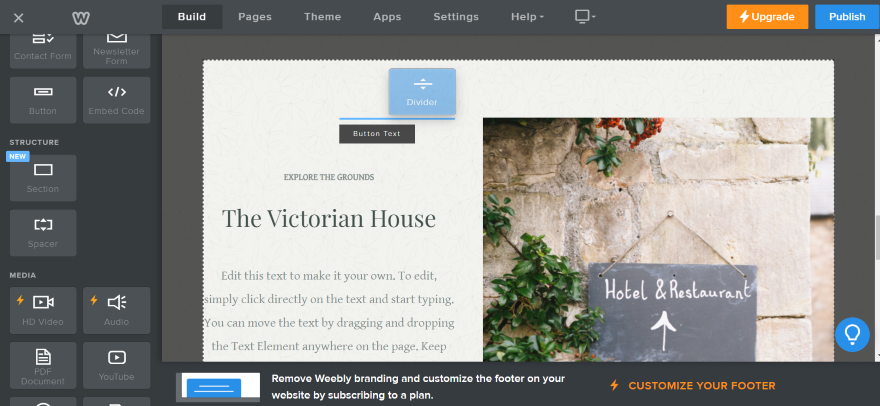
Because Wix can do so much and has so many tools and added extras on offer, the editor can feel pretty overwhelming at first. It’s difficult to know where everything is and how to do what you want. Because of this, we’d say it comes with a steeper learning curve than the Weebly editor.
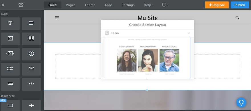
However, once you’ve explored and know your way around, Wix has endless creative possibilities. You can add up to 100 different pages, as well as make changes to the mobile view alongside your desktop view. The list of different elements you can add to your pages is extensive and every new section you can add comes with a variety of different layout designs. If you want choice, Wix gives it to you in bucket-loads.
In contrast, Weebly is much more pared-back. It offers the basics, so if you struggle with choice paralysis, Weebly makes things simple. However, this does mean you’re likely to run into a creative wall eventually. For example, Wix offers different menu layouts, whereas, with Weebly, you don’t get a choice. Ultimately, this means you’ll find it challenging to make a website that totally reflects your brand with Weebly.
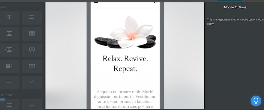
Another drawback of Weebly’s editor is that you can’t edit your mobile view. You can view what your website will look like on mobile devices, but you won’t be able to change anything about it. This is because Weebly claims that all of its templates are auto-responsive, so automatically adjust to different screen sizes. We’ll explore how accurate this is later on, but in terms of design, it means your hands are tied which we found frustrating.
Finally, Weebly has yet to join the rest of the website-building world and jump on the AI bandwagon. When we tested the builder, we couldn’t find any AI tools to assist in building our website.
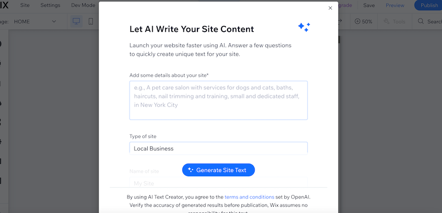
This is in stark contrast to Wix which has its own AI website builder. As soon as we opened the Wix editor, we were greeted with a popup inviting us to let Wix create all our written content for us. In practice, this was very slow to load, but we like that Wix is adding tools that are designed to make the building process easier and faster for its users.
4. Best for Templates: Wix
The Winner
Wix has more professional templates to choose from
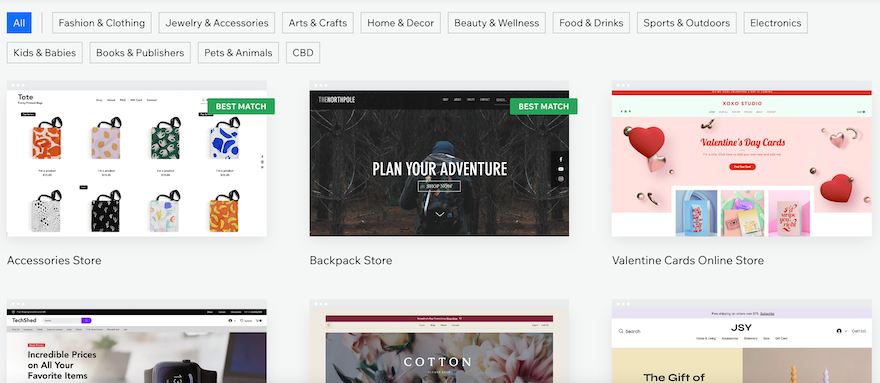
In contrast, Wix has so many templates you’re bound to find something to suit you, and the excellent customization meant we could fully tailor our template so it perfectly matched our business.
When it comes to templates, Wix wins the award for sheer volume. It offers over 800 options, covering every industry from blogs and catering to beauty and wellness.
However, not all of Wix’s templates are created equal. Where some are visually stunning and very modern, others feel clunky and outdated. Despite this, we appreciate that, given how many there are and how many industries Wix caters for, there’s sure to be something for everyone.
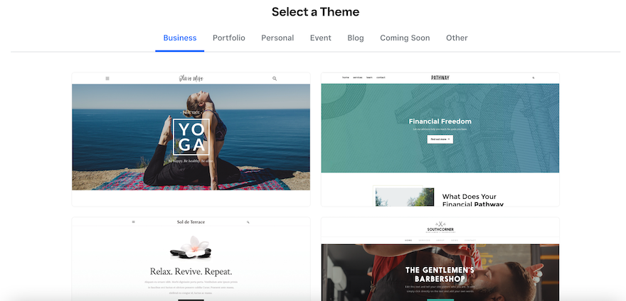
Weebly, on the other hand, has a smaller selection of themes, but none of them wowed us. Compared to Wix, they felt plain and boring and you might find yourself too limited by the options available. This is especially true considering that customization in the editor is limited, so you might find it difficult to make a website that’s truly reflective of your brand.
We were disappointed to see that the themes on offer haven’t really changed much in the last five years. We’d like to see Weebly bring out some new and exciting designs, rather than sticking with the same old options.
As well as advanced customization, it’s difficult to tailor Weebly’s themes in even the most basic areas. For example, you won’t be able to change your theme colors, as Weebly only allows you to choose between a “light” mode or a “dark mode”. This makes it a lot harder to incorporate brand-specific colors into your design and is frustrating because many brands take a long time purposely choosing specific colors for their business.
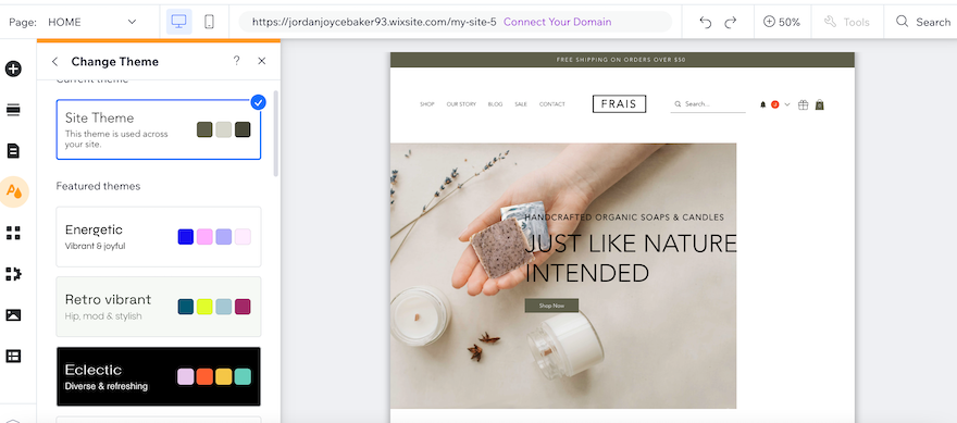
Wix is a lot more flexible when it comes to theme colors. It gives you full control and allows you to alter specific colors so that your palette matches and complements your brand. As a result, with Wix, it’s much easier to tailor your template so that it feels unique to you and your business.
Despite the superiority of Wix’s themes compared to Weebly’s, it’s worth noting that once your Wix website is live, you won’t be able to change your template to a new one. If you do want to swap them over, you’ll need to start your website from scratch which is disappointing and time-intensive. Weebly, on the other hand, allows you to change the theme, although you will need to do a little reformatting.
Are Wix or Weebly Websites Responsive on Mobile?
Because so many people browse the internet on mobile devices nowadays, mobile responsiveness and mobile-first design is key to building a successful website. Wix nails this, allowing users to edit the mobile view of their website to ensure everything formats as it should.
Weebly, on the other hand, falls down in this crucial area. Despite its claims of auto-responsiveness, its themes often reformat strangely on mobile, with blocks resizing in odd ways. Plus, its loading speeds are lacking, too. This is a big issue, especially considering that search engines track mobile responsiveness as a ranking factor, so it could affect your SEO efforts.
5. Best for Selling Online: Wix
The Winner
Wix has a wider range of ecommerce tools
If you want to sell online, both Wix and Weebly are also ecommerce website builders allowing you to build an online store. All you need to do is add a store page from the pages menu in either editor. This will create a page for you to display your products. So far, so simple!
When it comes to actually adding your products to your website, Wix allows you to do this in the dashboard. In the “Products” section, we were able to enter our product details, such as its name, price, and description.
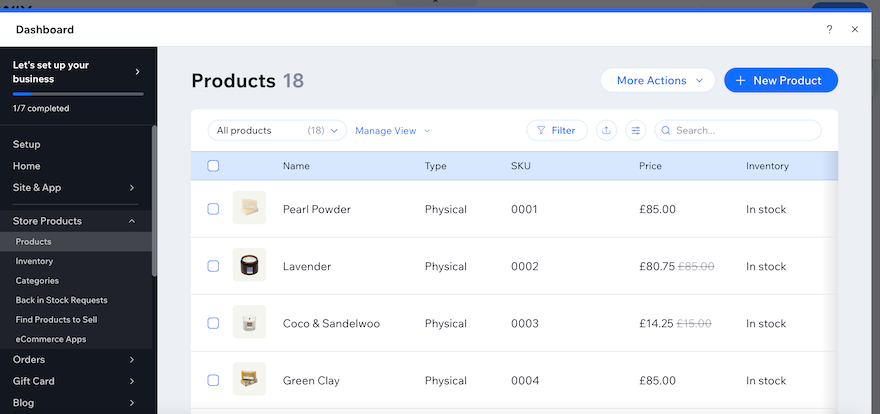
You can access the inventory feature in the dashboard, too, which helps you keep track of your stock. We were also able to set up “Back-in-Stock” notifications so that our customers would be alerted when a sold-out product was once again available. We particularly like this, because it encourages potential customers to revisit your site and boosts the chances of a sale.
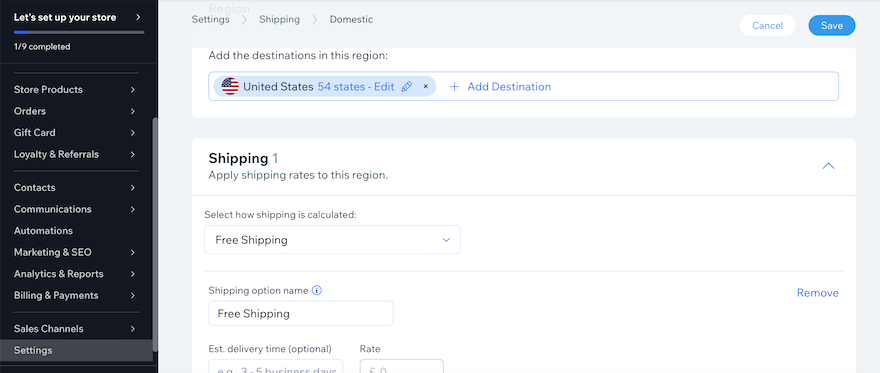
When it comes to shipping products, Wix allows you to set shipping rules on a product-by-product basis. You can also set multiple shipping options which we thought was very useful for offering faster shipping at a higher cost, for example.
For those users on the Core plan or above, you’ll also be able to print shipping labels and connect your website to advanced shipping-specific apps to make order fulfillment that bit more efficient.
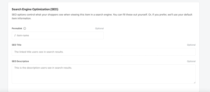
Similarly to Wix, once we added our store to our Weebly website, we were prompted to input our products, but this time, we weren’t required to leave the editor to do it. Instead, a popup appeared where we were able to add all the usual information, as well as specify whether each product had any variations such as color. The whole process felt pretty seamless and we liked that there was less back and forth than with Wix.
We also really liked that we were able to manage product SEO settings in the product popup window, adding an SEO-friendly URL, as well as setting the meta title and meta description. It made the whole process very easy and kept SEO at the forefront of our mind while we were adding new elements to the site.
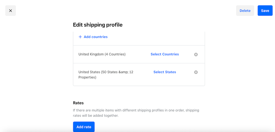
Shipping has its own section in the Weebly dashboard, which we initially found a little confusing, especially because we didn’t feel it was overly obvious how to reach the dashboard from the editor. Once we’d discovered we had to press the “X” in the top left-hand corner, this became much clearer.
Within the “Shipping” section, we were required to add our sender address before we could set out shipping rules. Weebly also offers a calculator to help you set your shipping costs, but this is only available on paid plans.
How Can I Accept Payments With Wix or Weebly?
When it comes to payment methods, Wix blows Weebly out of the water. Firstly, it has its own payment processor, Wix Payments, which handles all transactions in-house. If you’d rather use a third-party payment processor, Wix partners with over 80 different payment providers worldwide, including PayPal, Stripe, Square, Klarna, and Braintree to name a few. Integrating with these processors is all super easy, too, and Wix will lead you through it step-by-step.
It’s worth noting that if you use Wix Payments, you’ll be charged a standard processing fee of 2.9% + 0.30 USD. The processing fees charged by third-party processors vary depending on the provider, but Wix won’t charge you anything extra on top, which is good to know.
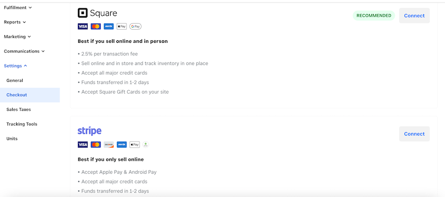
When it comes to Weebly’s payment providers you only have a choice of three: Square, Stripe, or Weebly. If you want to use PayPal, you’ll need to be on the most expensive paid plan to do so. Given Weebly’s relationship with ecommerce specialist, Square, we’re disappointed that they don’t offer more options and this could be frustrating for any store owners currently using a different processor.
If you opt to accept payments through Stripe, your customers will be able to pay through Apple and Google Pay.
Additionally, Weebly charges a 3% transaction fee for anyone not on the most expensive Performance plan. This is quite steep compared to Wix’s fees, especially when stacked on top of extra third-party charges. We found this pretty disappointing, particularly for small businesses that are just starting out.
- Keen to know more about selling on each platform? Check out our Wix Ecommerce Review or Weebly Ecommerce Review for more information.
6. Best for Marketing: Wix
The Winner
Wix's high-quality marketing tools can help you grow online
Once your website is built, marketing is the thing that brings the visitors in and keeps them coming back. So how do Wix and Weebly measure up in this vital area?
SEO
In this area, Wix excels. It comes with a whole host of SEO features which are all designed to give your website the best chance in the search engine results pages (SERPs). It offers a comprehensive SEO checklist to get you started, as well as a Wix SEO assistant that regularly reviews your website to check for any issues. Plus, you can also connect your site to Google Search Console to track your site’s performance in real time.
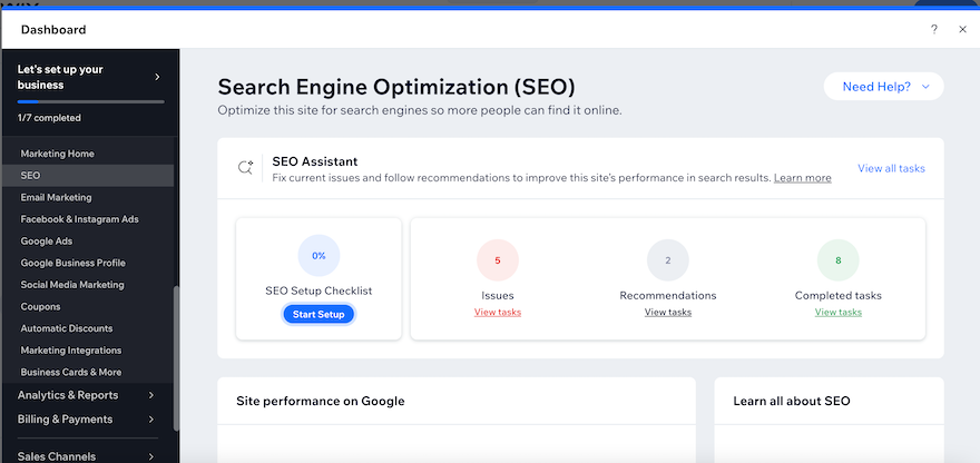
We struggled to find Weebly’s SEO settings at first, which was surprising considering it made it so easy for us to set our product SEO in our online store. After we finally located it in the “Pages” section, we found it lacking. There were no helpful SEO checklists or guides, and we didn’t feel it was very beginner-friendly.
Email Marketing
Weebly and Wix both offer an email marketing service, with Wix offering 200 emails for free, with the option to unlock more if you upgrade to a paid plan. There are three plans available, starting with the Essentials plan for $10 per month.
In comparison, Weebly’s email marketing service, Weebly Promote, only allows you to send two email campaigns for free. After this, you’ll need to subscribe, with plans starting at $8 per month. Despite this, Weebly’s email editor is very easy to use, with a layout that’s similar to the website editor, so users shouldn’t have any issues navigating it.
Social Media
One area that Wix aces is its social media marketing. Wix allowed us to create social media posts and then track content performance all in the Wix dashboard. This is great news for businesses with a solid social media strategy. For users who don’t have a stash of ready-made content, Wix also grants access to Wix Creator, Vimeo, or Adobe Express to help you along. Weebly doesn’t offer anything like this, limiting its social media integration to simple homepage icons.
Since Square purchased Weebly in 2018, the website builder hasn’t made any new updates or improvements, and as far as we can tell, it has no plans to do so in the future. As a result, the tools and features that we’ve mentioned in this review aren’t set to develop or change. What you see now is what you’ll get – forever. This will be especially limiting for businesses that are looking to grow and scale in the future.
How We Test Website Builders
When undertaking website builder comparisons like this one, we draw on a whole host of research to make sure that our judgements are fair and based on facts. This research is made up of careful market analysis, hands-on experience, rigorous data collection, and carefully weighted scores.
When testing builders, we focus on six key areas specifically:
- Ease of use
- Website features
- Value for money
- Design functionalities
- Help and support
- Customer score
In addition, we test all of the website builders ourselves, so we can draw on our personal experience when making recommendations.
We review our research process every year and regularly re-test website builders so that we can evaluate new features and respond to the changing needs of our audience. As a result, we’re able to give you honest recommendations that are designed to meet your needs.
Wix vs Weebly: Summary
That rounds up our comparison of Wix and Weebly! We’ve examined the key areas, and although both builders have plenty to offer, Wix comes out on top. This is thanks to the many tools and features it comes with, as well as how easy it is to build and customize a website that truly reflects your business.
That’s not to say that Weebly isn’t without its positives, though. This platform is ideal for businesses on a budget that aren’t concerned about being able to customize every inch of their website. Plus, if you want to sell online for free, Weebly is your best bet!
- Curious about other platforms on the market? Read about our five top picks with our list of the best website builders.
If you’re still unsure about which website builder is for you, why not take our online quiz to receive a personalized recommendation that’s tailored to your specific needs?
581 comments