Here’s My Honest Weebly Review: Is the Website Builder Is Worth It in 2024?
If you click to purchase a product or service based on our independent recommendations and impartial reviews, we may receive a commission. Learn more
As far as website builders go, Weebly is a name that’s been in the game since 2007. Known for its simplicity and allowing users to sell online for free, Weebly was once one of the most popular builders out there. But is this still the case?
Recent years have seen rapid growth in the website-building industry, and while some platforms have only grown, others have fallen by the wayside. The real question is, does Weebly fall into this latter category or does it have the gusto to support your growing business?
In this Weebly review, I’ll take you step-by-step through creating a Weebly website, covering everything from ease of use and design to value for money and support. By the time I’m through, you’ll have all the information you need to decide if Weebly is the one for you.
Weebly Alternatives
- Wix – Best overall website builder
- Squarespace – Easiest website builder
- Shopify – Best ecommerce website builder
- GoDaddy – Best value for money
- Hostinger – For AI enthusiasts
Weebly Pros and Cons
| Pros | Cons |
|---|---|
| Plans are cheap which is good if you’re on a budget | Outdated templates |
| Sell for free – great for online stores just starting. | Limited customization |
| Good ecommerce offering – sell unlimited products, get shipping labels, and abandoned cart emails. | No new tools or features to meet current digital demand |
| Difficult to scale because of limited marketing tools | |
| Poor social media integrations |
My Recommendations: Who Is Weebly For?
Use Weebly if…
- You’re a small business that’s interested in establishing a basic online presence
- You don’t plan to grow your business that much
- You’re a beginner and want a basic, easy-to-use website builder
- You’re on a budget and want to keep costs low
But, if you want…
- A ton of innovative and constantly evolving features – use Wix.
- Beautiful templates and generous customization options – use Squarespace.
- Advanced ecommerce features to support online store growth – use Shopify.
- To make the most of AI features – use Hostinger.
Cost and Value for Money
Before I get into the nitty-gritty of creating a website with Weebly, let’s address one of our readers’ biggest concerns: money.
The good news is that Weebly isn’t going to bust your wallet. All of its plans are very affordable, ranging from $10 to $26 per month, and if you really don’t want to spend a single cent, you don’t have to because Weebly has a free plan, too.
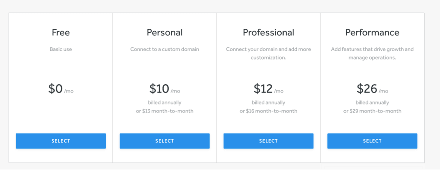
Here’s a breakdown of Weebly’s four plans and a rough overview of what you’ll get for your money:
| Plans | Price (per month, billed annually) | Price (per month, billed monthly) | Features |
|---|---|---|---|
| Free | $0 | $0 | ●500MB storage ●Sell unlimited physical items online ●Inventory management ●Free SSL ●SEO tools ●Lead capture ●Instagram feed ● Chat and email support |
| Personal | $10 | $13 | Free features plus: ●Connect custom domain ●Sell digital goods ●Shipping calculator ●Shipping labels ● Pop-ups |
| Professional | $12 | $16 | Free and Personal features plus: ●Unlimited storage ●Advanced site stats ●Remove Square Ads ●Free domain ●Password protection ● Phone support |
| Performance | $26 | $29 | All other plan features plus: ●Accept payments through PayPal ●Item reviews ●Abandoned cart emails ●Advanced ecommerce insights |
The bad news, however, is that although Weebly is cheap, it’s not necessarily good value for money. The free plan is a great option for small websites or businesses that are just starting out, but as you climb through the tiers, the features that Weebly offers are lacking in comparison to its competitors.
For example, Wix and Squarespace both offer built-in booking systems, whereas, with Weebly, you’ll need to rely on third-party apps, many of which come with a cost of as much as $249 per month.
The exception to this rule is when it comes to selling. This is because Weebly allows you to sell even on its Free plan. Of course, there are some restrictions, such as not being able to sell digital products or get access to shipping labels on the Free plan, but even so, the option to sell for free is a major bonus for small businesses and makes setting up an online store very affordable.
However, before you get too excited, there’s another big reason why we don’t consider Weebly to be good value for money, and that reason is Square. Back in 2018, the payment processor Square purchased Weebly and added it to its website-building portfolio alongside Square Online. However, since this acquisition, Weebly’s development has stagnated, and hasn’t released any new tools or features in the past six years.
This is disappointing and means that while other website builders have soared ahead with innovations, Weebly has lagged behind. In short, it’s no longer responding to the needs of the online world, so those businesses with a Weebly website will struggle to do so, too.
In short, this means that, although your monthly payments might be less than if you’d chosen Wix or Squarespace, your website will struggle to match others in terms of what it can offer your customers.
More Information
If you want to take a closer look at Weebly’s pricing, I recommend reading our more in-depth Weebly Pricing Review.
Setup
Now we’ve got the money talk out the way, it’s time to get stuck into Weebly and test how it actually handles as a functional website builder.
You’ll be pleased to know that getting started with Weebly is super easy. Once you’ve clicked the “Sign Up” button on the homepage, you’ll be asked to answer a few questions such as your name, your email, and your location. You’ll also be asked to set a password.
Don’t panic if, instead of Weebly, you start seeing Square branding everywhere. You haven’t taken a wrong turn – this is just another side effect of Weebly being brought into the Square fold.
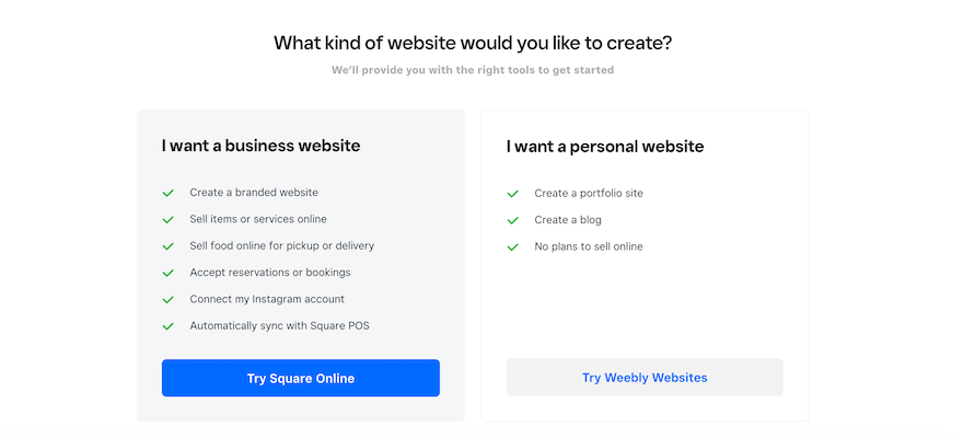
After this, Weebly will ask you what kind of website you want to create: a business website or a personal website. If you select “I want a business website”, you’ll be directed to Square Online. This is very misleading, though, because you can still build a business website with Weebly.
Ultimately, Square wants more people to choose its primary platform, Square Online, which is why it makes it seem as though this is the best option for businesses. In reality, you can still sell and run a business on Weebly. Because I wanted to test what Weebly could do, I went ahead and selected “I want a personal website”.
Unfortunately, Weebly doesn’t offer an AI site builder option like other popular website builders. This is disappointing because AI has become such a core part of website-building in the last year or so. Sadly, this is just another example where a lack of new and innovative features means that Weebly is being left behind its competitors. If you do want to use an AI builder, we’d recommend checking out Wix, Squarespace, or Hostinger.
After selecting Weebly, I was then directed to a page where I could choose my template – I’ll review Weebly’s design options later on. Once I’d chosen my theme, Weebly automatically took me into the editor.
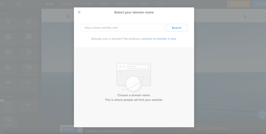
Immediately, I was greeted with a popup inviting me to connect my custom domain. I really like how upfront this is and it saved me loads of time having to search through all Weebly’s tools to figure out how to do this.
If you don’t want to connect your domain immediately, you can shut this popup down. However, be warned – it’ll keep appearing. This is slightly annoying, especially if you have no plans to attach a custom domain or you just want to get creating.
The Editor
If you’re a fan of simple and straightforward, the Weebly editor will tick your boxes. Website editing tools are located down the left-hand side, with a separate menu running along the top and giving you access to your pages, themes, apps, and settings.
Everything is very clearly signposted, with the “dark mode” appearance making it easy to see how it’s all organized.
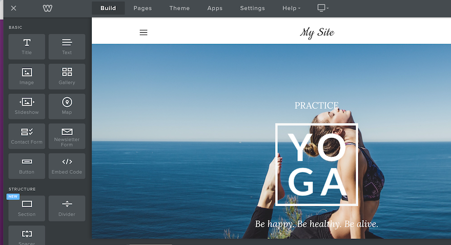
Like most popular website builders, Weebly uses a drag-and-drop format. This means you can select any element on your website page and drag it. However, where some website builders like Wix allow you to drag elements wherever you want, Weebly works within a rigid row structure. This means that you’re restricted by the boundaries of the row you’re working in.
This has its positives. Firstly, it stops your site from looking too overcrowded and messy. It also means that you’ll never accidentally drag an element somewhere that it won’t be seen when your site is live. However, for those of you who like full creative control, this lack of flexibility is incredibly frustrating.
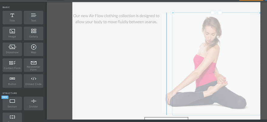
Overall, the Weebly editor is very pared back. Editing text is as simple as clicking the textbox and typing your personalized copy. You can also add a new element by selecting it in the left-hand menu and dragging it onto your webpage. But that’s as exciting as it gets. “Basic” is the keyword here, and for those of you who don’t want anything too complicated, Weebly will be a dream.
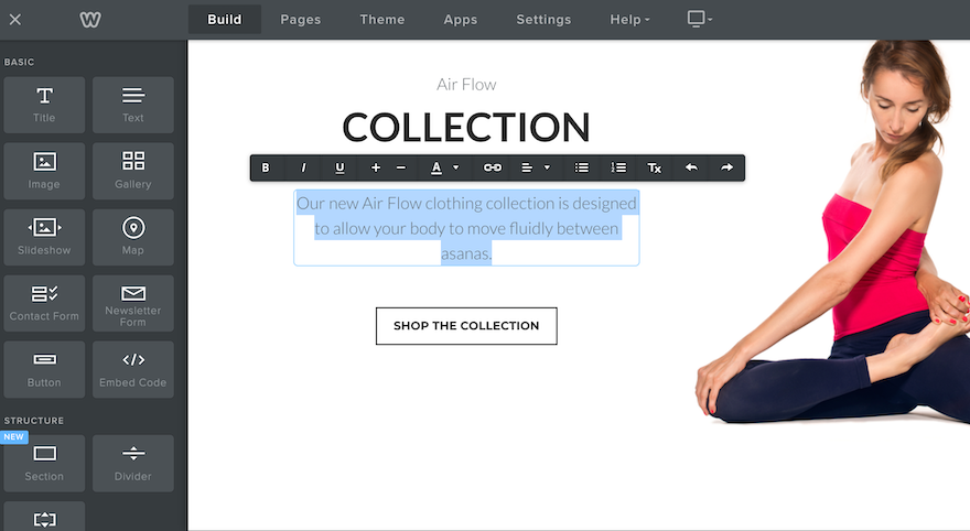
However, if you want a little more from your website builder, Weebly’s editing capabilities are disappointing. In my opinion, its simplicity is its downfall, and ultimately, it makes it very difficult to ever create a site that’s truly unique.
Templates and Design
Given the simplicity of Weebly’s editor and design capabilities, surely its themes must be visually stunning and not need much editing to make them stand out, right? Unfortunately, this is not the case.
Weebly’s templates aren’t awful. In fact, they’re all pretty neat and tidy, with plenty of white space and clean lines. They’re just a bit boring. There’s nothing in them that really wowed me. In fact, when I was choosing my theme, not one of them jumped out at me as a template I was eager to use for my website.
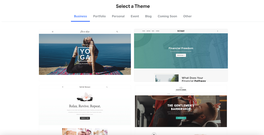
Perhaps part of my frustration is down to the fact that, like its tools and features, Weebly’s themes have remained largely the same for the last few years. They feel outdated and that’s because they are.
This might not be so glaringly obvious if there were more choices, but given that there are only around 50 to choose from (compared to, say, Wix’s 800 options), there isn’t anywhere for Weebly to hide. And unlike Squarespace, which justifies its small number of templates with exceptional design, Weebly’s efforts fall flat.
This disappointment only increases once you get your chosen template into the editor. Like its rigid row structure, Weebly is frustratingly restrictive when it comes to color schemes, and it only gives you two options: light mode and dark mode. This means that it makes it almost impossible for you to impose any kind of carefully chosen brand colors on your design.

In addition to this, Weebly performs poorly when it comes to mobile-first design. I was unable to edit my mobile view because Weebly claims that all of its themes are already engineered to be mobile-responsive. Even if this were the case, I found this slightly irritating because it’s yet another restriction which, although designed to make my life easier, stopped me from putting my stamp on my design.
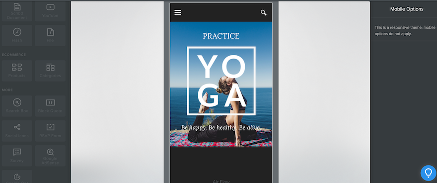
However, the real frustration comes from the fact that Weebly’s original claim of mobile responsiveness simply isn’t true. Often, loading times are slow and mobile formatting is inconsistent. This is incredibly disappointing given that 92.3% of the global digital population access the internet from a mobile device
Of course, it isn’t all bad. Weebly does have some positives. For example, you can switch themes anytime and you won’t need to reformat your site when you do. This is more than you’ll get with website builders like Wix, which doesn’t allow you to switch once your website is live.
In addition to this, all of Weebly’s themes are free, so you won’t need to dish out any more cash when you choose one. This is a good thing, really, because I’m not sure that Weebly’s templates have the necessary shine to convince me to part with any extra dollars.
Selling Online
While Weebly disappoints when it comes to design, selling online is one area where I have few complaints.
This is largely because Weebly lets users on all plans sell for free. This is extremely rare in the website-building world, with top builders like Wix and Squarespace charging between $23 and $29 per month before you can take any payments.
Square’s acquisition of Weebly also means that its ecommerce tools are pretty substantial. Users can add a store in the editor, by selecting the “Pages” tab at the top and then clicking the “+” button.
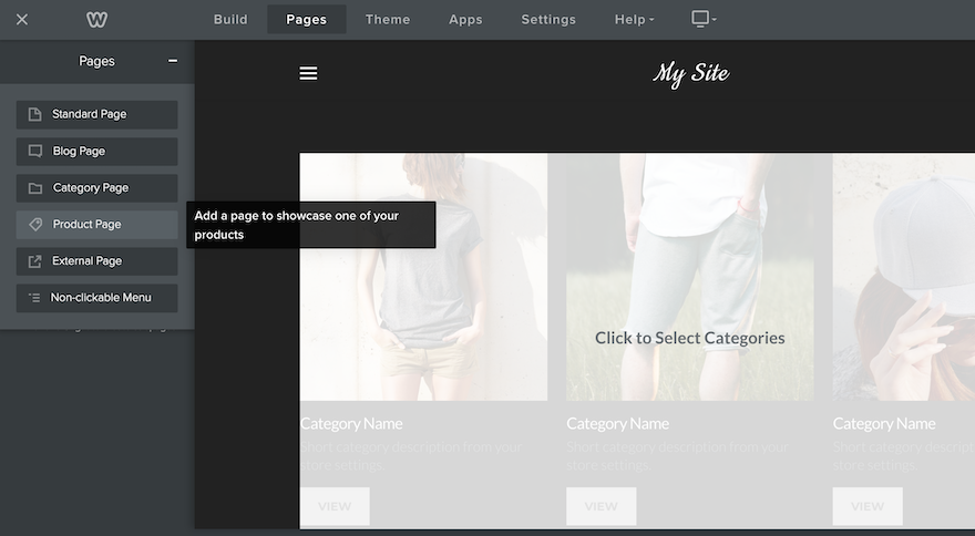
Adding a product is just as easy as adding a store page. However, you’ll need to navigate away from the editor and head to the dashboard, using the “X” in the top-left corner. Once here, I was pleased that I didn’t have to do much searching to find what I was looking for. The “Items” tab was easy to find in the menu.
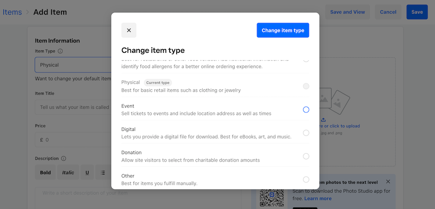
I was able to add a product by selecting “Site Items” and then “Create new item”. I was then directed to a page where I could add all my product details as well as item variations and pictures. I could also set my fulfillment method, choosing between shipping and pick-up – something that’s useful for businesses serving a local area.
At the top of the page, I was also able to change the product type and I was pleasantly surprised that there were a variety of types to choose from. I’d expected the choice to be limited to “Physical” or “Digital”, but instead I could select “Prepared food and beverage”, “Event”, “Donation”, or “Other”. This adds extra versatility to Weebly’s ecommerce offering and gives businesses more flexibility with their products.
Unlike builders such as Wix and Squarespace, Weebly doesn’t have a separate inventory management tool. Instead, its “Item List” serves this purpose, showing you your stock levels on the far right. This does make Weebly’s inventory management seem less advanced than some of its competitors, however, for smaller online stores, this isn’t too much of an issue.
When you add your products, don’t forget to tick the box next to “Track stock on this item” in the “Additional Information” section – this means your stock levels will appear in your item list which is super important for inventory management.
Overall, I like Weebly’s ecommerce features, however, there is one area that I feel falls short, and that’s its limited number of payment options. Weebly only offers three payment processors – Square, Stripe, and PayPal. For a platform that’s owned by such a big ecommerce player, I’d expected there to be more, especially considering that you can only use PayPal on the most expensive plan.
If you choose to use Stripe, you’ll be able to accept payments through Google, Apple, and Android Pay.
It’s not immediately clear where you can manage your payment options, but after a little searching, I found them tucked away in the “Settings” tab at the bottom, hidden in the “Checkout” section.
No matter which payment option you choose, there’s a processing fee attached, even for Square’s native Square Payments. And where other platforms like Wix will waive the transaction fee if you choose to use its payment option, Square doesn’t do this either, and you’ll need to pay up to 2.5% per transaction.
Here are the processing fees you can expect to pay on Weebly:
| Payment Processor | Processing Fee |
|---|---|
| Square | 2.5% |
| Stripe | 1.4% - 2.9% + £0.20 |
| PayPal | 1.9% - 2.9% + £0.30 |
When considering whether Weebly is right for you, it’s worth bearing these processing fees in mind. Although this website builder does allow you to sell for free, you’ll have to account for the processing fees that will dig into your profits with each purchase. This will be particularly damaging for small stores, or stores that sell large-ticket items and will therefore have to pay a proportionally higher charge.
Although Weebly is a good option for small online stores, we recommend choosing its sister platform Square Online instead. Not only is Square Online specifically designed to support online stores, but it also benefits from being Square’s preferred platform, and as a result, it receives all of the updates and innovations that Weebly doesn’t.
Marketing and Scalability
Once your website is built, the work doesn’t stop there. Building an online brand requires good marketing if it’s going to be successful, so choosing a website with tools that can support this is vital. So is Weebly up to the task?
Email Marketing
The answer depends on how big you want your website to be. Smaller sites and businesses will be satisfied with Weebly’s marketing efforts, much of which centers around its email marketing service, Weebly Promote.
Weebly offers a small number of pre-made templates as well as a blank canvas for you to create your own. The email editor is similar in layout to the website editor, so I didn’t experience too much of a learning curve when jumping from one to the other.
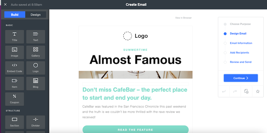
However, Weebly Promote comes with some limitations. Those on the Free plan can use it, but will only be able to send two email campaigns ever. If you want to use it consistently, you’ll need to subscribe to one of its paid Promote plans, which start at $8 per month.
SEO
One of the biggest parts of marketing is SEO, and any website builder worth its salt will offer SEO tools to help boost your site up the rankings. Weebly is no different.
Although a little difficult to find – head to the “Settings” tab in the website editor – Weebly covers all the SEO basics. I was able to set my site description, as well as specify keywords. There’s also an option to input custom header and footer code, as well as a section for managing 301 redirects.
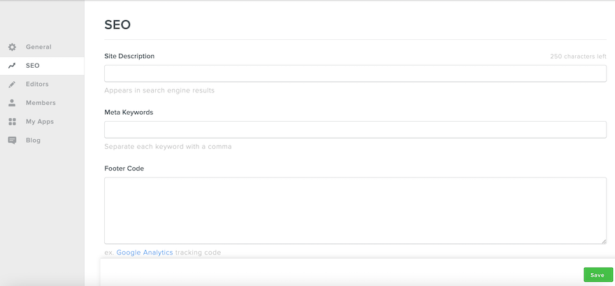
But that’s it. There isn’t any SEO support such as checklists or guides like its competitors Wix and Squarespace offer, and if you want to do anything more advanced such as adding canonical tags or amending your URL strings, you’ll need to either use an external app or have coding knowledge.
This means that although Weebly simplifies generic SEO for beginners, any inexperience will start to cause issues once you want to step things up a notch. Given that SEO is a huge part of growing and building your website, I found this disappointing.
Social Media
Another area that I found lacking is Weebly’s social media. Although users can add their Instagram, this is the extent of what the builder offers. This feature isn’t even built-in. Rather, you’ll need to use a third-party app. Other than this, users can add a line of basic social icons.
This oversight puts Weebly at a severe disadvantage when compared to other builders. Social media strategies form a huge part of many businesses’ growth plans, which is why platforms like Wix and Squarespace allow users to create and manage social posts all from their dashboards.
Weebly is nowhere near offering something like this, once again highlighting how its lack of new and innovative features is harming its standing in the website-building world.
App Market
The only bright side is that Weebly does have a good App Center which is full of third-party apps to help you fill the many gaps that Weebly’s offering leaves.
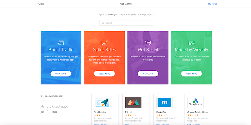
One thing to bear in mind, though, is that not all of the apps on Weebly’s App Center are free. In fact, some of them can cost as much as $300 per month if you opt for the premium subscription plans.
Because Weebly’s built-in features aren’t as impressive as they should be, this could mean that your monthly bill might end up spiraling pretty quickly. Costs can rack up, and before you know it, your cost-effective website builder is draining your savings.
Scalability
So what does all of this mean for Weebly’s scalability? Well, the news isn’t good.
Weebly has everything a small website could need to keep things ticking over. It’s ideal for anyone with an in-person business who’s looking to establish a digital presence. But if you’re looking to grow and turn your small startup into a high-level enterprise? Weebly just doesn’t have the muscle to support you.
Plus, given that Weebly hasn’t responded to the demands of the market or made any substantial improvements in recent years, I’m not convinced that this builder is a smart choice to grow with. Your website will end up getting stuck – just as outdated as Weebly’s feature offering.
Customer Support
All customers can get in touch with Weebly 24/7 by email or through a Support Assistant on the website. Those on the Professional or Performance plans can take advantage of phone support, too, although the phone lines are only open between 6 AM and 6 PM (US Pacific Time). If you’re on the Performance plan, you’ll also benefit from priority support, too.
I tested the AI Support Assistant on Weebly’s site and was very disappointed with the experience. When I asked it how to add Instagram to my website, it didn’t understand my query, no matter how slowly I typed or how many different ways I phrased it.
I then tried selecting one of the preset options around adding content to my site, at which point the bot led me through a lengthy explanation about how to add texts and pictures to my website. Helpful, but not relevant to my query.
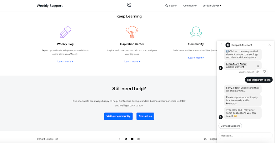
Exasperated with going around in circles, I selected “Contact Support” in the hopes that I would be directed to a live agent who could help with my problem. Instead, I was sent to the email page and invited to send an email. Not only does this process take much longer than it should, I still didn’t have an answer at the end.
This whole experience was very frustrating, and I was only submitting a test query. I can imagine that it would be highly inconvenient for users who are experiencing real website problems and need a solution fast.
The only upside to Weebly’s support is its Knowledge Base. When contacting support fails, this massive database of help articles is likely to have an answer for you. Unfortunately, though, it still couldn’t answer my query about how to add Instagram to my website!
Weebly Website Builder Review: Summary
In this review, I’ve covered all the key aspects of the Weebly site builder to help you decide whether it’s the right website creator for you. And the final verdict? I wouldn’t recommend it.
Although Weebly does have its pros, there aren’t many. Its designs are outdated and its customization potential is severely limited. To add to that, it isn’t mobile responsive, and its marketing tools are lacking.
The only points in Weebly’s favor are its incredibly cheap prices and its ecommerce offering. Being able to sell for free is a massive perk, particularly for businesses that are at the beginning of their journey. However, I would warn you – scaling with Weebly isn’t easy and you may find yourself outgrowing the platform before long.
The biggest rub with this website builder is that, compared to its competitors, it’s stagnated. The lack of new improvements has left it stuck in the past, unable to meet the demands of today’s digital landscape.
For small websites and businesses who want nothing more than to establish a digital footprint, Weebly is easy to use and it’ll tick off the basics with no problems. Just don’t expect too much from it because it’s sure to disappoint. If you want a website builder that has the muscle to really take your website places, we’d recommend either Wix or Squarespace instead.
447 comments