12 Essential Steps to Create Your Dream Wedding Website
If you click to purchase a product or service based on our independent recommendations and impartial reviews, we may receive a commission. Learn more
The big day is looming, and there’s so much left to do! Between choosing color schemes, tasting cakes, and poring over guest lists, you’ll probably want to spend any precious free time relaxing with your feet up – rather than, say, building a website.
In reality, building your very own wedding website is the perfect way of keeping your guests up to date, sharing information with everyone in one go, and staying organized. It puts everything in one place, makes your life easier, and is a fun way of documenting your special day.
Luckily, creating a wedding website is totally something you can do with your feet up at the end of the day – it’s super easy, and we’re here to walk you through each step. You don’t need tech skills or a ton of time, especially if you use a website builder, so if you’re wondering how to get started, you’re in luck – with our step-by-step guide, you’ll have your wedding website live in no time!
1. Determine the Purpose and Goals of Your Wedding Website
First things first you need to decide the purpose of your wedding website and ask yourself why do I want to create a wedding website?
Identify the key information you want to include. For example, is your website there to give guests information about the wedding and ceremony? Perhaps you want to use it to tell your guests more about you as a couple? Or you could even use it to list your wedding registry.
Whatever it is, ensure you’re clear on both the information you want to include on your website and the overall goal of your wedding website. Your goals could be anything from collecting RSVPs from your guests to providing practical information for the day itself.
Top tip! When you tell people about your wedding website, make sure you make it clear what the goal is. Some people may not have visited a wedding website before so make sure you provide clear and simple instructions e.g. please use our wedding website to send us your RSVP.
2. Choose a Website Builder
Instead of having to rely on a web designer or give yourself headaches over code, you can use a website builder to create your wedding website. This is a quick and easy way of making a website – and better still, many builders come with free plans and trials.
There are hundreds of website builders out there, making it hard to know which one to choose. Luckily, this is our area of expertise – we’ve tested over 50 website builders, so we’re in an ideal position to recommend the best of the best!
3 Best Wedding Website Builders
- Wix – combines ease of use with creative freedom
- Squarespace – best designs on the market
- The Knot – specialized wedding website builder
Wix is our top choice because it’s super easy to use, and comes with a huge amount of creative freedom – meaning you can create a wedding website that’s totally unique. Squarespace has the best designs on the market, making it perfect for sharing photos and videos, while The Knot is a specialized wedding website builder that doubles as an online wedding planner.

While Wix and Squarespace aren’t wedding-specific website builders, their designs are much more sophisticated and professional-looking than The Knot’s. However, The Knot comes with more wedding-focused features, such as registry integrations.
Both Wix and The Knot are totally free, although Wix also has premium plans if you want a more professional website. Squarespace has a 14-day free trial, after which it costs $16 per month.
Whether you want a beautiful site, a practical one, creative freedom, or basic control, your website builder should provide the things most important to you.
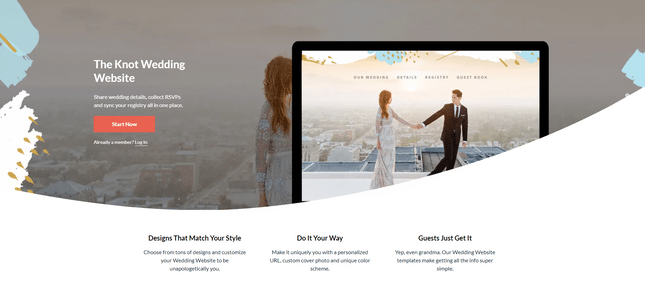
We recommend Wix if you want freedom and flexibility, Squarespace for classy and elegant designs that show off photos and videos, and The Knot for a more practical, guided approach to creating a wedding website.
You can try them all for free, which we definitely recommend before choosing!
- Tested out a few website builders
- Picked the one that best suits your needs
- Created an account so you can begin building
Further Information
- Compare the Best Wedding Website Builders in our thorough review
3. Pick a Unique Domain Name
Once you’ve chosen your website builder, you need to pick a unique domain name. This is the name of your site that appears in the web address – for example, ours is websitebuilderexpert.com.
When you choose a free plan, you get a domain that contains the website builder’s branding. So you could have a website address that looks like this: www.stacy.wixsite.com/stacyandjohnswedding – as you can see, it’s not very memorable, catchy, or professional-looking!
If you want a website address that’s totally unique, you’ll need to get a custom domain, which costs a bit extra. You can buy your domain directly from your website builder, or through a third-party registrar such as GoDaddy.
Prices for domains vary from builder to builder. For example, both Wix and Squarespace provide a free domain for your first year (after which domain prices range from $14.99 to $20 per year). That said, you likely won’t need your domain for the long-term, so don’t worry too much about renewal costs.
Domains are unique, meaning you can’t have the same one as anyone else. You want your domain to be simple, straightforward, and reflective of your website. Here are some helpful tips on creating your perfect domain name:
- Make it short and memorable
- Keep it relevant
- Avoid numbers and punctuation
- Be personal
Simply using a combination of both your names is a great idea, but you might find this domain has already been taken – if so, you’ll need to get more creative!
- Decided if you want to pay for a custom domain for your website, or if you’d rather stay on the free plan
- Come up with ideas for your personalized domain
- Searched to see if your domain is available
- Purchased your domain
Further Information
- Do you want to learn more about domains? Read our What Is a Domain Name? Beginner’s Guide for a full explanation of domain names.
4. Choose and Personalize a Template
Now for the fun part – you get to choose the design of your wedding website!
Website builders provide you with templates that you can edit to make them unique. This saves you time and effort, because it means you don’t have to start from scratch – instead, simply pick a template you love, then customize it until you’re happy.
You should choose an event website template that reflects your relationship, as well as the vibe of your wedding. Guests should be able to understand straight away what to expect from your big day – for example, a relaxed, rustic wedding will suit a very different design to a suave, classic event.
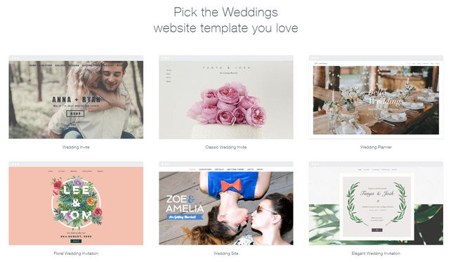
Browse and preview your builder’s designs to find the perfect one. Here’s an example from Wix of the sort of wedding website templates you’ll be choosing from:
Squarespace has a smaller, but truly stunning selection of only six wedding specific templates, while The Knot has a huge range of 39 designs – although they’re nowhere near as stylish!
Once you’ve chosen your template, you can customize it to make it unique. Here are some ways you can personalize your template:
- Use the same color scheme you’ve picked out for your wedding
- Add photos of yourself and your partner, your families, bridesmaids, and groomsmen
- If you’ve chosen a particular font for your invitations, see if you can use the same or a similar font on your site
Some builders allow more customization than others, so it’s a good idea to find a template that matches your style – you’ll find it much easier to tweak it to your liking, rather than trying to totally redesign the whole template.
- Browsed the templates provided by your website builder
- Picked a design that reflects the tone of your wedding
- Personalized the style by adding images, and changing the font and color scheme
5. Add the Important Details
Now that you’ve got your design and your site is starting to look fabulous, it’s time to get all the nitty gritty details down.
If you’re still in the very early stages of planning, your site can act as a “save the date” – be sure to include you and your partner’s names, the location, and the date, and be clear that more important information will be shared soon. This lets guests know they’re not missing out on important details (such as the dress code or exact time of the ceremony).
If you’ve already sent out save the dates and invitations, and have a clearer plan for your wedding, you can have more fun with displaying all of this on your site. Add new pages, text boxes, images, maps, and more to give your guests a helping hand. Here are a few things you can include:
Your Story
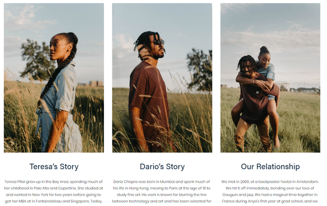
You can add an “About Us” page telling the short-but-sweet version of your relationship, along with your favorite photos.
Who’s Who
Some couples add a page with photos and very short introductions for bridesmaids, groomsmen, parents, siblings, and other “top table” figures. This can help people coming to the wedding be clear on who’s who!
Finer Details
Time, date, location, dress code, a full schedule of the day (or weekend), a copy of the menu, and a list of events happening around the wedding – these are all things that will help your guests out by knowing in advance.
Only list events you want everyone to come to, however – if you’re having private gatherings (such as a bachelorette party or groom’s brunch), it’s best to keep those private to avoid confusion, unwanted guests, or ruffled feathers.
Location, Location, Location
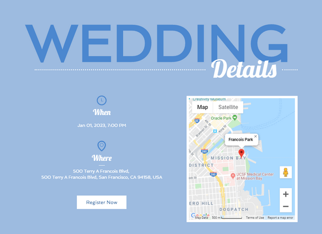
Be very clear about the location of the venue, including instructions for drivers and those taking public transport. You should also include directions to the hotel, or local accommodation recommendations (with links to relevant booking sites) if guests are booking their own stays.
Another nice touch is to add restaurant recommendations, plus a list of things to do in the area. It’s also a good idea to add a Google map to your site to help people find their way!
FAQs
If you’ve already been fielding question after question from your Great Aunt Tessie about this and that, put them to good use by creating an “FAQs” section for your site. Here, you can list common questions people might want to know the answer to – remember, they might be too shy to ask!
Make sure to put down a couple of contact details that people can use if they have any issues or pressing questions. This doesn’t have to be your number or email – it could be a best man, maid of honor, parent, or friend who steps up to answer queries.
Incorporate a Guestbook
Guestbooks are a great memento from your special day but sometimes your guests are having too much of a good time at your wedding to remember to sign them. Adding a guestbook to your website, therefore, allows all your guests to have the chance to write you a message, even if they forget on the day. Encourage guests to visit your website after the wedding to sign your guest book.
Include a Gallery of Engagement Photos
If you have special photos from your engagement, include them on your wedding website! A section about your engagement including photos from the moment itself is the perfect way to include your guests in your love story.
Make sure your photos are high-quality and be clear with your guests about how you do or don’t want your personal photos used… just in case Aunt Helen saves them and uploads them to her Facebook without your permission!
Add a Countdown Timer
Of course you are counting down to your wedding day but why not get your guests involved too? Include a countdown timer on your wedding website that counts down to the big day. Not only will this help to drum up excitement with your guests, but it will also act as a reminder that the day is fast approaching and ensure everyone is organized and prepared.
- Added all the important information your guests need to know
- Included extras such as maps, links, galleries, booking forms, contact details, etc.
6. Include an RSVP Form
This is totally optional – you can still go for the traditional method of sending out invitations with RSVP slips. In fact, this is definitely something to consider if you have a lot of older family members, who may struggle to access your wedding website without help. After all, you don’t want anyone missing out!
However, inserting an RSVP form into your website is a super easy way for you to sit back, relax, and manage your guest list, with a cup of coffee in one hand and your website at the other’s fingertips.
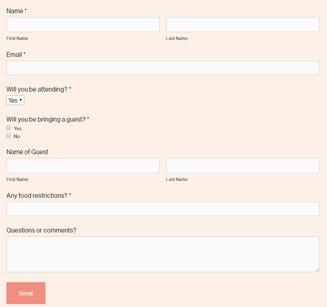
Staying on top of who’s coming, who’s cancelled, and who’s bringing a plus one can get pretty complicated pretty fast. But automating RSVPs takes a lot of the work out of your hands, saving you time and effort. You just need to be careful that everybody treats it with the same respect and commitment as a traditional wedding invitation.
If you don’t want to use online RSVPs for your big day, you can still use them for other wedding events such as brunches, dinners, shopping days, and parties, where there’s less pressure on numbers.
- Decided if you want to use online RSVPs for your wedding day
- Sent out RSVPs to select people for more casual wedding events
7. Include a Gift Registry
You shouldn’t include registry information on any invitations you send out, as it’s considered bad etiquette – so how are you meant to show people where to buy gifts if they want to? Calling everybody up would be both time consuming and incredibly awkward.
Luckily, your wedding website is the ideal place to point people towards the perfect presents. Let guests know where you’ve registered for gifts, and lend an extra helping hand by including links to the relevant websites.

You might be accepting donations instead of gifts, in which case you can easily add a PayPal donation button for people to use. This offers a more secure way of gifting money than putting cash in an envelope to bring on the day.
A nice touch is to include a short description of what the money will go towards – the honeymoon? A new house? Starting a business together? Travelling? Donating to charity? Letting people know these details helps them feel as though you really value their contribution towards your life together with your partner.
- Decided whether to register for gifts or accept donations
- Listed your gift registry on your site
- Included links to the relevant gift sites
- Set up a PayPal or other donation button to accept monetary gifts
8. Make Your Site Exclusive
Wedding crashing is something that turns up a lot in popular culture, from films to TV soaps and pop ballads. However, nobody wants the nightmare of having uninvited guests turning up to their special day in real life!
That’s why it’s important to make your website available only to your guests. You can do this in two main ways. The first is in your website’s settings, where you can block your site from turning up in search engine results such as Google.
The second way is to password protect your website, and send the password only to your guests. If you’re organized, you can set up your website first, then include the web address and password on your save the date cards or invitations.
Combining both these strategies is the safest way of protecting your wedding website from unwanted eyes.
- Password protected your website
- Blocked your site from appearing in search engine results
Further Information
- Check out our guide on How to Create a Membership Website for tips on making exclusive content
9. Make It Part of Your Big Day
Creating a wedding website isn’t just about the run-up to the main event – it can be part of it, too. Get inventive with the ways you can use your website to interact with guests and add an extra something to your special day. Here’s a few ideas to use as inspiration…
Add a Social Stream
If your website builder has an app store, take a look to see if you can install a social streaming app (such as Social Media Stream in Wix’s App Center).
This lets you and guests share photos and videos directly to your site by using a specific hashtag. The app gathers all the media shared and displays it on your website for all your guests to see!
Share Photos and Videos
One of the most exciting parts of post-wedding life is getting your photos back from your photographer. And it’s not just you who can’t wait to look through the pictures – your guests are also impatiently waiting to flick through all the snaps and relive their favorite moments.
A great way to share these memories is to upload them onto your website. Create an online photo album or gallery so that nobody misses out. This way, they’re up there for everyone to see, and it’s much easier than making copies or sitting down and going through the photos every time someone new wants to see them.
This is also a perfect opportunity to share moments most guests won’t have seen, such as the couple getting ready behind the scenes, or how the venue looked before everyone started arriving.
Display Mementos
Some weddings might involve competitions, games, activities, and more to engage guests and add an interactive element to the day. Your wedding website is the ideal place to show off any highlights – whether it’s drawings, polaroids, or quotes from the day that you want to share and for guests to look back on.
10. Optimize Your Wedding Website for Mobile Devices
Chances are, many of your guests will be accessing your wedding website on a mobile device, therefore you need to make sure it’s fully optimized for mobile visitors.
There are various ways you can make sure your wedding website is mobile-friendly including:
- Choose a responsive template or theme that will automatically adjust to fit the screen size that it is being viewed on. This ensures all of your content will display properly on desktop, tablet, and smartphone devices.
- Keep your navigation simple to make it easier to use on mobile.
- Use “touch-friendly” features such as clickable buttons and swipe galleries and avoid things such as pop-ups which can ruin the mobile experience.
- If you’re including an RSVP form make sure it’s easy to fill out on a smartphone. Don’t ask for too much information!
- Incorporate mobile-specific features such as QR codes that guests can scan for more information or location features that include interactive maps.
Q&A
What made you build a wedding website?
What did you like about using a website builder?
11. Review and Test Your Wedding Website
Just like your big day, you want your wedding website to be perfect. Before you send it out to guests, therefore, you need to check everything is as it should be.
Proofread all of the text to ensure there are no spelling or grammar errors and check that all your links and forms are working correctly.
If you have any interactive elements on your website such as a video, test them out to make sure they function as they should.
You should also make sure your website loads quickly. Although you aren’t trying to attract customers or clients like most websites, you still want to provide your guests with the best experience possible.
Optimize features such as images and files to make sure they are as small and fast-loading as possible.
Further Information
- Learn how to optimize images in our Image Optimization Guide!
12. Share Your Wedding Website
Now that you’ve made your wedding website, it’s time to share it with your guests!
The best way to make your guests aware of your wedding website is to include it in their wedding invitations. Include a link to your website or even use a bespoke QR code that guests can scan to take them straight to your website.
Many couples now also use a bespoke wedding hashtag for guests to share their photos from the big day online such as #JessAndSteveWedding or #HereComeTheMillers. If you want to use a special hashtag be sure to include this on both your invite and your wedding website.
How to Create a Wedding Website: Summary
From picking your perfect website builder to styling your design, this article has walked you through each stage of how to make a wedding website – and hopefully made you realise that it’s not as hard as you first thought.
In fact, it’s easy – and should make your life much easier while you plan and prep for your wedding. It’s a great way to keep your guests in the loop without racking up your phone bill, too!
We’ll quickly recap each step to help you get started with your own wedding website.
How to Make a Wedding Website – 12 Simple Steps
- Determine the Purpose and Goals of Your Wedding Website
- Choose a Website Builder
- Pick a Unique Domain Name
- Choose and Personalize a Template
- Add the Important Details
- Include an RSVP Form
- Include a Gift Registry
- Make Your Site Exclusive
- Make It Part of Your Big Day
- Optimize Your Wedding Website for Mobile Devices
- Review and Test Your Wedding Website
- Share Your Wedding Website
The first thing to do is start trying out a few different website builders – some are better than others, so be careful about which one you choose.
If your main reason for creating a wedding website is to display your photos and videos, you won’t find a better builder than Squarespace. If you’re after something a bit more specific, The Knot is perfect – it helps you properly plan your wedding, but is much more limited in terms of design.
Overall, though, our top choice is Wix – it combines powerful features with total creative flexibility, and is super easy to use. It has a large range of wedding specific templates which you can customize to your heart’s content, and has a free plan so you can save while you build.
We hope you enjoy building your wedding website, and use it to help celebrate your special day – if this guide has helped you get started, come back and share your stories with us!


2 comments