How to Create a Photography Website: 11 Simple Steps
If you click to purchase a product or service based on our independent recommendations and impartial reviews, we may receive a commission. Learn more
If you’re a photographer looking to succeed in today’s digital age, you’re going to need to build a website. Whether you’re looking for new clients, a new job, or just to raise your profile, a portfolio website is the number one tool at your disposal – this is where photography website builders come in.
But hey, you already know that, which is why you’re here. And the good news is, it’s literally never been easier to create a photography website you can be proud of – and you don’t need any technical skills to nail it, either.
How to create a photography website in 11 simple steps:
- Set a clear goal for your website.
- Choose the right website builder.
- Pick a plan.
- Find a template you love.
- Add your photos and content.
- Install apps.
- Optimize Your Site for SEO.
- Add Contact and Booking Information.
- Add Social Media Integration.
- Implement Security Measures
- Review and publish.
We’ll walk you through each of these steps in detail, with screenshots along the way to help you out.
Ready to get started? Great – let’s get your gallery online!
#1. Set a Clear Goal for Your Photography Website
Before diving into building your photography website, it’s important to take a step back and consider your goals, and the main purpose of your site. This will influence which platform you pick to build your site, and how you go about designing it. For example:
- Are you an events photographer looking for new, local business? Pick a website builder with strong SEO (Search Engine Optimization) capabilities to help you get found in the Google search results.
- Are you looking to make money by selling your images online? Pick a website builder with good ecommerce functionality. If you want to sell the images as downloads, make sure the builder supports selling digital products (not all builders do).
- Are you on the hunt for a new job in the industry, and using this site as your portfolio? Make sure your written content – like an About Us page – can take center stage alongside your images. You might also want to add a CV section, and start a photography-based blog to show off your expertise.
- Do you just need a simple website to get you started and raise your profile? Pick a well-rounded builder (we’ll let you know our favorite in the next section), and start out on the cheapest plan.

- Identify a clear goal – or several goals – for your photography website. Even if you’re just starting out, this is a really important step for shaping the way your site will look.
#2. Choose a Website Builder
Website builders are online tools that anyone can use to get online. You select a template as the basis of your site, then drag and drop elements to where you want them to sit. You can create additional pages, as well as edit the ones that come with your chosen template. In short, if you’re comfortable using PowerPoint, you’ll be comfortable using a website builder.
To use a website builder, you pay an all-in subscription price, usually somewhere between $5 and $25 per month. Some builders actually offer plans that are completely free, but we’ll cover why they aren’t always the best idea a little later on.
Many people make the mistake of assuming website builders will be too limiting for their website. While it’s true that they’re not the best route for every type of site, for photography websites, they really are ideal. Here are just some of the things you can do with a website builder:
- Upload new content quickly, without needing to know how to code
- Connect an existing domain name, or pick a new one
- Integrate your social media
- Add a contact form
- Create a login area for clients
- Switch up how you display your images with ease
- Sell digital and physical products
Picking the right website builder is important – you need a platform that won’t cost the earth, and can scale with your ambitions. It all links back to the goal setting we covered in the last section.
We’ve carried out extensive research into the best website builders on the market, testing each platform’s ease of use, design flexibility, value for money, features, and more. We also get everyday people to test each builder and give us their feedback.
Of the 50+ website builders we’ve tested, these are the top three we’ve identified as the best for building photography websites:
- Squarespace
- Wix
- GoDaddy
Let’s take a closer look at each one:
1. Squarespace
Best overall website builder for showcasing photography
It’s no surprise that Squarespace, a true design leader, is the best website builder for professional-looking photography sites. It offers some of the most stylish templates around, with a curated selection of photography-specific options.
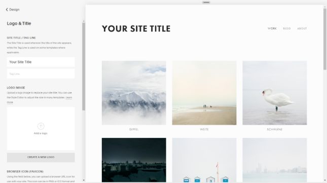
As website builders go, Squarespace is a pretty cool customer. Our only complaint is that the editing interface is in keeping with its trademark minimalist look – in other words, it’s not always obvious how to do stuff.
It takes a little getting used to, but once you do, you’ll find Squarespace a stylish platform with strong features for getting your work seen.
There’s no free plan, but there is a free two-week trial period. The premium plans start from just $16 per month, and also let you connect your own domain.
We spoke with Timo Nausch who built a website with Squarespace to showcase his photography:
Squarespace in Action: Timo Nausch
Q&A
How long have you been using Squarespace?
What do you like most about Squarespace?
In addition, hosting and domain allocation is also in the checkout process with Squarespace. For me at the time, it was more logical to build the website first and then decide on a domain / hosting. For someone who had never built a website before, this was much easier to understand than a CMS like WordPress that requires hosting first before I can even start building a website.
Squarespace, on the other hand, felt like building a website on training wheels, which meant I didn’t feel like I could do much wrong.
Is there anything you'd change about Squarespace?
An example: There is no possibility to insert simple tables, a template simply does not exist in Squarespace. A central plugin / add-on store is available mainly for ecommerce functions, but not nearly as sophisticated and versatile as WordPress plugins. Therefore you have to rely on third party developers and have no guarantee how good their templates are (for tables I haven’t found any good ones).
At some point I used ChatGPT to output tables as HTML code and inserted that. But this code was not always mobile optimized and as someone who had no coding experience, it was very cumbersome to generate meaningful code using ChatGPT.
I’ve had several hurdles like that over the years. Squarespace is also somewhat limiting for affiliate functions and doesn’t offer an easy option to integrate a sidebar, for example.
Would you recommend Squarespace?
But at the moment I’m building a new affiliate website in the area of dogs and pets and I’m using WordPress for that, because I simply have more functionality and options here. But the learning curve for WordPress is also steeper.
So it depends on what you want from the website, but for portfolios or small businesses Squarespace is a good option.
Click the + to see our favorite part of Timo's website

Full-screen background images are a perfect choice for a photography website. It’s a smooth way of showing off your skills while also creating an enjoyable user experience! We also love the simple navigation buttons, which make it really easy for visitors to find the right part of the site for their needs and interests.
2. Wix
Best for photographers who want an online store and a portfolio all in one
If ease of use is your main priority, then Wix really delivers. In fact, it was the website builder that our users were most likely to recommend after testing it.
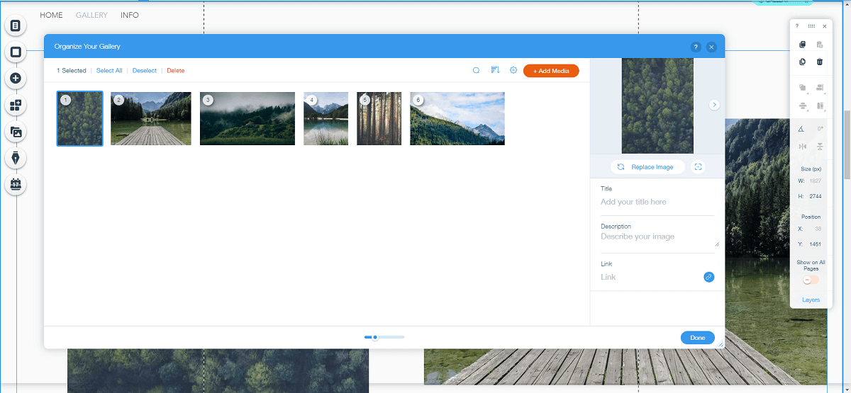
Wix’s templates may not have the same instant “wow factor” as Squarespace’s, but they actually offer more scope for customization – and there’s a lot more of them, too (over 800 altogether in fact). If you’re happy to spend some time experimenting, you can make something that’s truly unique and undeniably impressive.
Wix offers a completely free plan, or paid plans starting at $16 per month.
3. GoDaddy
Best for establishing a central online presence quickly
GoDaddy is the go-to for many photographers. The platform is super simple, making it quick and easy to create and update your website.
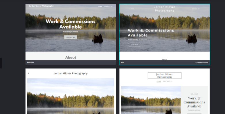
Busy photographers will appreciate how quick it is to build a website on the GoDaddy platform. But that doesn’t mean it isn’t packed with features that will help you create a stunning, highly functional site for engaging potential customers and perfectly representing your photography online.
GoDaddy offers a free plan, but for advanced functionality you’ll need to select a paid plan which range from $9.99 to $29.99 per month.
- Review each of the above platforms against your website goal(s)
- Decide which platform you’d like to try, and sign up – or better still, sign up to a couple and test them out!
More Information
- Squarespace Review: Learn more about our top choice of builders for photographers
- Wix Review: Find out why Wix performed so well in our testing
- GoDaddy Review: Discover how easy it is to create a website with GoDaddy
#3. Pick a Plan
When you sign up to a website builder, you’ll be asked to provide your name and email address, and to pick which plan to start on (although different website builders do this in a slightly different order). This is also the stage at which you’ll be asked to pick a domain name, i.e. your website’s unique address – ours, for example, is websitebuilderexpert.com.
Many builders (Wix included) offer a free plan. This is great for testing whether the builder is right for you, but we don’t recommend sticking with this free plan for very long; you’ll be stuck with the builder’s adverts on your site, and its name in your domain name. Wix’s free plan domain names are particularly unappealing, following the format username.wixsite.com/siteaddress. So ours would be hannah57707.wixsite.com/hannahsphotography – not the catchiest!

Even if you’re just starting out, there’s an element of ‘fake it till you make it’ – if your site looks professional, and you’re nailing that first impression, you’ll appear much more experienced.
The reverse is also true, of course. Forking out for at least the cheapest plan is, to our mind, the only option for any photographer.
- Compare the features of each plan offered by your chosen website builder
- Decide on the plan that best suits your needs. If you’re not sure, start out on a cheaper plan and upgrade later
#4. Find a Template You Love
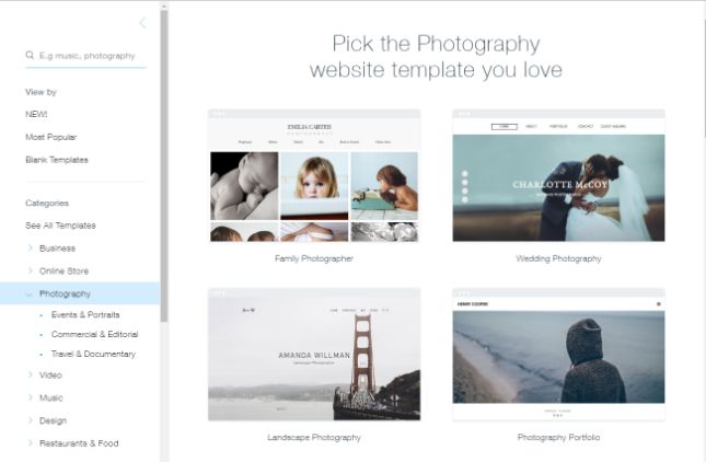
According to one study, Wix , GoDaddy all offer a wide range of beautiful templates to choose from, which are all categorized into different industries. Simply click on the ‘Photography/Portfolio’ category, and then pick the best template to suit your photographic ambitions.
Once you’ve chosen a template through your builder, you can personalize the text, background images, menus, and navigation bars. Customization works a little differently depending on which builder you choose:
Squarespace – you don’t have as much freedom when it comes to altering your chosen template’s appearance, unless you’re happy to go rooting around in the code. This is no bad thing, as it ensures you stick to best design practices.
Wix – you’ve got complete freedom to drag and drop your content anywhere. Indeed, you can quickly end up with something that bears no resemblance to your original template (which is why you can’t switch templates after publishing).
GoDaddy– using Artificial Design Intelligence (ADI) makes it easy to design your site. However, this is unlikely to be as unique and bespoke to your brand as site which is build on another plaform such as Squarespace.
- Demo several different photography/portfolio templates
- Test a few templates offered by your website builder to see which will best suit your content
- Experiment with customizing a couple of templates, before deciding on your final choice. Remember, if you use Wix, you won’t be able to switch template after publishing
#5. Add Your Photos and Content
Now you’ve picked a template, it’s time for the important stuff – adding your photos and content! You need to plan what you want, and where you want it. We’ll explain how to add content to each section of your website below.
Homepage
Home is where the art is. Aside from your actual portfolio, the homepage is the most important page on your website. You need to capture the imagination of visitors with just one page, so make it count!
Here are some considerations:
- Grid or hero image – do you want to display lots of images in a grid, or make a statement with just one?
- Color and font – what colors and style will work well with your imagery?
- Navigation – this is essentially your website’s menu, and how users will find the different sections of your site. Think about where on the page do you want this to sit. Across the top and down the left hand side are both pretty standard options, so doing something different will make a statement
- Social media integration – do you want to add buttons, an Instagram feed, or both?
Present Your Images
Your website should be a curated selection of the work you’re most proud of – often, that will be your most current stuff. Don’t give in to the temptation to upload everything you’ve ever worked on – it will make your site messy and hard to navigate.
When it comes to presenting your images, you’ve got a couple of different options:
- Use a gallery
Displaying images in a gallery format is a pretty standard approach. With an app like the Wix Pro Gallery, you can arrange your images as a grid or a slideshow, and visitors can ‘like’ photos directly on your site.
- Divide images by theme, project, or date
A slightly more understated presentation method is to divide your images up by project or theme (e.g ‘Portraits’ or ‘Movement’), and give each set its own page. This page is then linked to from your site’s homepage navigation.
About Page
Prospective clients want to know the eye behind the lens. The ‘About Me’ section allows you to add a splash of personality, and talk about your inspiration and experience. You should talk in the first person, and we’d strongly recommend adding a photo of yourself to give your portfolio a more personable feel.
Contact Page
51% of people think “thorough contact information” is the most important element missing from company websites. Make sure you create a dedicated ‘Contact’ page (included in your homepage navigation) so potential clients can get in touch with you. You can either add your contact details to this page, or add a contact form to allow people to submit their enquiries to one place, around the clock.
Online Store
If you want to make a few cents from your snaps, then you need an online store. On Wix, GoDaddy, this can be done by upgrading to a price plan which unlocks ecommerce functionality.
Blog
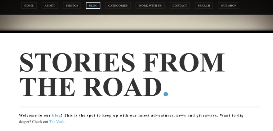
This is definitely optional, but something well worth considering. A blog can be a great accompaniment to a photography website – whether you use it as a way to share your photography tips and insights, or use it to tell the story behind your most recent projects.
But writing isn’t everyone’s cup of tea, and that’s fine – if it’s not something you feel comfortable doing, or you know you’ll struggle to keep it up-to-date, then it’s best left off.
- Decide on a format for your homepage
- Settle on a color and font that matches your content and personal brand
- Create an About Us page and a Contact page
- Add an online store to your site (if you plan to sell your images, either as downloadables or as prints)
- Consider creating a blog, and upload a couple of starter posts if this is something you’d like to try
#6. Install Apps
Apps can help bolster your website in areas such as marketing, finance, social media, shipping, and blogging.
For your photography website, we’d recommend integrating a social media feed application like Facebook or Twitter. This will link your website with your social channels, which can display your photos to a huge social media audience, directly from your website, in just a few clicks.
Active on Instagram? You can link your Instagram feed to your website, giving your visitors a sneak peek into your social media snaps.
Email marketing is another great feature you can access through an app. By setting up an effective email marketing campaign, you can reach out to existing and potential clients with ease, and share information on your latest gallery openings.
It’s worth noting that you’ll have to pay for some apps, although a fair number are free of charge.
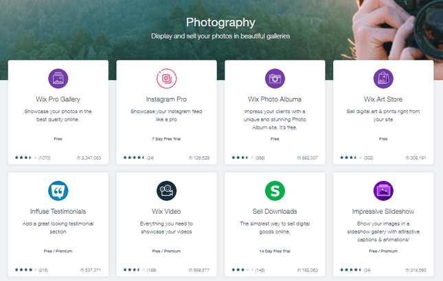
Both Wix and SmugMug have app markets, which you can browse and buy from just like you would your smartphone’s App store. Wix alone has over 250 apps on offer:
Here are some of our favorite free Wix apps for a photography site:
- Wix Forms – for contact enquiries
- Wix Art Store – to sell digital art and prints
- Instagram Feed – to add your Instagram feed to your homepage
- Spotify Player – add a complimentary soundtrack to each project
We also love the SmugMug Adobe Lightroom plugin, which lets you cut out the middleman, going straight from editing to publishing.
- Squarespace Scheduling is an online booking tool that you can use to schedule online or in-person viewings, and even set up video conferences with prospective buyers. You can sync this tool with an existing calendar on Google, iCloud, Outlook, and more.
- Printful is an extension that integrates with Squarespace to automatically print and ship any orders your store receives, under your own brand.
- Delighted is another extension that works with Squarespace to automatically send surveys to your customers after a purchase. You can get some really valuable insights about the buying experience this way!
- Find and explore your website builder’s app store or feature selection
- Experiment with adding a few different functions to your website, and decide on your final selection – you can always add more at a later date
#7. Optimize Your Site for SEO
You’ve now built your website. Hooray! But that’s only half the story; now people need to find it.
There are a number of ways you can get eyes on your website – and we don’t just mean telling your colleagues, friends, and family!
SEO (Search Engine Optimization) plays a huge role in getting your website noticed. SEO involves tweaking or “optimizing” your site to help Google ‘read’ it, improving your chance of featuring high on the results page.
Never worked with SEO before? Not to worry – we’ll show you some SEO basics on how to give your photography website greater exposure on Google with our top SEO tips and tools.
- Add alt text – Search engines can only ‘read’ your captions – they can’t see images! This means you need to add simple descriptions to each of your photos, using keywords if you can.
- Be mobile ready – Ensure your website is mobile friendly, so it reformats to look great on a smartphone screen (the website builders we mentioned have this feature built-in). Search engines prioritize mobile responsive websites on their results pages.
- Use keywords – Search for the top ‘keywords’ related to your type of photography using a search tool like Google Keyword Planner, then implement the words naturally into your copy, without overusing them. For example, if you’re a wedding photographer in Boston, use Google Keyword Planner to check people are searching for the term ‘wedding photographer Boston’, then incorporate this phrase into your site copy.
- Minimize image file size – Use a tool like kraken.io to compress your images, without compromising on quality. This will decrease your site load time, keeping customers and search engines happy. Check out our quick before and after compression below – the image on the right is 18.7% ‘smaller’ in terms of file size, and it took only a few seconds.


Image: @danielacuevas via Unsplash
Most builders also come with a ton of SEO advice, so don’t worry if all this sounds a little overwhelming.
Of our top three builders, Wix and Squarespace stand out as being particularly strong in this area. Wix has the Wix SEO Wiz resource on hand to offer you in-the-moment tips, as well as longer reading:
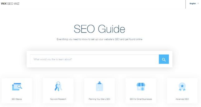
When it comes to SEO, Squarespace doesn’t have the same ‘hand holding’ approach, but it does have a really impressive array of important features for getting eyes on your site. Here are some of the things you can do with Squarespace:
- Edit site titles and meta descriptions
- Create a custom 404 page
- Amend auto-generated URLs
Check out the Squarespace SEO checklist for the full set of features on offer.
More Information
- Wix SEO Review: How to rank well with Wix
- Squarespace SEO Review: Our full breakdown of Squarespace’s SEO features
- Add alt text to your images
- Minimize your image file sizes using an image compression tool, such as kraken.io
- Check how each page looks on from your mobile phone, or by reducing the window size on your browser
- Search for keywords you’d like to target using a tool like Google Keywords, and incorporate them tastefully into your copy and page titles
#8. Add Contact and Booking Information
A contact information and booking form is a must-have for photography websites. After all, how are potential customers supposed to ask you questions about your services and book you for their photography jobs if your website doesn’t include them?
Here are some tips for doing this right:
- Create a user-friendly booking inquiry form that includes essential information such as the photography services they need, date preferences and contact information – most website builders will have an easy tool for creating these.
- Ensure that your contact details such as your email and phone number are easy to find and read on your website.
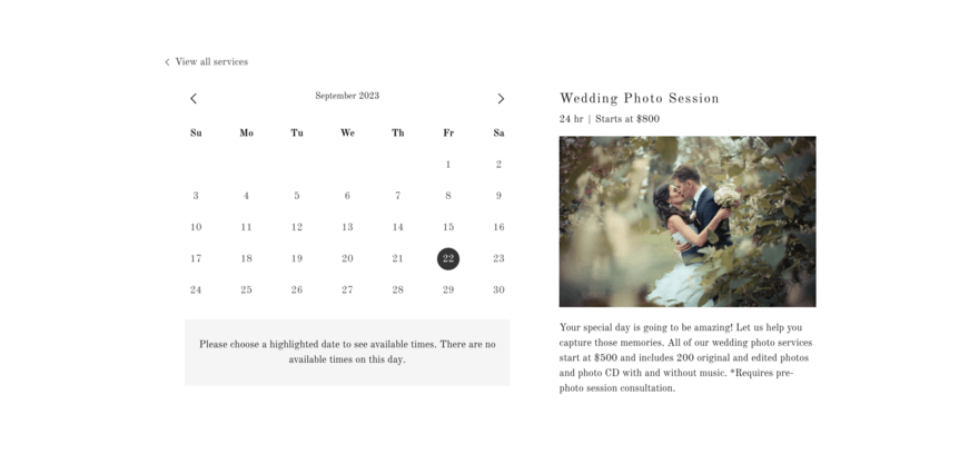
- Integrate a booking calendar into your website so people can check your availability and book a time directly. You may use a tool such as Calendly for this.
- Include location information (such as studio location) clearly on your site so clients can find you.
- Highlight your commitment to replying to enquires and how long people should expect this to take.
#9. Add Social Media Integration
Highlighting your use of social media on your website will help potential clients get a better sense of your latest work and follow you on their preferred platform. A social media strategy is an important part of marketing and promoting your site online.
Here are some tips for adding social media integration to your website:
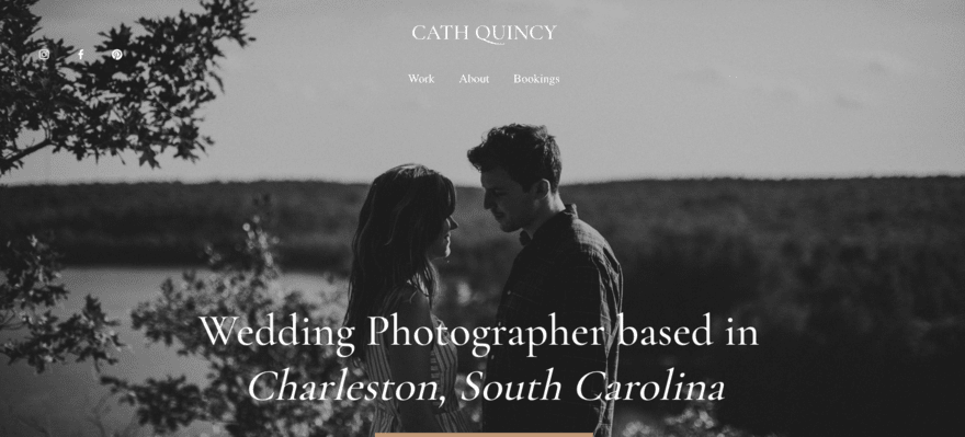
- Add social media icons, using their recognizable logos to highlight which platforms you are active on and make it easy for your audience to find you.
- Integrate an Instagram feed into your site, this will make it easy to highlight your latest work without constantly having to update your website.
- Share curated Pinterest boards to highlight your work and to offer inspiration to potential clients.
- On sharable content such as blog posts, include a Facebook share button to help you reach new people via your current audience
- Create visual content that is appealing and highly shareable – this may include examples of your work, top tips or behind the scenes
#10. Implement Security Measures
Ensuring your website is secure will help reassure your clients that they are safe using it. This is especially important if you are using your website to send your clients their content or if you offer samples of your work which you do not want to be used elsewhere without permission.
Here are some tips for keeping your site secure:
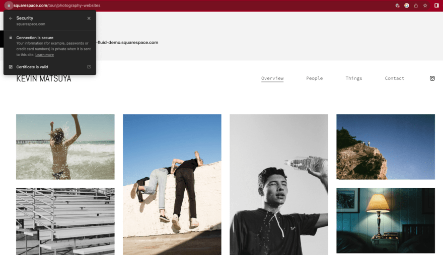
- Install an SSL certificate to secure transmission on your website. This is absolutely essential if you collect client information or accept online payment.
- Implement an automated backup system for your website’s data to protect against potential loss.
- Use strong passwords and implement two-factor authentication for any login credentials for your website.
- Use image watermarking and utilize metadata to protect your work from theft or unauthorized use.
Find Out More
- Discover more tips on How To Secure a Website in our full guide.
- Our Website Security Checklist will help you ensure you don’t miss anything important.
- Check Your Website’s Security with these 10 free tools!
#11. Review and Publish Your Photography Website
Before you publish your website, you need to check everything works. Leave no stone unturned – proofread your copy, test your links, and reshuffle your gallery if you feel the need to.
Then, you should ask some friends and family to check over your website. Having a second opinion can really help improve the user experience of your website, so make sure you get some feedback before you publish!
When you’re completely satisfied with your website, it’s time to press that button to go live online. Feels good, right?
However, that’s not the end of your website building story. Even after you’ve published, you need to update your website regularly with your most recent photos to keep it fresh. Also, the more you refresh your alt texts and keywords, the better chance your site stands of being found by more clients and customers online.
- Reviewed each page of your site from a variety of different screen sizes
- Asked friends and family to proofread any copy and test out each page of your site to iron out any errors
- Hit publish!
- Planned in some future updates to keep your content fresh
How To Make a Photography Website: Summary
There you have it – our guide to creating a photography website. As you can see, you don’t to be a web designer to achieve something beautiful and functional; you just need to decide on the key purpose of your site, and pick the best tool for the job. Website builders are more advanced now than they ever have been, so there’s no better time to start building yours.
Excited to get started? We bet you are – here’s a quick look at those steps again:
11 Steps for Creating a Photography Website:
- Set a clear goal for your website – set the direction you want your site to take
- Choose the right website builder – pick the best platform for your goals
- Pick a plan – choose from the different pricing tiers and features
- Find a template you love – find an inspiring layout for your photos
- Add your photos and content – personalize your website
- Install apps – add extra functionality
- Optimize your site for SEO – promote your hard work
- Add contact and booking information – so people can reach out and book you
- Add social media integration – to increase your reach
- Implement security measures – to keep your website and your business safe
- Review and publish – give things a final once-over
If you’ve created a photography website, and have your own tips or tricks, we’d love to hear them! Please let us know in the comments.
And in the meantime, happy creating!
More Information
- Best Website Builders: We’ve thoroughly researched the top website builders in the market
- Best Portfolio Website Builders: When it comes to constructing a striking portfolio website, these are the best platforms for the job
- Photography Website Builder Comparison: A side-by-side comparison of all the best platforms for building a photography website
- Interview with Han Designed: We spoke with a real photography business about getting started online



8 comments