How To Make A Logo: Four Best Logo Makers Online
If you click to purchase a product or service based on our independent recommendations and impartial reviews, we may receive a commission. Learn more
From the golden arches of McDonalds to FedEx’s orange and purple typeface, some company logos have transcended standard pop culture and become standard pieces of our everyday lives.
If you’re looking to join these business titans at the top, then you’ll need an iconic logo that you can plaster across your products and online presence. But you can’t just sketch out a logo overnight – if you want a recognizable cornerstone of your company’s branding, you’ll need to put some considered thought into your process and final result.
If you don’t think of yourself as much of a designer, that’s okay! We’ll also unpack a broad range of logo-making software which can use questionnaires to help generate a logo for you, or hook you up with designers that you can pay to do the job.
Why is a logo important?
A logo stands for your entire business. You want people to see your logo and instantly remember your product or service, or, if they’re new customers, feel inspired to explore your website.
Your logo can inspire many different feelings, based on things like colors, shape, and typeface. Going to our original examples, the McDonald’s golden arches have a smooth, rounded shape, with a friendly inviting yellow color. However, FedEx’s logo is sharper, with colors associated with energy and professionalism.
Without sounding too grandiose, your logo is your business. You’d struggle to find anyone who doesn’t know what Coca-Cola is, so it’s not surprising that Coca-Cola’s logo is recognized by 90% of the world’s population.
So if you’re looking to make an impact with your website or company, you’ll need a logo that can permeate culture in the same way.
Tips on how to design your logo
Don’t use too many colors
A logo should be simple at its core. You want people to recognize your logo at a glance, so too many frills or details are just going to muddy the waters. The same applies to colors – you’ll rarely find a widely known logo with more than two or three colors. In fact, 95% of top brands only use one or two colors in their logos.
Let’s look at an exception – the NBC logo. This iconic peacock uses six colors – seven if you count white. It’s a very colorful logo, which could be interpreted as too busy, but this abundance of color is offset by the simplicity of the shapes.
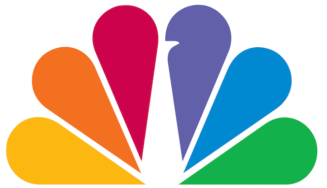
To prove this point, let’s look at one of NBC’s earlier logos.
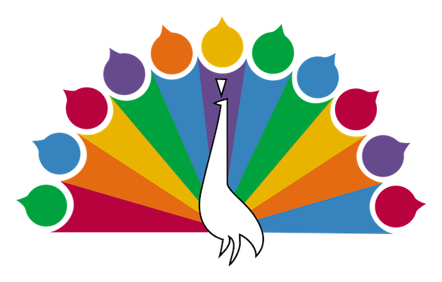
It’s not unfair to say that this is far too busy. There are the same amount of colors as the current logo, but the complexity and lack of pattern makes it complicated and messy. Yes, you can pull off having multiple colors – but unless you heavily control them, you might end up with a nightmare of a logo.
This is why your first step should ideally be you locking down your colors. You won’t need to know the exact hex code of your logo right away, but it’s good to know if you want your logo to be purple or green.
If you’re struggling to decide on a color, check out our article on picking a website color scheme. The right color can send powerful trust signals or subconsciously elicit emotions, so it’s important to choose carefully.
Try to hint at what your company is
A lot of famous logos, like the Nike swoosh or the Apple apple, don’t really tell you anything about the company – the swoosh has nothing to do with sport, and the apple doesn’t indicate that you’re looking at a computer company.
However, these companies are heavily established, and have earned their recognition over time. If you’re starting a company, it’s a good idea to have your logo indicate what your company does.
For example, let’s look at the logo for fast food restaurant Chipotle.

Firstly, they spell it out for you, with the words “Mexican Grill” on the logo itself. However, even if you took away anything written down, you’re still left with the image of a pepper – a food very often associated with Mexican cuisine.
However, we understand that some companies offer products/services that are a bit more abstract. Have a look at our own logo.

Our logo is a simple W, but made up of three parts. In a vacuum, you wouldn’t know what we do, but knowing that we offer advice on website builders, you can see how attaching different pieces together to make a whole product fits our method.
Use text sparingly
Text is great – you’ve been reading it this whole time. However, too much text on a logo can weigh it down. Logos are supposed to be mentally absorbed within a fraction of a second, and if there’s more than a couple of words involved, it can bloat the whole process.
Compare the Nike swoosh with the logo for the Epcot Food and Wine Festival.


While the Epcot logo is for an event, not a company – and therefore not intended to be something retained for years like the Nike logo – it still fails as a logo.
Firstly, there is far too much color usage, as we discussed earlier – but the amount of text on display here is also overwhelming. Including the word “Epcot,” made up of abstract food, there are five words. There is just too much unnecessary reading involved in this logo.
This can be okay when your logo itself is text. The New York Times’ logo is those four words presented in a nice font, and works well because that’s all it is.

However, once you start adding an image to your logo, you need to make sure that you’re very conservative with the amount of text, so as not to inundate the viewer.
Keep your logo versatile
A lot of the world’s most famous logos were made before the internet was bestowed upon us. As such, companies like Coca-Cola or McDonald’s didn’t make their logos with internet branding in mind.
Coke’s logo is like the New York Times’, in that it’s purely text. And while this can work as an isolated logo, it’s not ideal for social media profiles. Have a look at Coke’s Twitter page:
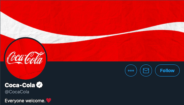
It works fine, especially since you’re overloaded with Coke’s distinctive red, but having text in your social media profile picture isn’t the ideal situation to be in.
So when you’re designing a logo, make sure it’s something that can fit in a social media page – whether that’s a profile pic, a heading, or scaled down to fit in something like an emoji. Bonus points if your logo can be easily grayscaled or rainbow-ified, to fit things like Black History Month or Pride Month.
How to make a logo: DIY tools
With those tips in mind, hopefully you’re ready to kick into gear and make your own logo – if only you knew how! Here are our top picks for logo-making software.
Logo makers are good for those without much design expertise who still want to be in charge of the whole process. Hiring a designer is a good option, but will limit your input to simply giving feedback, instead of steering the ship yourself.
1. Wix Logo Maker
Website builder Wix offers its own logo maker, with a few interesting standout features. Firstly, if you’re not the creative type, you can use Wix to find a logo designer. Simply give them some pointers on what you’re looking for, and you’ll be matched with Wix partners who like the look of your job.
However, if you want to be more involved in the process, you can make a logo yourself. By filling out a form and describing your vibe and preferences, you’re given a page of possible logos.
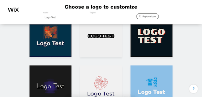
You can then go into Wix’s design software and play around with your logos until they’re to your liking.
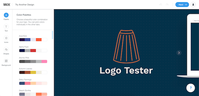
This is a great bit of software to help you create a logo. It’s free to make your logo, but it does cost to download it. It’ll be $20 for a basic logo, $50 for a professional one, or you can bundle it all together with a Wix plan, which can vary from $16–$45 a month.
More Wix Information:
2. Squarespace
Squarespace, another popular website builder, offers a similar logo maker service to that of Wix.
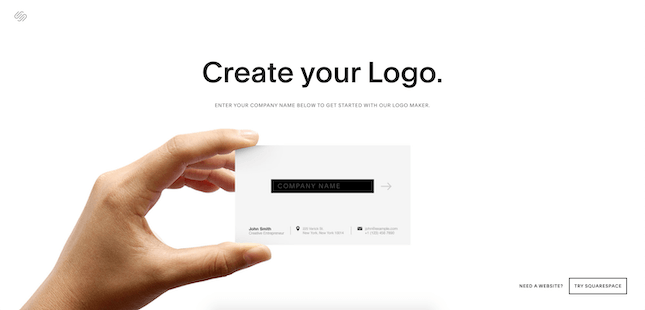
Simply enter your company name, and you’ll be taken to their logo making software. It’s not particularly deep, however. There’s a full spectrum of color, as well as some shapes and typefaces, but there’s nothing mindblowing here. It is nice that they show how the logo would look on a business card, website, and t-shirt, though.
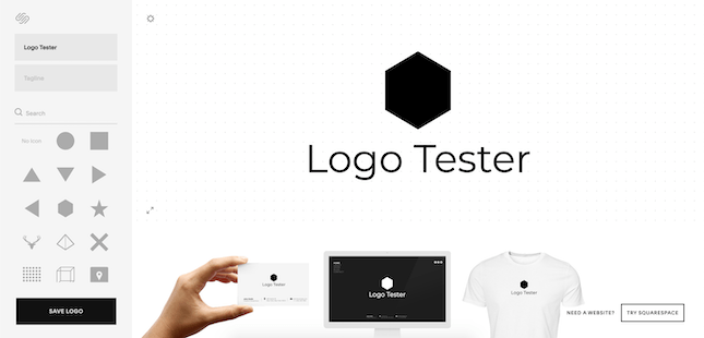
This is a good choice for someone on a budget, as logos are free to download if you already have a Squarespace subscription ($16–$49 a month). Otherwise, they’re still only $10, which is one of the cheaper options we have here.
3. Tailor Brands
Tailor Brands is one of our favorite logo makers. Rather than just dumping you into their software, they do what Wix did, which is ask you what kind of vibe you want for your logo.
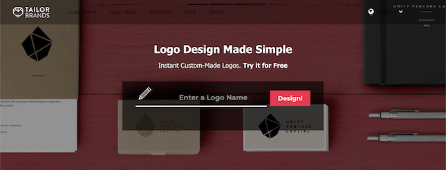
They ask you about your industry, your audience, and even whether you’d like your logo to be an image, a letter, or a word. After they get the information they need from you, you’re then given a bunch of different options which you can then tweak further.
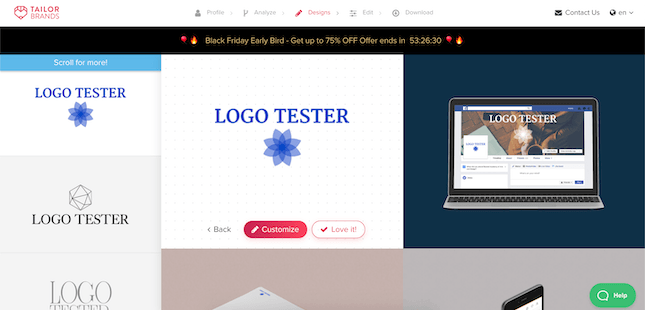
When it comes to cost, unfortunately, there’s no free option here. Tailor Brands bills you $2.99 a month if you pay annually for the basic Dynamic Logo plan. This gives you a high-definition version of your logo for commercial use. But you can pay for one month’s subscription at $9.99, download your logo, and then cancel, effectively only paying $9.99 for your logo.
If you’re a logo amateur, this is one of your best options, despite the fact you can’t grab a free version.
More Tailor Brands Information:
4. Shopify Hatchful
Online store builder Shopify comes with a logo maker called Hatchful. Just like Tailor Brands, you fill out a short questionnaire, going over your business purpose and aesthetic.
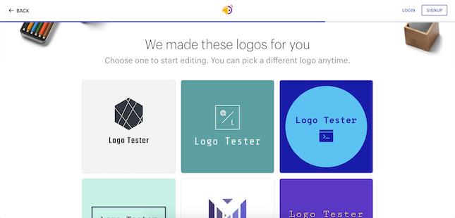
You’re then given an array of logos generated by Hatchful for you to select from.
After you fill the questionnaire out, however, there isn’t a ton of customization to go over before downloading your logo. Other than color and typeface, you can’t change anything about what you’re given, meaning that your logo’s proportions and design are stuck the way they are.
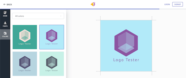
There’s also no preview option, so you can’t tell what the logo will look like on a business card or webpage. To download your finished product will cost you $9.99. Also the packages all include favicons, which are those small icons you see representing websites in the URL bar or on a tab. These are nice ways to put a cherry on top of your website!
5. Canva
Canva is an (almost) entirely free service that lets you create infographics, posters, and, obviously, logos. You do have to make an account to make things, but this is quick and easy to do.
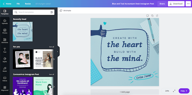
The only things you’ll have to pay for are some of the visual elements. For example, some of Canva’s pictures that you can use cost a dollar to implement. Not too expensive to begin with, but you probably wouldn’t even want to use these if you’re trying to create an original logo.
In fact, Canva is more of a place to start out on your logo creation, and not really one for the finished product. It’s a great place to tinker with colors and see which ones work for your brand, but there aren’t any drawing tools, so creating original shapes is tougher.
6. Adobe Illustrator
When it comes to manipulating/creating images, no one has more renown than Adobe. Photoshop and Illustrator are two of the most popular pieces of computer software on the market, and for good reason.
Illustrator is our most pricey software discussed here, costing $19.99 a month on an annual commitment, or $29.99 a month as you go.
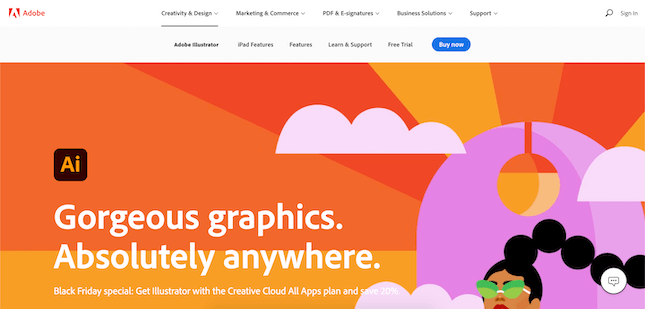
This pricing is justified, however, as this is professional level software. Professional advertising executives and visual designers use this software to create magazines and movie posters, so there’s a lot of weight behind this software.
And since Illustrator is a professional application, keep in mind that it might not be too user friendly for beginners, so maybe download the free trial and look up some tutorials before you dive in. Also, since Illustrator can’t be used online, you need to download the application – meaning you can use it while on the go!
How To Make A Logo: Conclusion
If there’s one thing you should never cut corners on, it’s your logo. Your logo will stand for your entire business, and will be plastered on your website, your social media, and possibly even your products themselves.
Despite the advice we’ve given you, there isn’t really a wrong way to go about designing a logo, as there are exceptions to every rule we’ve listed. Start off simple, only add what needs to be added, and show some of your family and friends to get an outsider perspective. Have fun!


14 comments