Homepage Design 101: How to Ace your Homepage Layout
If you click to purchase a product or service based on our independent recommendations and impartial reviews, we may receive a commission. Learn more
Building a homepage with a professional feel is a bit like standing in front of a buffet counter with an empty plate, waiting to fill it with all sorts of delicious goodness. This can be very exciting, but if it’s your first time, you might not be sure which things will pair together to create a winning combination.
Don’t worry – you’re not alone. But designing a website that looks great doesn’t have to be super complicated – in fact, with the right tools, anyone can do it!
We’ll walk you through the key features that make up a professional and effective homepage, including several different layouts for you to sample and choose from.
The Importance of an Effective Homepage Design
Your homepage is arguably the most important page on your website. Every single day, humans make around 35,000 decisions, including what to eat for breakfast or whether to linger on a website. As soon as your potential customers click on your page, how well your homepage sets the scene for your business will decide whether they stay or go. Call it a feeling or a vibe, but whatever it is, if your website doesn’t have it, your customers are going to bail at the front door.
A professional homepage design has a ton of key benefits:
- It helps users identify what your website is about
An effective homepage tells your user who you are and what you do as soon as they set eyes on it. If it’s not immediately apparent, we can guarantee that most visitors won’t stick around for long.
- It establishes your brand right off the bat
This is your chance to show off your hard work and what your brand is all about. For most users, your homepage will be their first exposure to your business – and as the old saying goes, first impressions really do count. This is your chance to convey what your brand is about, and convince visitors to trust you and stick around.
- It allows users to navigate your site easily
When done correctly, your homepage should make your website simple to use and easy to navigate. At this stage, your homepage is like a virtual crossroads with each element acting as a road sign, guiding users in the right direction. The aim of the game is to make this part of the user journey so subtle and effortless, your visitors don’t even need to think about consciously taking the next step.
- It Helps You Cash in on those conversions
No matter how good your product is, customers won’t buy into it if your homepage doesn’t look professional. All of the points above combine together to do one key thing: encourage visitors to convert. Essentially, an effective homepage removes any doubts the user might have about whether your business can provide what they need it to.
Find Out More
- Interested in learning more about the importance of a good homepage? Our report on Landing Page Statistics is full of stats and tips to help you improve your landing pages. For example, landing pages with social proof convert better than those without, so be sure to include reviews or social media feeds!
What Should Be Included in a Homepage?
Let’s be honest – how many times have you landed on a website, only to end up clicking the ‘back’ button in mere seconds because you couldn’t see what you were looking for?
We live in a world of fast answers and instant gratification, which has resulted in an impatient audience that’s increasingly demanding. Most of us are conditioned to expect to find what we’re looking for in a matter of seconds, so the job of an effective homepage is even more important – but also more challenging too.
So, how do you give users what they want quickly, whilst capturing their attention at the same time? Here are 8 tried and tested features you need to include that will help your effective homepage take shape.
#1. Headline
In one sentence (two at the most), you must answer the question that all your visitors will be asking – ‘What does your company do?’
A good headline doesn’t have words to waste – it needs to be short and clear, and most importantly, it needs to describe what you do perfectly.
Take a look at this simple but effective headline, which does a great job of answering that all-important question.

In the space of eight words, Basecamp presents a solution to a problem many businesses will find themselves facing. Straightforward, concise, and relevant, it gets right to the heart of what this company can offer its visitors.
If you don’t know what to write, try asking your customers or audience why they visit your website or use your products or services. You can take the words right out of their mouths, and use them as your headline!
#2. Subheadline
Where the headline is all about a quick, clear injection of information, your subheadline gives you the opportunity to define your service or product in a bit more detail.
At this point, you need to be trying to answer the question: ‘How are you going to solve this problem for me?’
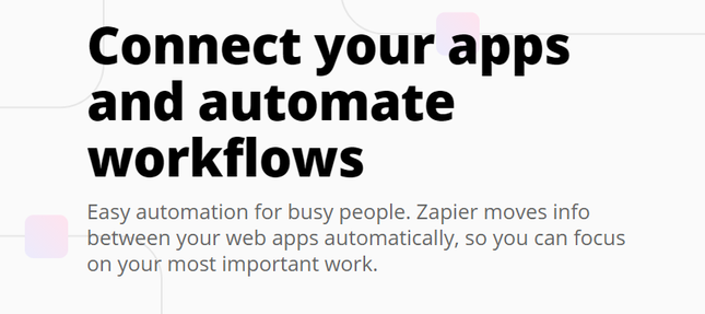
Zapier does a great job of this, describing in more detail what it does and why that’s so good for you. It even goes a step further by using an emotive tone and including wider benefits, leaving users with the impression that Zapier won’t just help them with their automation, but their productivity too.
#3. Call-To-Action
Now you’ve caught their attention, your next task is to visually show your visitors what to do next. This is where your call-to-action (CTA) plays an important role. It provides directions, and tells your users how to move forward.
Calls-to-action mostly appear in the form of buttons or links, so it’s important that they’re short and snappy – no more than a few words long. They need to provide direction, and the more interesting you can make them, the more likely your users are to click them.
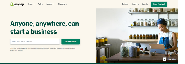
Here, Shopify uses its call-to-action to clearly show visitors where to go next. The language is active, direct, and clear. Plus, Shopify has included that magical word – ‘free’. This is one of a few powerful words you can use to persuade your users to take the next step.
The key is to actively engage with your users – tell them what to do, and guide them to take action so you can start building a relationship with them.
#4. Your Logo and Clear Branding
Your logo and your brand are like your signature scent. They hint at the DNA of your business, and should surround your product or service in a way that can subtly inform your customers’ opinions of you.
Whether they see you as professional or unreliable all lies in the choices you make when it comes to your branding. After all, who thinks of an iPhone without conjuring images of white, clean space and cutting-edge tech, all carefully tied up in that small but iconic silver apple?
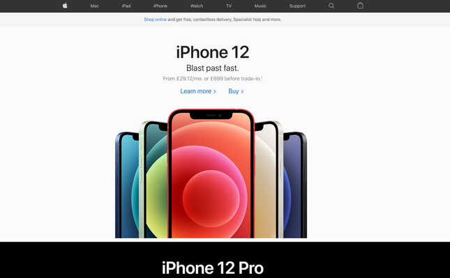
This is the gilding on your website that’s going to give your business its personality, so you need to make sure it all works together in harmony. If your brand doesn’t work cohesively, chances are your visitors will be left feeling confused about who you are and what your business stands for.
If coming up with your own logo sounds daunting, don’t panic. There are plenty of ways for you to find the perfect design, including getting someone else to do the heavy lifting for you! Take a look at the best logo makers out there to get started.
Create a Logo Using Tailor Brands… and Save 25%
Tailor Brands is one of our favorite logo generators, and they’ll do all the hard work so you don’t have to. Simply enter your brand name, choose the style options you like the most, and then choose from a number of logos that Tailor Brands designs just for you. You can even customize your logo to make sure it suits your branding. Tailor Brands’ premium plans give you professional tools to boot, such as social media logo sizes and a business card creator tool.Tailor Brands Review – learn more Tailor Brands and whether it’s the right online logo generator tool for you!
#5. Images
They say a picture is worth a thousand words – and when it comes to your homepage design, they might be onto something. People are naturally drawn to visuals like images or videos, making them a great way to convey information and prevent your homepage from becoming too text-heavy.
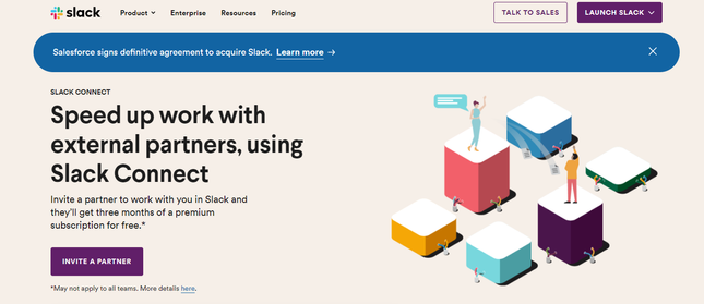
Slack does a great job of harnessing this tool. Not only does its image fit with its branding, but it also provides a visual representation of what the business has to offer.
Images are an awesome way of creating a mood or showing your audience what you’re all about, but be careful to use graphics that are relevant to your website. If they don’t serve any purpose, or don’t help to enhance your overall brand, don’t use them.
It’s better to keep your website clean, rather than including things that aren’t useful and only serve to distract from the important bits.
#6. Navigation Bar
Your navigation bar does exactly what it says on the tin: it helps your visitors to find their way around your website. It needs to be easy to find and clearly labeled, so that they can get to the information they’re looking for.
Keep your navigation bar functional by following these tips:
- Only include necessary pages. This prevents your visitors from getting confused. They’re not going to be interested in pages about copyright, privacy, and terms of service, so insert them elsewhere – like in your footer.
- Create logical groups of related links, with the most important links going from left to right.
- Keep page titles short and descriptive
- Place your navigation bar in a prominent location so it’s easy to find
#7. Value/Trust Indicators
Every time a visitor lands on your website, they’re taking a chance on you and your business. Keeping them engaged will be much easier if you give them a reason to trust your legitimacy. You can achieve this by including trust indicators at the bottom of your page.
If you’ve never heard of a trust indicator before, they can be any of the following:
- Customer success stories
- Customer testimonials
- Professional accreditation (e.g. industry association affiliations, publication features, Trustpilot scores)
- Media quotes
The key here is to positively associate your business with external parties, and show that it’s operated by real people, not robots. Almost a third of online shoppers hesitate to commit to a purchase because of security concerns, but trust signals are very powerful tools to help bring them one step closer to becoming customers.
Ultimately, people like to be part of a group. When they see others (just like them) supporting you and purchasing your products, they’re more likely to follow suit. It adds a layer of trustworthiness and credibility that not even your most persuasive copywriting could achieve.
#8. Benefits List
Ever heard the saying, ‘Features tell, benefits sell?’
A common mistake that many websites make is focusing on features, rather than benefits. It’s helpful to let your visitors know what your product includes, but what’s more useful is explaining why that’s so good for the customer.
Benefits tap into the emotional side of people. This means they help you connect with your customers on more than just a surface level.

Basecamp, a project management software that helps teams to manage communications, is great at using benefits to its advantage. First, it lists out the many pain points the potential customer might have (and which they’ll likely relate to on an emotional level). It then makes the promise that its software can make all those problems go away!
There are many ways to feature benefits on your home page, but the key is to show your audience how their lives will change for the better once they invest in your product or service.
Find Out More
- Want to see these features in action? Our list of great One Page Website Examples shows you how real websites make the most of a single page to engage visitors.
- Check out our guide on How To Create a Landing Page for more top tips.
5 Effective Homepage Layout Designs to Copy
Unsurprisingly, building an awesome home page isn’t just about placing information randomly wherever you want to. There’s actually a lot of science, data, and methodical thinking behind how all the puzzle pieces fit together in the best way.
Luckily, most businesses have been in the position you now find yourself in, and have come out the other side with a homepage that does the job effectively. This means there are plenty of examples you can replicate and learn from.
Take a look at our top 5 effective layouts to help you optimize your website and achieve homepage success. Each one includes all of the key elements identified earlier, with some added extras you might find useful, too.
Below each layout is a collection of ready-to-use templates. You can click through them to take a look, and if you find one you like, you can sign up and start using them right away.
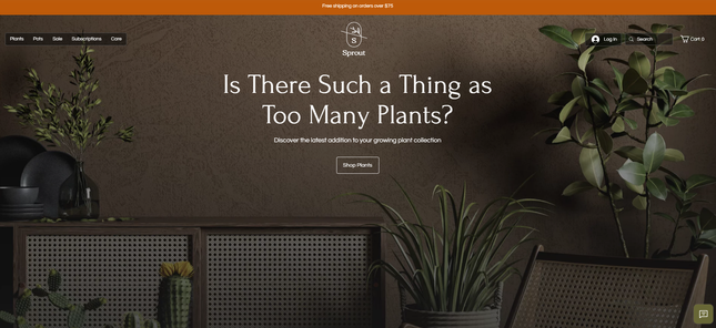
Layout #1: Bold – suited to ecommerce stores
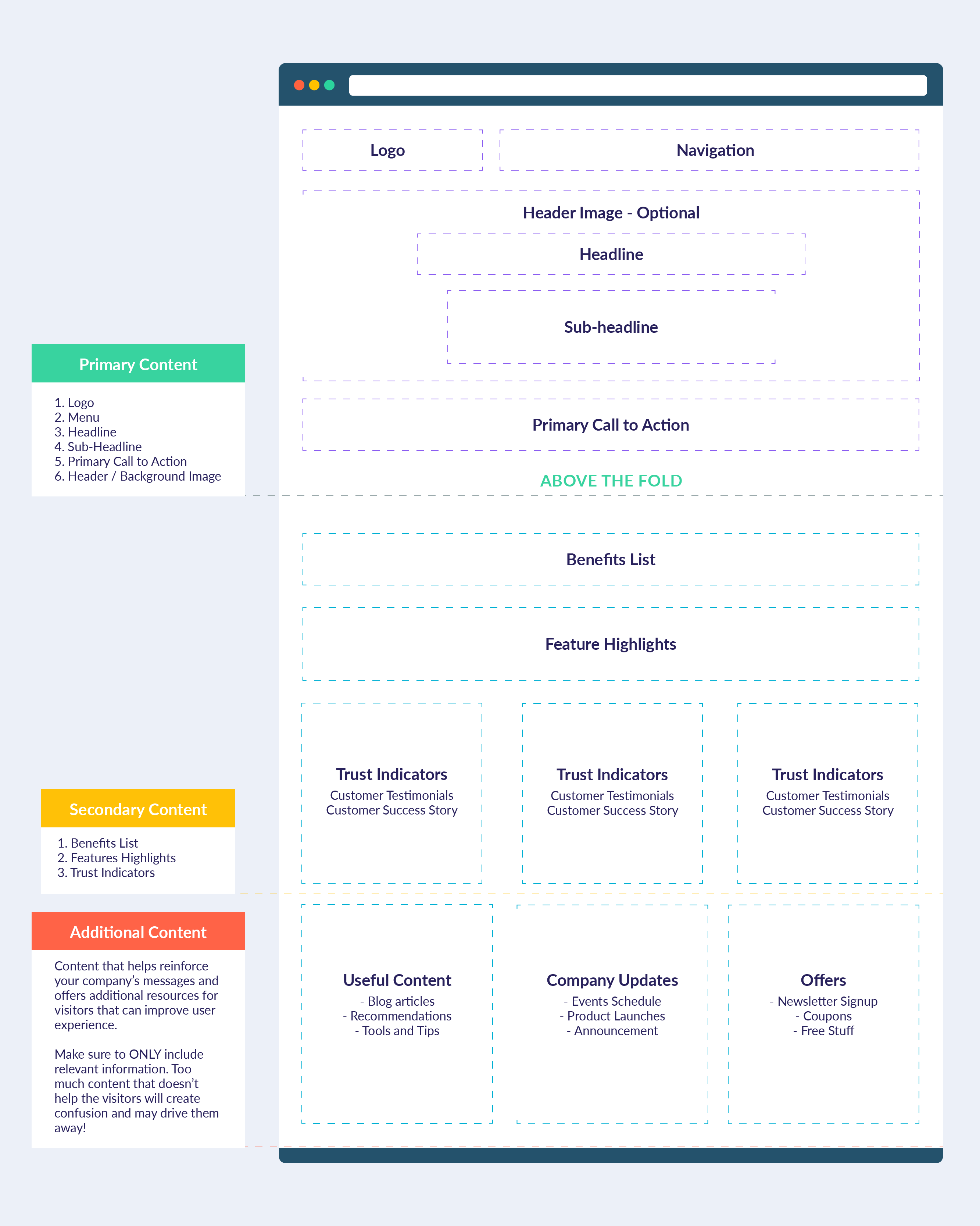
This first layout is fairly common across most industries, but particularly when it comes to online stores.
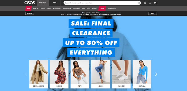
Placing your headline in the center of the page allows you to convey important, punchy messages immediately, as seen on ASOS. The multiple CTAs are ideal for helping users to find what they’re looking for, especially if your website has plenty of choices and avenues your visitors can take.
This type of template is also perfect if your business relies on visuals more than words, such as a florist or tour operator. The inclusion of an image front and center gives your visitors a glimpse of what you can offer, and helps capture their attention.
Template recommendations:
Layout #2: Informative – ideal for service providers
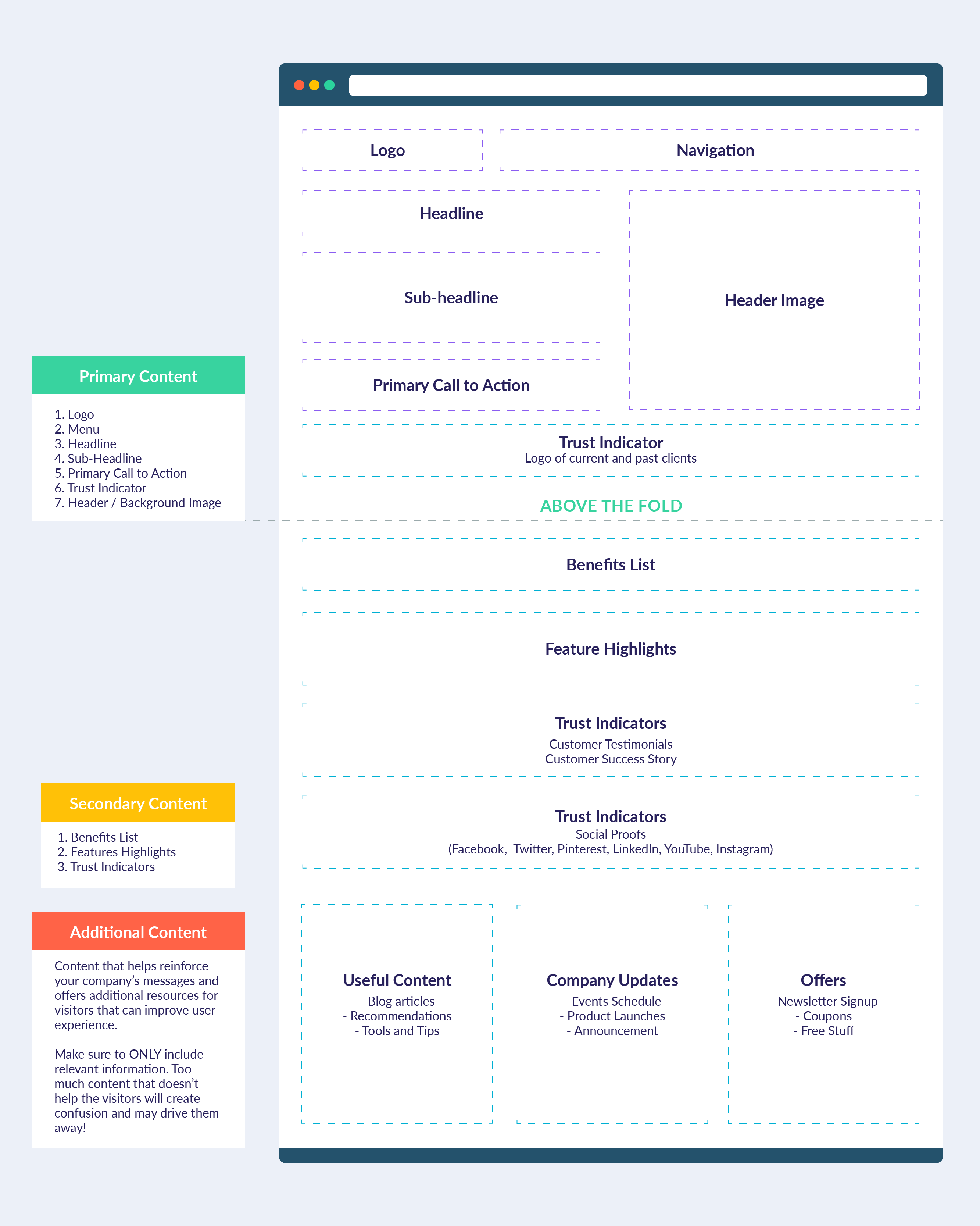
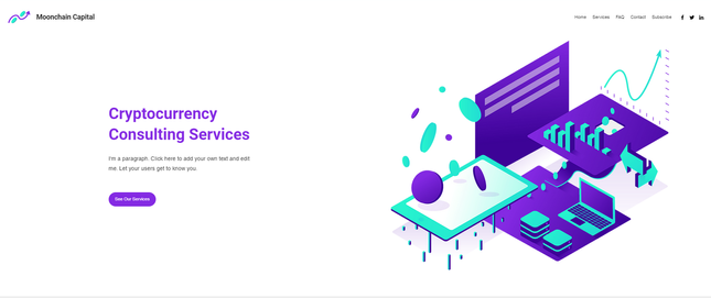
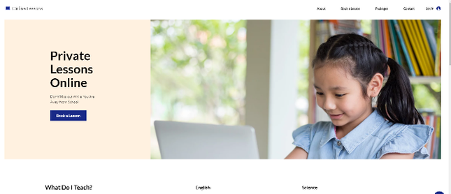
Like the first template, this layout can be used across a variety of industries, but it’s ideal for businesses that don’t rely so heavily on images to create a brand presence on their home page. This is why you’ll often find it on websites offering a service rather than a product.
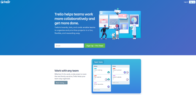
A good example of this is Trello. Although the image reinforces what the business has to offer, visitors are going to get their answers from the headline and sub-headline. After reading this, your eyes are naturally drawn down to the CTA, which contains one of those all-important power words – ‘Free’!
Template recommendations:
Layout #3: Brand statement – perfect for mobile traffic and style brands
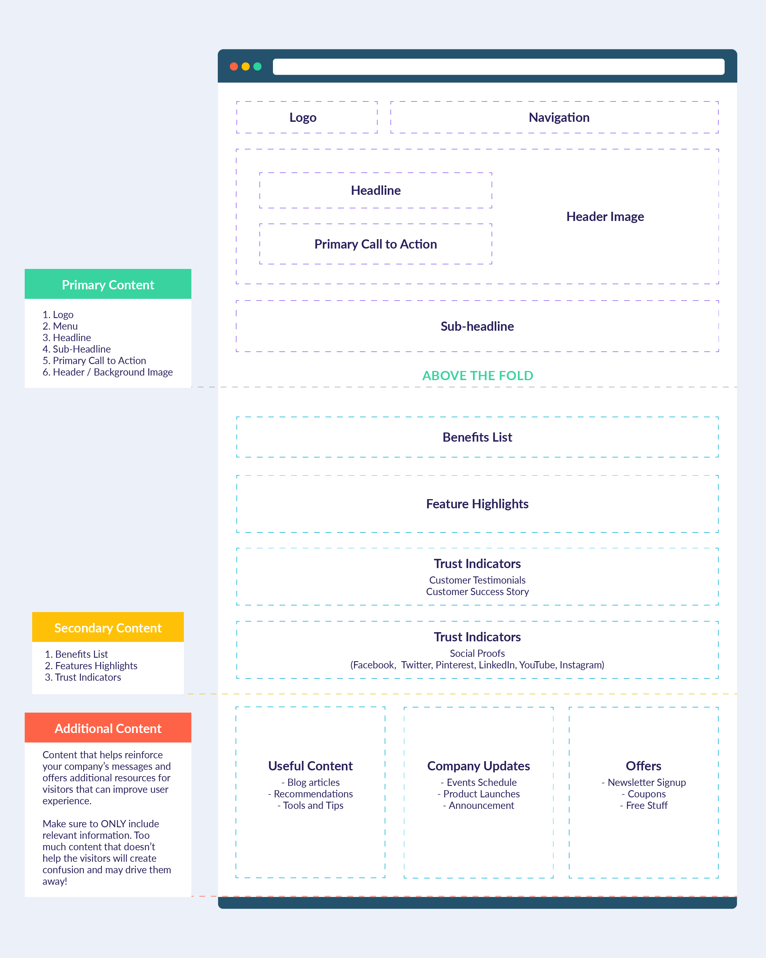
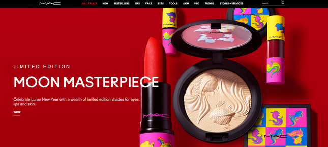
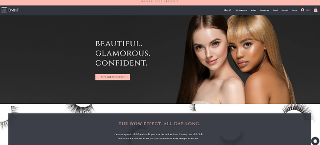
The third layout looks fairly similar to the first, but contains a smaller amount of text. It allows the image and the headline to do most of the talking, relying on short bursts of information to get the important message across and encourage visitors to read on. The MAC make-up website is a great example of this in action:
Template recommendations:
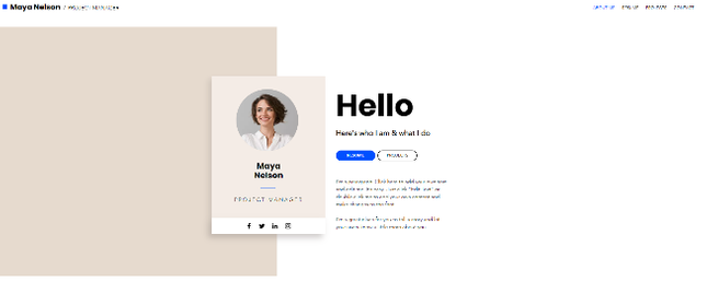
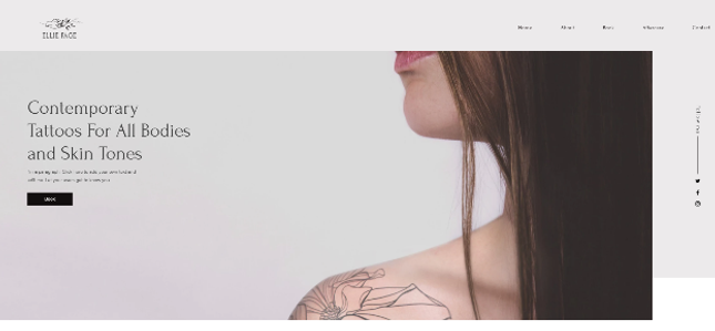
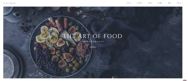
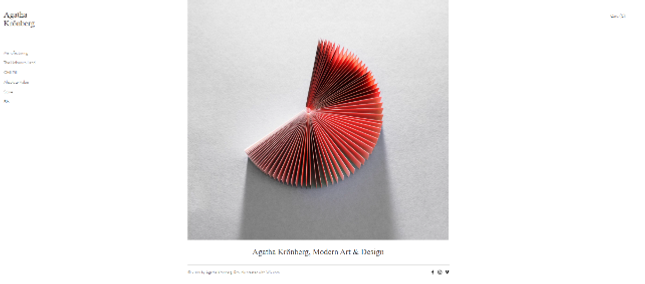
Layout #4: Focused on visuals – best for photographers and designers
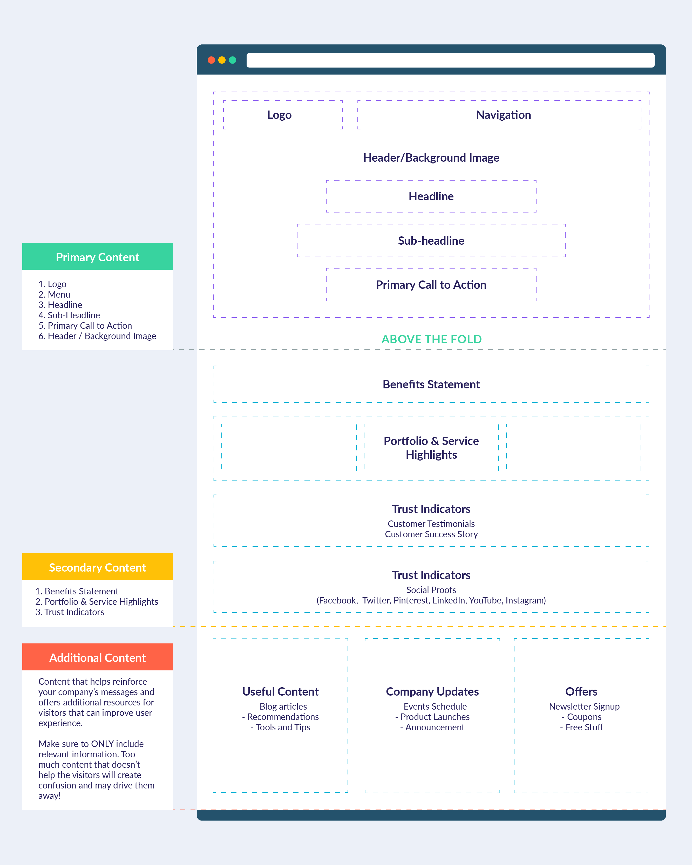
This layout is perfect for creative businesses such as photographers, designers, musicians, and illustrators.
These types of websites are more focused on visuals than the copy, because their work is better showcased through pictures than words.
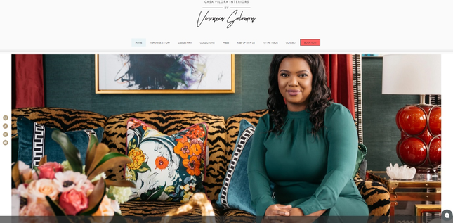
For example, on Veronica Solomon’s interior design homepage, she’s chosen to dominate the space with an image of her in an eclectically decorated room. This is relevant to her business, and tells us more about what she can offer than a lengthy and unnecessary sub-headline would.
Template recommendations:
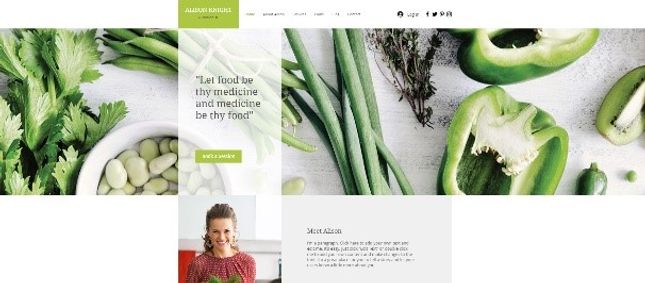
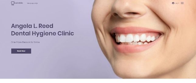
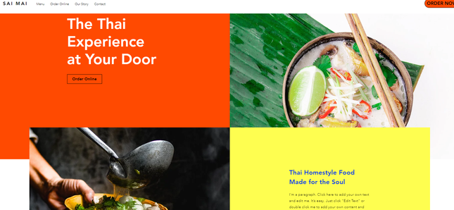
Layout #5: A good balance of visuals and text – great for restaurants and food businesses
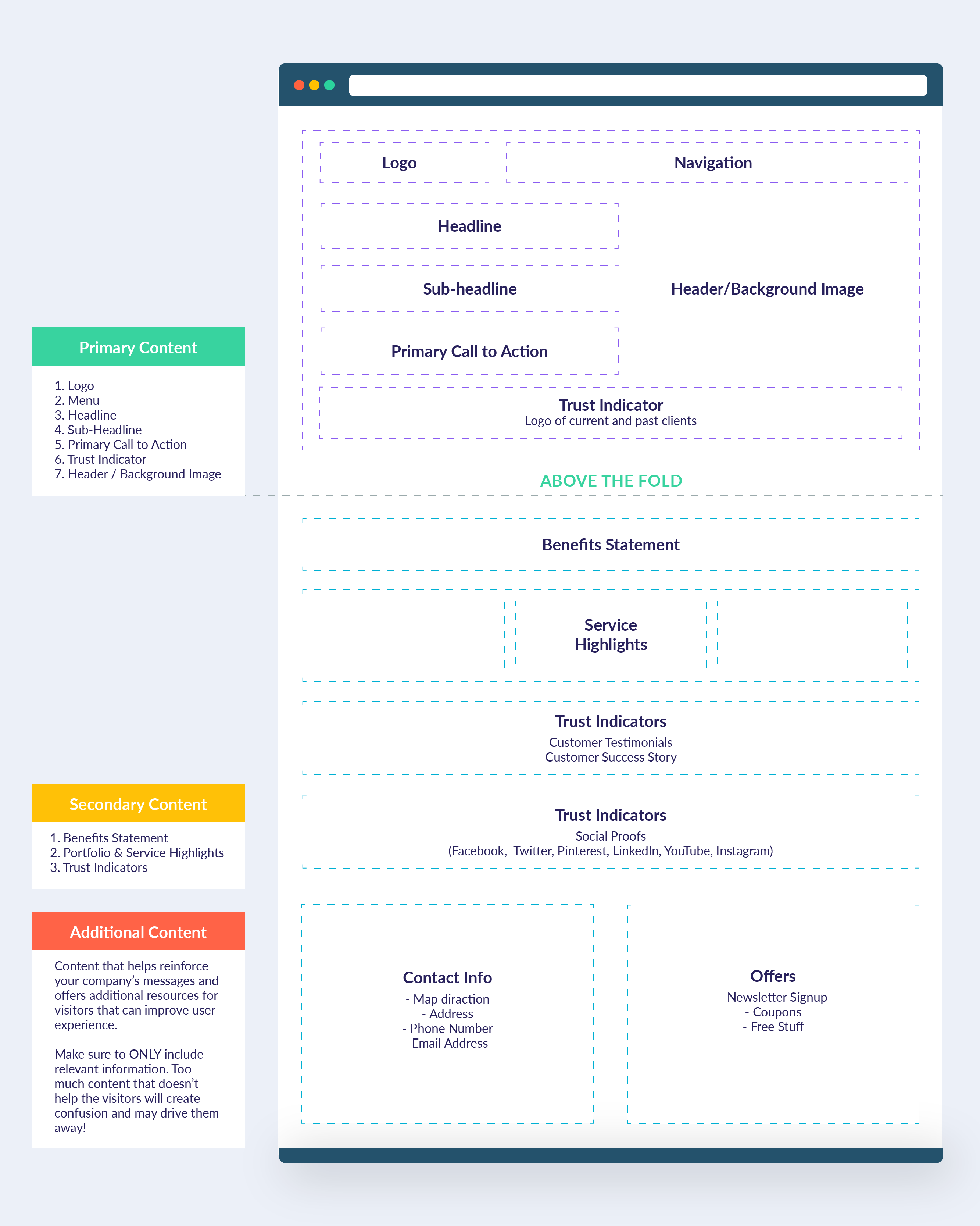
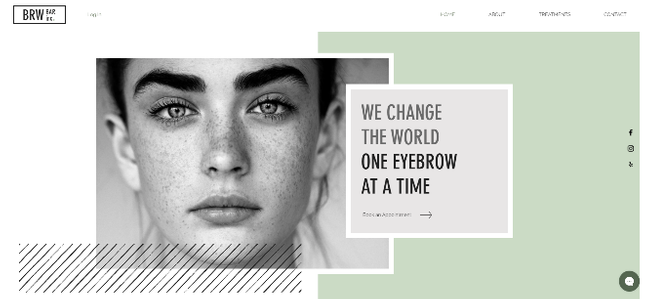
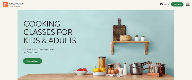
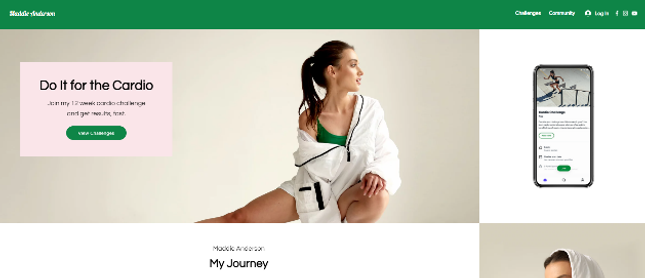
This final layout is another great option for creative businesses, but allows you to include more text in your headline and sub-headline. This is perfect if your business relies on the power of both clever copy and beautiful imagery. Plus, including trust signals at the top of the page rather than the bottom will help to quickly build and solidify customer relationships.
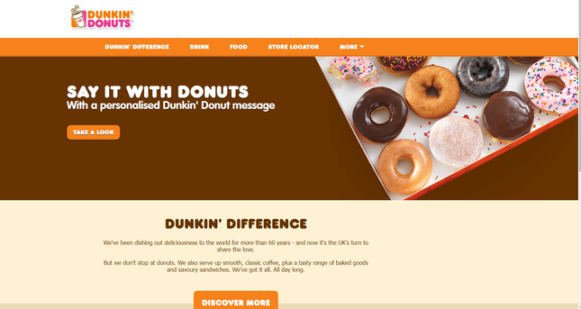
Dunkin Donuts ties graphics and text together for a balanced homepage style. This type of layout would be well-suited to a restaurant, cafe, spa, or salon website.
Template recommendations:
Getting Your Layout Right
What doesn’t belong on a homepage?
There are plenty of elements you want to make sure to include in your homepage design, but what about those you want to leave out? Here are a few things we’d recommend avoiding if you want your homepage to be as effective as possible:
Overwhelming clutter
It’s hard to leave white space alone, but the emptiness draws more attention to the stuff you do decide to include. Resist the urge to clutter – you need to create a visual hierarchy so the important things don’t get lost, and to ensure your visitors can easily find their way.
A long list of features
Benefits have the most persuasion power, but sometimes it’s good to tell your potential customers exactly what they’re getting too. If you have a lot of features to list, pick out the top 10. You can always create a separate, dedicated features page for your visitors to view if you want to go into more detail.
Avoid jargon
This isn’t always as easy as it sounds, especially if you work in a specialist industry, but avoiding technical talk is a surefire way to make sure your visitors don’t misunderstand what you do. Simplifying things makes your message much clearer.
Steer clear of funky fonts
It sounds fun in principle, but it could work against you if your chosen fonts are obscure and a bit hard to read. Stick with something simple and clear. Take a look at some of our favorite fonts to find one that’s right for you.
Design that isn’t optimized for mobile
Approximately half of internet traffic worldwide comes from mobile users. In fact, even Google prefers mobile, now only using the mobile versions of websites to decide on its overall rankings. Getting this wrong could cause you to alienate a large portion of users. Thankfully, many website builders offer mobile optimization as standard, but if you want to do it on your own, check out our article on how to improve your website for mobile users here.
Above-The-Fold – what you see when you first land on a website. It encompasses everything that’s visible without you having to scroll down.
Below-The-Fold – content you only see when you scroll down.
This idea has its roots in newspapers, which were typically folded in half and stacked when sent to stores to be sold. Editors would have to choose which articles to feature above-the-fold, as it would be the first thing buyers would see.
This used to be a popular way of arranging your homepage too, but with the rise of smartphones and the impulsive scrolling action that comes with them, it doesn’t hold the same weight as it once did.
What this means for you is that most visitors to your website will stick around to scroll down. Although you still want to make sure to get the most important bits up top, around 90% of users will start scrolling within 14 seconds. This gives you slightly more flexibility when it comes to deciding on your homepage layout.
Find Out More
We compiled some of the worst website designs we’ve found in this list of Bad Websites. Take a look for inspiration of what to avoid!
Homepage Design: Summary
Effective homepage design isn’t just about looking ‘pretty’ – although that’s not a bad start. Its true purpose is to help visitors understand what you do, what problems you solve, and how they can benefit from your business. They might not always find your services or products helpful, but they should never misunderstand what it is you’re offering.
It’s your job to make sure this isn’t a problem, answering their questions and showing your customers where to go and what to do next – whether that’s through a punchy headline or an irresistible call-to-action. Arranging these elements on your homepage is similar to leaving a trail of breadcrumbs for your visitors to follow, but it’s no use if those directional signals get lost amongst useless and unhelpful clutter.
Keep in mind that you won’t get the ‘perfect’ home page design on your first attempt – and that’s okay. Instead, it’s the first stepping stone to understanding your visitors, and building your brand around them and their needs. Your homepage should be in a constant state of improvement, changing based on the feedback you receive and the data you collect.
Lastly, take a look at the template examples shared above – instead of designing your homepage from scratch, these can provide some helpful inspiration, and give you a head start to creating an attractive and effective layout.



136 comments