The 10 Best StoryBrand Website Examples
If you click to purchase a product or service based on our independent recommendations and impartial reviews, we may receive a commission. Learn more
Contrary to popular belief, building a brand online isn’t just about the colors you use. It’s not only about a catchy name, either – or having a prettier logo than the competition.
Nope. It’s about telling a story – a brand story, to be exact.
This, of course, is where StoryBrand comes in. Laid out by Donald Miller in his 2017 book, Building a StoryBrand, StoryBrand is a framework designed to help businesses structure their core marketing message. It’s a seven-part process that utilizes the power of storytelling to position your customer as the hero of the narrative – and your business as their companion.
As Miller himself outlines, the customer is Luke Skywalker. You’re Yoda. You’re not James Bond, but his weapons outfitter Q. You’re not Frodo – you’re Sam.
If that all sounds a little ‘wishy washy’, we get it. Without some ‘real world’ examples, it’s difficult to picture.
That’s why we’ve put together our top 10 favorite StoryBrand website examples. The following websites have been created with different platforms (Squarespace, Shopify, and WordPress among them) but they all have one thing in common – they’re all structured around Miller’s StoryBrand framework. That means they all tell a compelling story about their brand, and weave the consumer into it.
So what can you do to set your business up in a similar way, and enter into a dynamic conversation with your audience?
You can start by learning from the best.
1 The Friday Habit
Made with Squarespace
The StoryBrand framework is all about articulating a narrative around your customer. What are their struggles? What quest must they go on to achieve their goals?
To do this, a website needs to get to the bottom of its customers’ pain points. To not only understand exactly what drives them, but to make it clear how they can benefit from the product or service on offer.
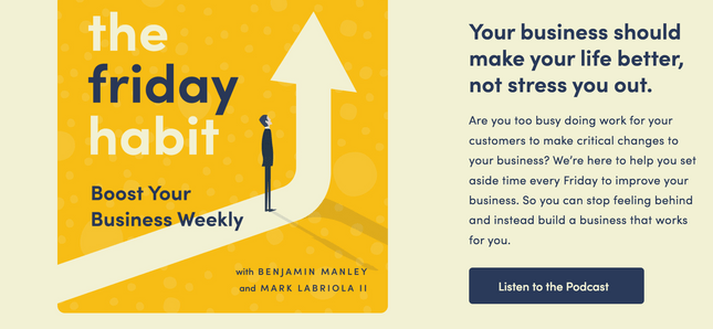
This is something that productivity-focused podcast The Friday Habit does well.
Created with Squarespace, its website clearly conveys the issues its customers are concerned with.
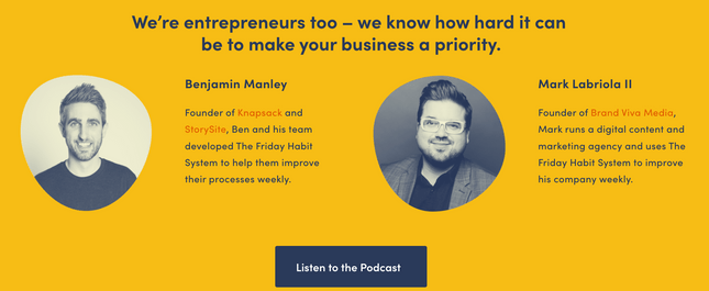
By making statements such as “we know how hard it can be to make your business a priority”, The Friday Habit’s founders Benjamin and Mark put themselves in the shoes of their target audience.
The clean UX (user experience) and bold, simple color palette of The Friday Habit’s website complements the messaging’s StoryBrand structure. Plus, by addressing the audience directly (through using words like ‘you’ and ‘your’), The Friday Habit builds a conversational, comfortable tone to align itself as the reader’s ‘companion’.

2 Indulge Right
Indulge Right utilizes Miller’s StoryBrand framework to tell a particularly delicious tale. The company’s range of sweet treats are free of sugar and allergens, high in prebiotic fiber, and friendly for diabetics.
Like all good StoryBrand websites, Indulge Right’s online presence puts the customer at the center of the narrative. By making powerful statements such as “you have the power to make informed choices and support your family’s greater health”, Indulge Right makes its audience the heroes of their own individual weight loss stories.
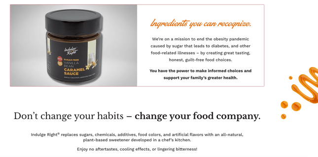
Of course, no good story comes without effectively setting up the stakes – and this is something Indulge Right gets spot on. Its website empathizes with the customer, making it clear that it understands its audience’s struggles. Whether that be with the villains of weight gain, diabetes, or simply finding a healthy snack that actually tastes good, Indulge Right is there to help.

When it comes to understanding the goals, motivations, and stressors of its audience, Indulge Right is remarkably effective.

3 ZenFounder
Made with Squarespace
Spearheaded by founder Dr Sherry Walling, ZenFounder is all about productivity. Its Squarespace-created website features a range of articles, plus links to books and retreats.
On top of offering consulting services and running her own podcast, Sherry’s also mastered the art of the StoryBrand framework. Her website opens by declaring that “burnout and isolation are not part of your job description”. By also introducing who her target audience is – entrepreneurs – she sets up the central premise of her offering.
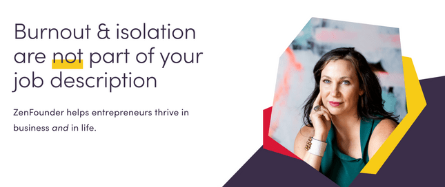
Step 2 and 3 of the StoryBrand framework? Set up the problem – then introduce your business as the solution. By posing direct questions to her audience and clearly laying out their pain points, Sherry does both – before telling her customer exactly where they can come for help.


Having a ‘guide’ to help with your problems is great – but it’s not worth much without a result. That’s why Step 7 of the StoryBrand framework is that the narrative ‘Ends in Success’.
Fortunately, ZenFounder’s does. With statistics detailing the people she’s positively impacted, Sherry paints a compelling picture of the value she can add.

4 Mary-Meduna Gross
Made with WordPress
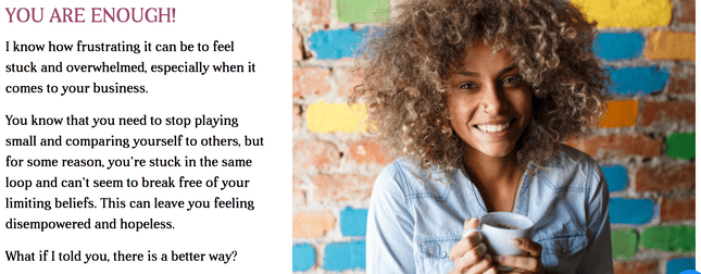
“When we work together, you’ll let go of your limiting beliefs, create new possibilities, and your business will thrive”.
If anyone’s got storytelling downpat, it’s Nebraska-raised life coach Dr. Mary Meduna-Gross. By infusing her website – made with popular CMS (content management system) tool WordPress – with a direct, conversational tone, Mary cultivates an empathetic voice.
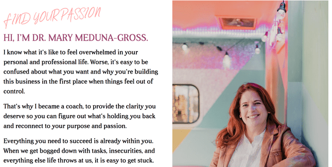
Step 4 of the StoryBrand framework (after establishing the character, the problem, and the guide) is to lay out a plan. How will you, the guide, help the character – your customer – to solve their problem?
For Mary, it’s about clearly listing out the goals of her coaching problem. Whether it’s reducing stress, boosting confidence, or having more energy, Mary’s StoryBrand narrative covers it all.

5 The Happy Sleeper
Made with Squarespace
Squarespace is well-known for the stylish, spacious websites it allows its users to build, and The Happy Sleeper – a company that sells on-demand sleep courses – is Exhibit A.
But even overlooking its intuitive layout, soothing color palette, and inviting look and feel, The Happy Sleeper’s website excels for another reason – its application of the StoryBrand framework.
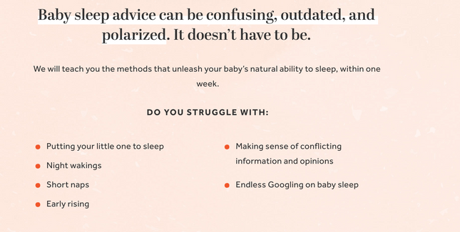
By spelling out the struggles of new parents in bullet points, and not overloading the page with copy, The Happy Sleeper spins a simple, successful yarn.
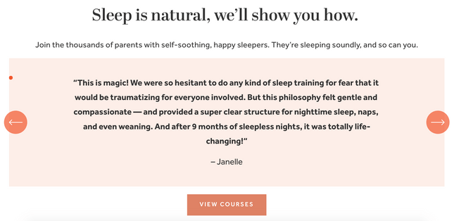
Founders Julie and Heather have also applied the techniques of the StoryBrand framework to tell their own story.

Step 5 of the StoryBoard framework is ‘Call to Action’ – essentially, imploring your customers to take that next vital step to solve their central issue. But how does this look on a website, exactly?
The Happy Sleeper offers the perfect example. With bold, highly clickable CTA buttons woven into the design tapestry of their Squarespace site, Julie and Heather make it easy – and enticing – to view their courses.
6 Lovejoy & Numbers
For an indication of whether or not Lovejoy & Numbers has used the StoryBoard framework, look no further than its main CTA. It even features the word ‘story’!

By personifying its customer base’s accounts as ‘the numbers’ – and then impelling their audience to “take control” of said numbers – the accountancy firm sets up the key players of its story.
Then, it tells that story. Through a clearly defined three-step process, Lovejoy & Numbers creates demand, speaks to its audience, and offers social proof as to why its team are the best at what they do – before throwing down an alluring CTA.
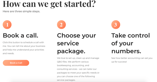
Lovejoy & Numbers’ website is also an excellent example of how web design and the StoryBrand structure can work together in harmony. Original graphics depicting stressed out business owners tell the firm’s story in a visual way – not a verbose one.

7 Motivated Mornings
Made with Squarespace
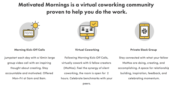
Motivated Mornings offers a virtual coworking community designed to help employees be more productive. And its Squarespace-constructed website – with an office-esque yellow and black color scheme, and business-related graphics – attests to that.
It’s also a fine example of the StoryBoard framework in action. All the classic elements are there, including:
- Laying out the problem (Step 2)

- Giving the audience a plan (Step 4):
- And calling the customer (or, should we say, the ‘character’) to action (Step 6):
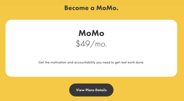
The system works!
8 Tie Boss
Made with Shopify
Tie Boss – a multi-purpose tool designed to help with hoisting, hauling, and tying down loads – built its site around popular ecommerce site builder Shopify.
But of course, since the company features on this list, it had another ace up its sleeve – the StoryBoard framework. Like all the StoryBrand website examples we’ve seen so far, Tie Boss is adept at nailing its customers’ pain points.
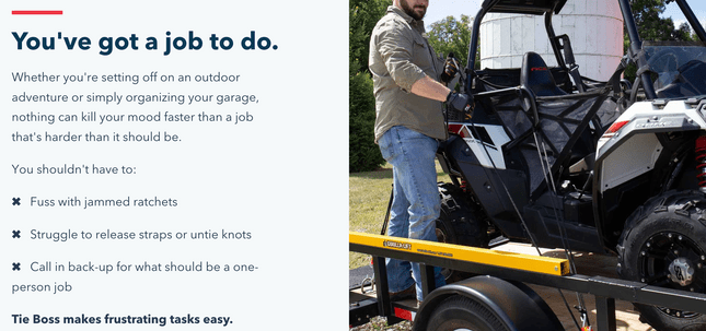
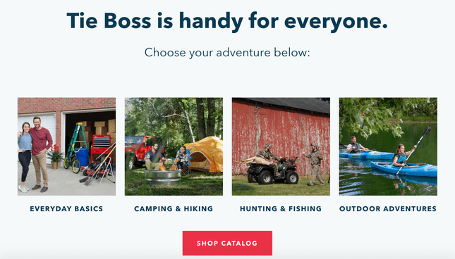
No matter how good your brand is at telling a story, if you’re not able to get your audience actually imagining what your product will look like in their everyday life, you won’t turn them into customers.
Luckily for Tie Boss, this is something the company does well – telling the story of its product by attempting to thread it into the tapestry of its customers’ lives.
9 Made to Impact
We’ve talked about Step 2 of the StoryBoard framework – setting up the issue our ‘hero’ must face – a lot.
It’s a big one, after all – a business has to be able to understand and lay out its customers’ pain points to persuade them to engage. And after analyzing its website, it’s clear that this is something Made to Impact understands all too well.
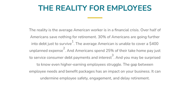
Made to Impact is an employee benefits program with a twist. Rather than simply dole out the freebies, it incentivizes employees to save money, and better plan their financial future. In setting out the current financial state of play for employees, Made to Impact harnesses some compelling (and condemning) statistics.
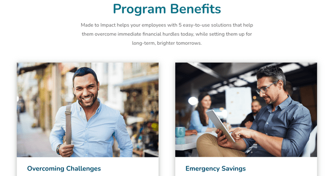
Made to Impact also utilizes an aesthetically pleasing ‘block’ layout to illustrate the benefits of its program – Step 4 of the StoryBoard framework.
And let’s not forget good old Step 6 – a CTA that our hero can’t refuse.
10 Nephesh Pilates
Made with Squarespace
Our final example of a website built with StoryBrand is Nephesh Pilates – a bespoke exercise studio run by founder Elisha.
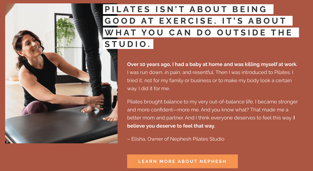
Elisha’s site – built with the ever-popular Squarespace – melds the spirit of her studio with superb StoryBrand messaging. Not only does Elisha tell of her own unique pilates journey, she incorporates her audience into the narrative, claiming “Pilates made me a better mom and partner. And I think everyone deserves to feel this way.
“I believe you deserve to feel this way.”
That, of course, ticks the first three steps in the StoryBrand framework off in one fell swoop: introducing the character and the issue, then Elisha as the guide and mentor. Story 4 – the plan – comes next.
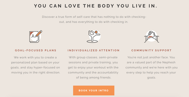
Throughout Elisha’s website, design, CTAs, and a recognition of customer pain points dance together in an elaborate waltz. Her calls to action – which, you’ll remember, constitute Step 5 of the StoryBrand framework – are woven throughout the site’s UX.
Step 6 – which highlights the negative consequences if the hero doesn’t seek help – is also documented throughout Nephesh Pilates’ site. When “the aches and pains of everyday life” are the alternative, who wouldn’t sign up?

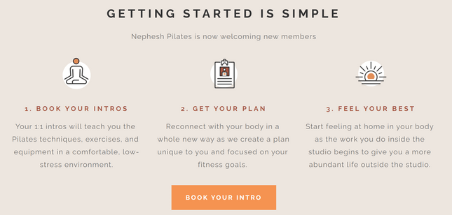
Oh, and let’s not forget Step 7 – the hero’s journey ending in success. Elisha’s website illustrates this beautifully, with a three-step guide providing a whistle-stop tour of Nephesh Pilates’ story.
Book your intro. Get your plan. Feel your best!
Summary: The Best StoryBrand Website Examples
After checking out the examples we’ve listed here, it’s easy to get intimidated. Surely I can’t create such a good-looking online presence? There’s no way my business could weave storytelling practices into its website…right?
Wrong! Actually, the formula for the storytelling is pretty simple:
- Establish the character/hero (your customer)
- Introduce the problem (their pain point)
- Present yourself (or your company) as the hero’s ‘guide’
- Lay out the plan (how your business can solve the problem)
- Call them to action (convert them)
- Help them avoid failure (outline the consequences of not seeking your help)
- Guide them to success (and turn them into a lifelong customer!
Plus, though these sites look amazing, there’s no reason yours can’t, too. Most of the best StoryBrand website examples we’ve included here have been created with website builders. Squarespace, Shopify – all make it simple to construct a website (then start storytelling through it!).
Not all builders are created equal, though, so it’s crucial to find the right one for your needs. Before you dive in, be sure to compare the best website builders on the market. For a more visual overview, our website builder comparison chart lets you weigh up all the top builders side by side, and contrast their key features and benefits.
Go check them out, and sign up. It’s time you started telling your brand story to the world!
For more inspiring content, check out our list of the best brand strategy examples.
Leave a comment