How to Build a Brand Online in 2024: My Easy 8 Step Guide to Success
If you click to purchase a product or service based on our independent recommendations and impartial reviews, we may receive a commission. Learn more
Want to know how to build a brand online? One of the first steps is designing your website’s branding, which will help your business stand out in today’s noisy market.
Cultivating your brand identity is key if you want to build rapport and trust with audiences, showcase what your business stands for, and leave a positive first impression in the minds of your website visitors.
Below, I’ll show you how to create an online brand that’s memorable, so you can differentiate your business from the competition and stand out (for all the right reasons!) Let’s delve into the eight key steps now.
1. Research and Identify Your Audience
First of all, you need to make sure that you understand your target audience. After all, your online branding needs to align with their interests and needs, whether that’s reflected through the tone of voice you use or the colors you’ve added to your homepage design.
To identify your audience, consider these research tips:
- Assess the competition – Look at your main industry competitors and see what they’re doing. An easy way to do this is by finding their social media accounts. Look at the kinds of followers they have, which posts their customers engage with the most, and the sort of comments they’re receiving. Can you identify common customer traits, like age ranges, interests, occupations, or lifestyle choices?
- Dig into current trends – Keep updated with what’s trending so you can ensure that your brand’s identity is useful and relevant to your audience. Conduct keyword research to see what people are searching for, read industry-related news sites or publications, and keep your eyes on social media sites like X or TikTok.
- Set up surveys – Once you have a better understanding of your target market, consider setting up a survey to collect customer feedback and see what your audience is most interested in. You could ask them about the companies they resonate with the most (and why), and their design preferences regarding text, fonts, colors, and imagery.
2. Write a Unique Value Proposition
So you’ve done the research, but what do you do with this information? Well, you’ll need to use it to figure out what your brand is and how it can fulfill your customers’ needs. It’s time to create your unique value proposition (UVP).
Unique value proposition = a concise statement that tells your customers exactly what you’re offering them, be it useful information, a product, or a service.
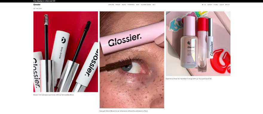
For instance, if you’re a beauty brand offering colorful eyeliners for a Gen Z crowd, your UVP might sound like: “Helping Gen Zers express themselves through bright, bold, and beautiful eyeliners”. Ultimately, it should highlight how your brand can benefit customers in a sentence or two, and emphasize how your brand stands apart from the competition.
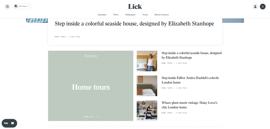
Below I’ve found two examples of impressive UVPs to take inspiration from:
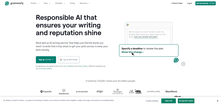

How To Create Your Unique Value Proposition
Now it’s time to write your own UVP, here are two ways to get your creative juices flowing:
- Work out your competitive advantage: Have another look at your competitors and see what they offer. Does your brand possess any unique qualities, features, or benefits that make you stand out? If you’re having difficulties thinking of one, it could be your superior customer service, innovative solutions, or your unique approach to solving customer problems.
- Consider your target audience’s needs: Identify key needs or pain points for customers. Once you’ve worked out what they’re looking for, you can use your UVP to explain how your product or service can help them. Try to keep your summary to under 50 words, and use language like “you” instead of “we” to put the customer first.

3. Create a Memorable Brand Identity
Now for the fun part: building your brand’s logo, colors, and fonts! For best results, I recommend keeping these aspects of your website simple. The aim is to create branding that’s easily identifiable online and doesn’t confuse or overwhelm website visitors. When someone looks at your homepage for the first time, they should be able to understand what you’re all about.
Choose Your Colors
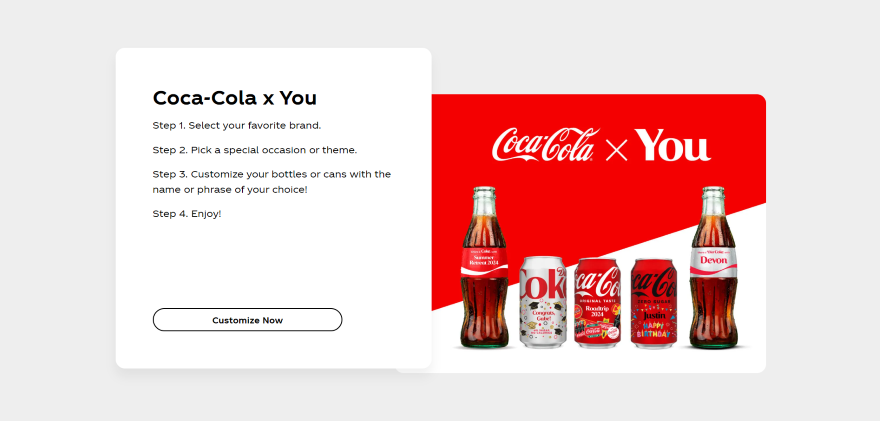
As you build a brand, your colors shouldn’t be bland, but they also shouldn’t include every color of the rainbow. To keep your website’s color palette balanced, aim for one primary color with one or two complimentary secondary colors. Notable examples include Coca-Cola, with its red primary color and white secondary color, and McDonalds, with its golden arches and red and white signs.
- Blue = Peace, security, and dependability.
- Red = Passion, love, and energy.
- Purple = luxury, royalty, and spirituality.
Make sure that the colors you choose reflect your brand. It’s very unlikely that you’d use a bold red for a meditation retreat website, or Barbie pink for a funeral home.
Pick your Font(s)
As you build your brand online, your website’s fonts will need to serve a functional and an aesthetic purpose. You’ll want them to be clear and easy for users to read, while also reflecting your brand’s unique personality and meshing well with the rest of your website’s design.
When choosing the best fonts for your website, keep these pointers in mind:
- Are they readable? Avoid choosing fonts that are tricky to read. You won’t be able to convey your brand’s message to audiences if your text is illegible!
- Are they versatile? Your website’s key fonts will need to look good in different formats, including bold, italic, uppercase, lowercase, and headers.
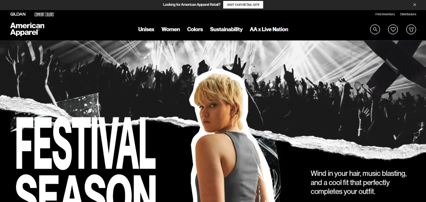
- Are they reflective of your brand? The fonts you opt for should also represent your brand’s personality. For instance, a fashion brand might go for curved edges, while an accountancy service might opt for something more minimalist.
Design a Distinctive Logo
To make a logo that’s effective, spend some time looking at some of the world’s most famous designs. What do they have in common? They’re typically uncomplicated, memorable, and often reflect abstract concepts within a few lines.
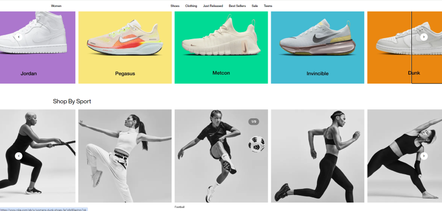
For this step, I recommend working with a professional (this could include an agency or freelancer) or using an online logo maker like Adobe or Tailor Brands to create your design. Your logo is a defining feature of your brand, so it’s worth investing some money into how it appears.
You’ll want to create multiple versions of your logo too. One should be just the symbol, while another should include your symbol and your brand name. This ensures that your logo is versatile and can be used across multiple touchpoints. For instance, you might want to print the symbol and brand name on your business cards, while the symbol alone will be a great icon for your social media accounts.
Develop Your Tone of Voice
Finally, you’ll need to establish your brand’s tone of voice, which will reflect how you interact with your customers online and tie together the visual choices you’ve made. It’ll also be at the heart of the content your brand produces, be it blog posts, product descriptions, adverts, or social media campaigns.
Even if you’re not the most confident copywriter, you can think about user personas to help you find the tone of voice that your audience will resonate with the most. A luxury brand targeting professionals with disposable income might sound sophisticated and articulate, while a playful drinks brand selling to youthful markets might sound more down to earth and use plenty of humor.
Below, I’ve created a few questions to help you out:
- Is your brand comedic and fun or serious?
- Is your brand chatty or formal?
- Is your brand quirky or down to earth?
- Is your brand experimental or traditional?
A great example of a brand with a strong tone of voice that matches its vision statement is Innocent, the smoothie company. Its consistency is impressive – everything from the lack of capital letters to the simple, informal language. The tone of its blogs, emails, and labels all work together to create a clear brand image.
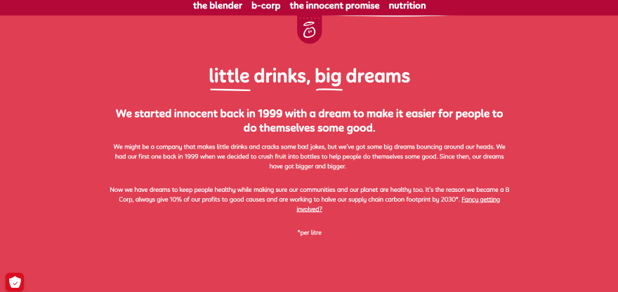
Playful, friendly, sustainable. These are just a few things Innocent wants you to associate with its brand, and it succeeds through its consistent use of voice. What are the three words you want to reflect your brand?
4. Build Your Engaging Website
Now that you’ve pinpointed your brand identity and UVP, it’s time to apply this creativity to your website. If you’re at the stage where you need to build a website from scratch, here are two ways you can create one:
- Hire a web designer – Got a generous budget and time to spare? You’ll benefit from a professional web designer. To find the best option, you’ll need to research each designer carefully, making sure that they’re legitimate and their style matches up with your brand. Additionally, you’ll want to create a design brief that will help your chosen web designer bring your vision to life.
- Use a website builder to create one yourself – Your second option, which is most appealing if you want to set up quickly, is to choose a website builder. You won’t need any specialized design or technical experience, since these builders come with all of the tools you need, from customizable templates to website features you can drag and drop onto each page.
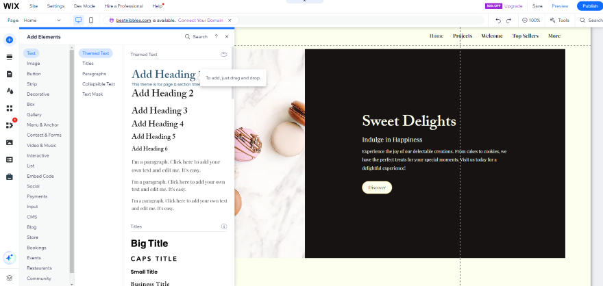
As you create a website that showcases your branding, keep these following questions in mind:
- Does everything look consistent? Examine each page and make sure that your branding is cohesive. Your website’s copy, imagery, colors, and fonts should look well-integrated, so try to spot any design choices that clash (unless it’s deliberate!).
- Do your visuals enhance your content? Your visuals shouldn’t overwhelm the user. Instead, they should help them navigate your website, or enhance their understanding of your brand. Use images wisely and don’t clutter the page, which is a common website design mistake I’ve seen.
- Does your website guide the user from A to B? A seamless user experience needs to be at the heart of your website, allowing website visitors to navigate through each page with ease. Does your website follow an intuitive structure? Or does it feel more like a maze? If you want users to appreciate your branding, you’ll need to guide them through your website, not frustrate them.
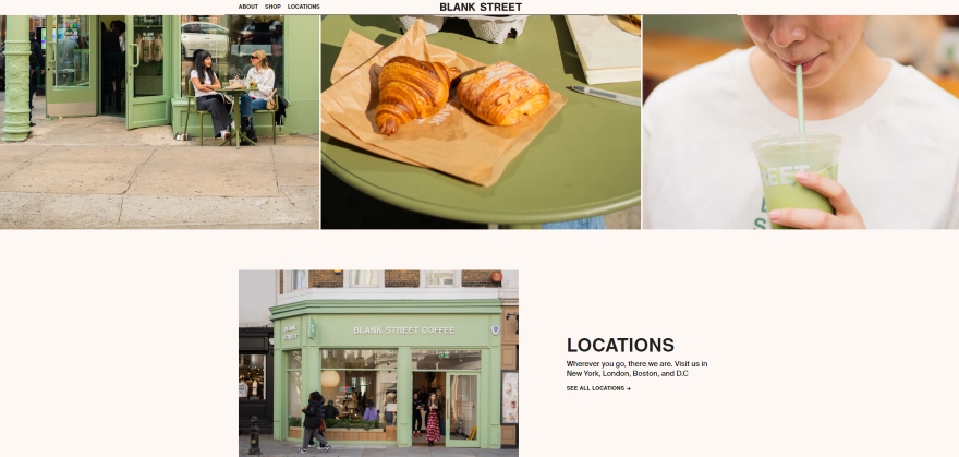
- Is your brand’s narrative clear? Most importantly, your website’s message should be as clear as day. To achieve this, I recommend adding an “About Us” page that explains your business’ story, and use website imagery (beyond stock photos) that showcases your brand in the best light.
5. Create Content That Reflects Your Brand
With your website built, you now have a solid foundation for your brand’s content. The content you create should reflect your brand’s overarching message and be in alignment with your audience’s needs and pain points. But what sorts of content should you add? Here are a few ideas:
- Blog posts – Posting informative blog content regularly can increase your brand’s authority online. For instance, if you’re a healthy drinks brand, then you could create 101 posts on the health benefits of a particular ingredient, exercise regimes for a better lifestyle, ethical production practices, and so on. If your posts are positively received, you may also find additional engagement through comments and shares too!
- Video – Creating branded videos is a dynamic and engaging way to add content to your website. You can create marketing videos that share your brand’s mission statement, showcase your team, and demonstrate how your product or service can bring value to customers.
- Infographics – A brilliant way to showcase your knowledge and design skills, infographics are an eye-catching form of visual content that simplifies data through colorful visuals and copy. You can use them to capture your audience’s attention and share valuable, digestible insights.
Remember to keep all your content in line with your tone of voice. That includes any videos you create, or graphics you design – don’t let them clash with the tone of your content, but do have fun showing the world what your brand is all about.
Should I Create Social Media Content Too?
Absolutely! Creating social media accounts and posting regular content can help you grow awareness of your brand online by reaching new audiences.
Before you begin, identify the platforms that suit your brand and will appeal to your target audience. For instance, if your target audience is Generation X, Facebook is a sound choice, while Gen Alpha are more likely to hang around on TikTok or Snapchat.
Once you’ve set up your social media accounts, you’ll need to fill in key business details that audiences will see when viewing your account. This includes your:
- Account name – If possible, your account name should be the same as your website name for consistent online branding. Unfortunately, if the name you want is taken, you may have to experiment with different variations.
- Account bio – This bio should be short and sweet, summarizing your brand and what you offer. If you need help creating one, think back to your UVP. Can you tweak it slightly to make it appropriate for the platform you’re on? Also, most social media platforms have word counts, so keep your sentences as concise as possible. You could also use emojis to convey visual ideas!
- Icon – This icon represents your brand on each social media platform, so I recommend re-using the logo you created back in step three.
- Contact details – Don’t forget about key contact details like your email or phone number. It gives new audiences a few ways to reach out if they’re interested in what you offer.
What Should My Social Media Content Be About?
This will vary depending on your industry. However, a key part of your social media strategy should be to regularly scour each platform, keep on top of the latest trends, and discover what topics your audience is talking about. This way, you’ll be able to generate fun and relevant content ideas based on what’s popular.
As you create and post your content, be it short form videos or striking photo carousels, you should then start social listening to keep track of what people are saying about your brand online. By doing so, you’ll be able to understand how people are reacting to your content, and whether you need to tweak your strategy to improve engagement with audiences.
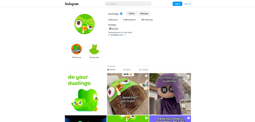
Additionally, regular posts are brilliant for your SEO, since it can increase your brand’s visibility online. Remember to use relevant industry keywords in your posts too.
6. Leverage Influencer Marketing
By this stage, you’re already using multiple channels – including social media and content marketing – to grow your brand’s influence. Now, it’s time to grow that influence even more – and you might choose to do that with an influencer marketing strategy!
Influencers are online personalities with followings on social media, which come in micro, macro, nano and mega form. Your job is to find out which ones are most relevant to your brand. Do they reflect your company values? Or are they key players in your industry? After identifying the right influencers for you, you can work alongside them to boost your brand’s presence online.
Here are three key steps to follow when creating your influencer marketing strategy:
- Find your influencers – To find influencers, I suggest looking through industry-relevant hashtags, seeing which influencers your rivals are using, scouring blogging websites, or signing up to influencer marketing tools like Upfluence or Modash.
- Establish partnerships – Found your targets? Now you can drop them friendly emails or messages to express your interest in working together. Be clear about your brand’s values, objectives and, crucially, what you can offer the influencer in return. You want to build genuine relationships with them.
- Track and measure your influencer campaigns – Set clear goals and key performance indicators (KPIs) to measure the success of your influencer marketing campaigns. Track metrics such as reach, engagement, website traffic, conversions, and brand mentions on an ongoing basis to assess how effective your partnerships are. Lastly, adjust your strategy as your insights grow to optimize future influencer collaborations.
7. Don’t Neglect Your SEO
After spending so much time on your branding, it would be huge shame if it wasn’t seen by anyone. That’s why you can’t avoid working on your website’s Search Engine Optimization (SEO). Having a good grasp of this technical skill can help you improve your website’s ranking on search engines like Google, ensuring that you appear on the first page of search results.
Unfortunately, your SEO won’t magically take care of itself, but there are some easy SEO basics to learn that can help your business climb up those Google rankings:
- Check you have an SSL Certificate – First of all, you need to make sure that your website is secure and has an SSL Certificate. This will encrypt data that passes through your website, such as card details and login information. If you don’t have an SSL Certificate, Google will warn visitors that your website isn’t secure. Fortunately, most website builders come with a free SSL, or you can use a platform like Let’s Encrypt.
- Compress your images – According to Google’s Core Web Vitals, site speed is an important ranking factor for websites. An easy way increase your speeds is to compress your website’s images. For this task, you can use a tool like ImageResizer to optimize multiple images at once.
- Break up your website’s content – Since Google prioritizes content that puts readers first, you’ll need to make sure that your content is user friendly. Use content features like headings (H1s, H2s, H3s, etc), bullet points, numbered lists, short paragraphs, and white space to keep your website’s content digestible.
8. Encourage Customer Reviews and Testimonials
Want another way to bolster your brand’s online presence? It’s time to look into social proof, which includes positive testimonials, star ratings, and customer photos. Once you start receiving positive feedback from your audience, or endorsements from other brands, you can use these glowing reviews to win even more customers going forward.
Here are a few ways to start collecting social proof:
- Request feedback from customers – Being active is the best way to find positive testimonials for your brand. You could send follow-up emails once someone has bought from you, or engage with them through customer service channels. However, don’t be too forceful with your customer follow up. Always ask politely and, if you want to really sweeten the deal, offer them incentives and rewards in exchange for their opinion. This could be a 20% off discount or access to exclusive content or events.
- Have a dedicated section for reviews on your website – If you want your audience to leave reviews, you need to make it easy for them to do so in the first place. For instance, many ecommerce shops will let you leave reviews on product pages, while some will even let customers upload a photo or star rating representing their experience – heightening the credibility and authenticity of your brand overall!
Of course, not all of your customers will be satisfied with what you’ve offered them, so you do need to learn how to address negative reviews. When responding to negative reviewers, engage the customer promptly, professionally, and with empathy. Address their concerns first, then try to find a solution that can rectify their problem. By doing so, you’ll demonstrate to other customers that you’re committed to their satisfaction.
How To Build a Brand Online: Conclusion
Though you now know how to build a brand online, this is only the beginning! As your brand evolves, you’ll likely be revisiting your website’s branding and tweaking it based on new developments. Finetuning your branding is a continual process, not a one-time activity.
For instance, if you’re tracking your website’s analytics through tools like Google Analytics, your branding might need to change slightly based on new data you’ve come across.
Additionally, I recommend gathering customer feedback once you’ve launched your brand. That way, you can see how people are responding to your website and whether you need to make any pressing changes. If you keep on top of your website’s progress, you’re more likely to cultivate a brand that stays in the minds of your customers for longer – good luck!

2 comments