I’ve Found the Top 8 Types of Website Imagery in 2024: Spice Up Your Page
If you click to purchase a product or service based on our independent recommendations and impartial reviews, we may receive a commission. Learn more
When designing your website, you need to make strong imagery a priority. Impactful visuals enable you to showcase your company’s unique branding, stylishly promote products or services, and even leave website visitors with a positive first impression of your business.
Not sure which imagery to go for? If you’re struggling to come up with eye-catching visuals, I’ve compiled a list of eight types of website imagery designed to entertain, inform, or convert audiences, be it relatable user generated content or pristine vector graphics. Let’s get stuck in.
Why Are Images Important on a Website?
We consume images everyday – whether through huge marketing billboards or Instagram feeds – so distinctive imagery is a key ingredient to your site’s success. It’ll help you:
- Create a positive first impression with site visitors, especially when attention spans are so short (it takes only 50 milliseconds for someone to form an opinion of your site!)
- Influence users to take action, which could mean purchasing one of your products or signing up for a service.
- Lead site visitors around your pages, helping them navigate towards other content such as blog posts or email marketing sign up forms.
Ultimately, website imagery makes up a huge chunk of your business’ branding, so your visuals will need to look appealing and accurately represent who you are and what you offer.
Now that you know about the importance of eye-catching visuals, let’s delve into the eight different types of website imagery you should consider using on your page:
1. Stock Photos
Best for: Making a business site look more professional and polished. Stock photos are particularly great for businesses sharing informational content like blog posts or news stories, since they complement text well.
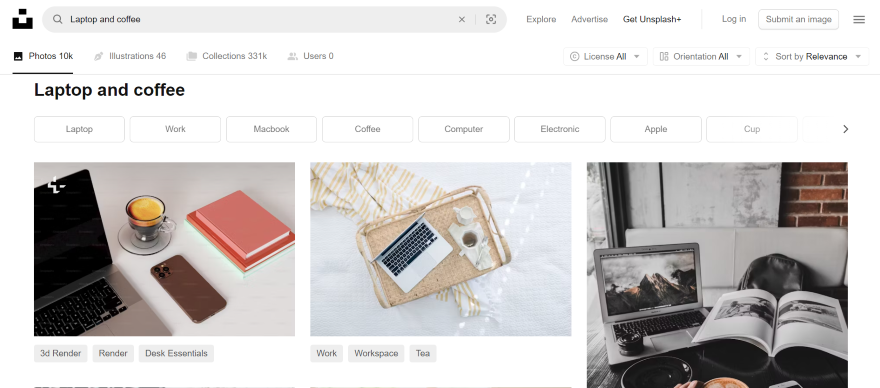
Stock photos are existing images that can be licensed for business or creative purposes, and are usually sourced through online image libraries, such as Unsplash or Pexels.
They’re a great option for websites that don’t need branded visuals, and instead, want to use more universal or generic images to convey a message. If you don’t have the budget or time to get professional imagery, stock photos are a handy resource to tap into.
The downside to stock photos is that your website might seem less unique in comparison to others, and the images won’t show a true reflection of your company or services. If you do want to use this type of website imagery, do so sparingly and make sure the visuals you choose are relevant to your website.
2. Custom Photos
Best for: Businesses who want to build trust with their audience. Custom images tell visitors that your site’s content is original and produced by real people, adding a personable and genuine touch to a page.
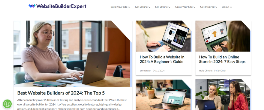
Custom photos are a great way to make your website stand out. From product photography to team photos, this form of website imagery can help you achieve a cohesive look online that remains relevant to your brand.
It’s an effective visual type to choose, especially if you’re selling products or services because customers want to see images of what they’re purchasing.
You don’t even need to shell out lots of money on getting custom photos done professionally if that’s not in your budget. There are plenty of mobile phones that can capture some incredible shots! If you do opt to take the photos yourself, though, make sure your images look professional and have a high-resolution finish for your website.
3. User-Generated Content (UGC)
Best for: Adding social proof to your site and building credibility, especially if you’re selling products or services. You can share customer photos to indicate that you’re a reputable brand to buy from.
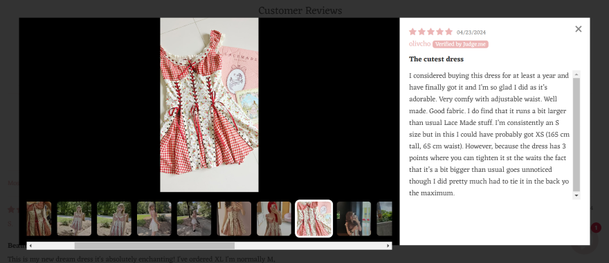
User-generated content refers to imagery – or any form of content really – that has been created by customers and shared online. Social media is a powerful resource to utilize and a great marketing tool.
A lot of businesses are turning to loyal customers for content, whether they’re reposting user posts across social media or on its website like La Croix, or engaging with customers through hashtags and messages.
Understanding your customers is essential if you want to run a successful business, and engaging with them in this way not only makes customers feel seen and understood, but appreciated too.
By sharing user-generated content, you boost your credibility with the evidence of customer satisfaction, and it encourages even more users to trust you.
4. Video
Best for: Businesses who want to showcase multimedia content on their site. This could include videos that demonstrate past projects, company values, or success stories.
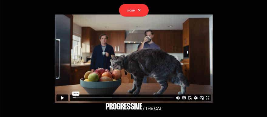
We all know what a video is, but did you know that adding them to your website can help you boost engagement with visitors?
Unlike a static image, a video is a great website imagery choice if you want to promote a message that’s impossible to do with a photo. You can pack in more information and a large number of visuals into a single video, while it’s also an entertaining way to keep visitors on your site for longer.
If you’re selling products or services online, I recommend creating a video marketing strategy to boost sales – handy video tutorials or examples of a product in use are the perfect way to engage with potential customers.
Equally, you could use videos to share interviews with happy clients, or members of your team talking about the company.
5. Infographics
Best for: Businesses who want to build up authority in their chosen industry, since it’s an effective way to share knowledge with a wider audience.
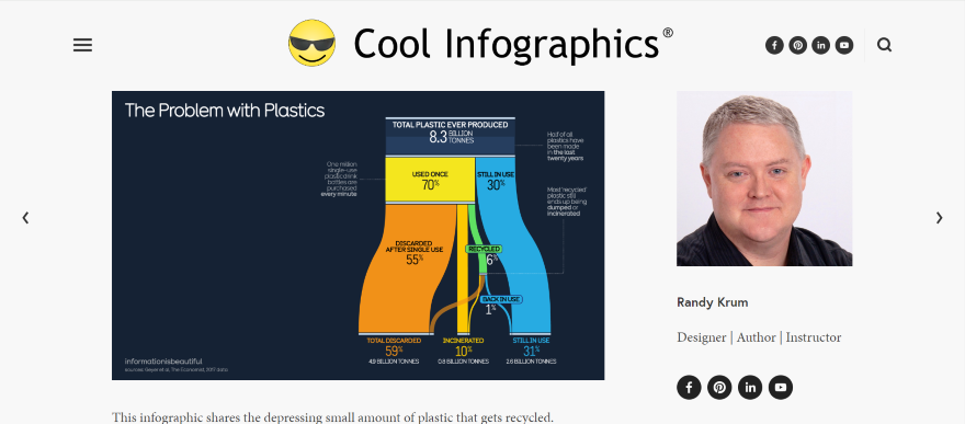
Infographics are a digestible form of engaging visual content that helps users to consume lots of data at once.
The purpose of this type of website imagery is to condense information and lengthy concepts into bitesize graphics in order for readers to understand the key takeaways quickly. So, be wary of overloading your infographic with data. I advise keeping it simple and tidy to avoid visitors to your website being overwhelmed.
Infographics are a visually pleasing way for websites to share a story with an audience, and they help break up text-heavy pages to keep visitors engaged. If users are impressed by them, they may also want to share it with others, so be sure to keep social sharing buttons nearby too!
However, if you do want to use infographics, make sure you find a consistent style to use across your website to avoid looking messy.
6. Animation
Best for: Businesses that have creative branding. Animations are ideal for portfolio sites, creative businesses, and design agencies who want to showcase their style, impress their audience, and find work.
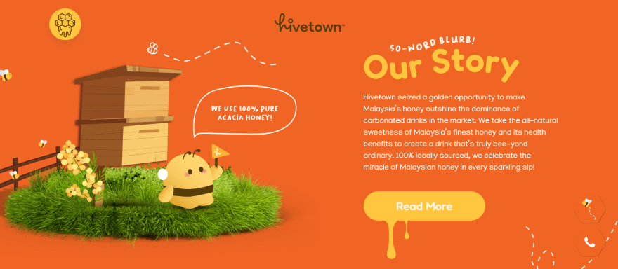
Animating elements of your website is an exciting way to keep your website engaging and interactive for visitors.
Whether you animate your navigation bar, include a dynamic background, or get creative with motion and transition effects across your pages, this form of website imagery catapults your website into the future.
This trendy design gives users a smooth experience, providing them with real-time feedback as they navigate the website or scroll through your content.
Though it can be tempting to get carried away and animate everything you can get your hands on, you don’t want to go overboard and add animation for no reason! It’s best to keep things simple yet effective – making sure your audience can easily navigate and read your website is the priority.
7. Overlays
Best for: Businesses who want to increase conversions on their site. Ensure that your overlays have clear calls to action, encouraging audiences to follow through with what you want them to do.
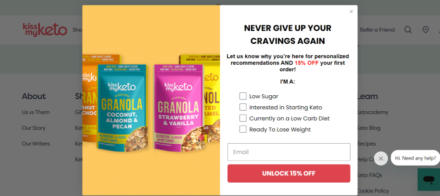
Overlays, as the name suggests, place elements — such as images of text — on top of each other to emphasize certain content. You’ll have seen them everywhere!
They’re usually added to a website to encourage users to sign up for marketing emails, or to persuade customers into making a purchase by promoting special offers.
It’s a powerful technique that helps add depth to your website, makes information stand out, and helps you engage with your target audience.
With an overlay popping up on a page, you can focus the visitor’s attention on one select thing, whether that’s a call to action or an update you need to share.
8. Vector Graphics
Best for: Businesses who want to show off their technical design skills. Also suitable for companies who want to add some creativity to their branding, be it through illustrative marketing materials or eye-catching logos that are used across touchpoints.
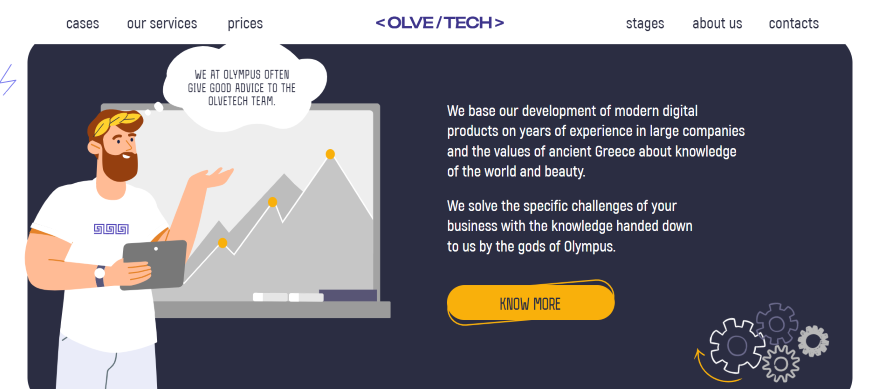
Vector graphics are website design images built using mathematical formulas. Sounds technical, right? But don’t worry — they’re used everywhere!
There is a learning curve to tackle if you want to create this type of website imagery yourself, but once you do, your website will be full of professional and high-quality visuals.
As website imagery goes, vector graphics are the ideal choice if you’re looking for something flexible and highly-customizable. You don’t need to worry about pixelation when scaling an image up or down, or slowing down your website’s performance thanks to the small size file.
Since it doesn’t lose its quality when resized, vector graphics are often used for marketing assets and business logos.
Top Website Imagery: Summary
Website imagery is critical if you want a professional and stylish website. The important thing to remember is that you should include images of some sort across every page, whether that’s custom photos or infographics. This helps to keep visitors engaged and stops them from becoming overwhelmed with text.
Of the eight top types of website imagery we’ve shown, find what works best for your business needs and company aesthetic, or even choose a mix of a few of them to create a visually pleasing experience for your customers.
Now that you’re here, start finding professional photos for your website to spruce up each page. I can’t wait to see what you find!
Leave a comment