How to Write a Call to Action: A Step-By-Step Guide
If you click to purchase a product or service based on our independent recommendations and impartial reviews, we may receive a commission. Learn more
Do you ever wish you had the power to get people to do what you wanted? Well, that’s exactly the superpower amazing calls to action provide for your website. With them, you can utilize conversion rate optimization to boost conversions and get some big wins.
Calls to action entice and motivate readers to, well, take action – whether that’s to buy a product, sign up to a newsletter, or download an ebook.
But simply adding a button that says “Click Here” onto your website isn’t enough – you need to put some time and thought into crafting the perfect call to action if you want to see results.
We’ll walk you through the steps to writing a powerful call to action, from the language to use, to how to format them using color and placement.
After that, we reveal the common mistakes that you should avoid at all costs – so read on to find out how to beat the competition with winning calls to action.
What Is a Call to Action?
A call to action is the name given to anything that prompts the user to take action! You most commonly see them in the form of buttons such as “Click Here” or “Add to Basket” – they’re inviting the user to do something.
How to Write a Call to Action: Step-By-Step Guide
A call to action is your best way to get visitors to complete the action you want them to, whether that’s make a purchase, sign up to a newsletter, or book an appointment. We’ll show you how to write persuasive, effective calls to action to inspire immediate action from your users.
1. Use Active Language
The first tip for writing motivating calls to action is to start with a commanding, active verb. Think about the most common calls to action you see online:
- Find out more
- Buy now
- Download for free
- Unlock your discount
All of these start with an active verb, and use imperative language – they’re telling the user exactly what to do. In fact, they sound almost bossy!
This makes it clear exactly what you want the user to do, removing any doubt that they might have about what they should do next. It also inspires action – imagine if you saw a call to action that read:
“A discount is available if you want.”
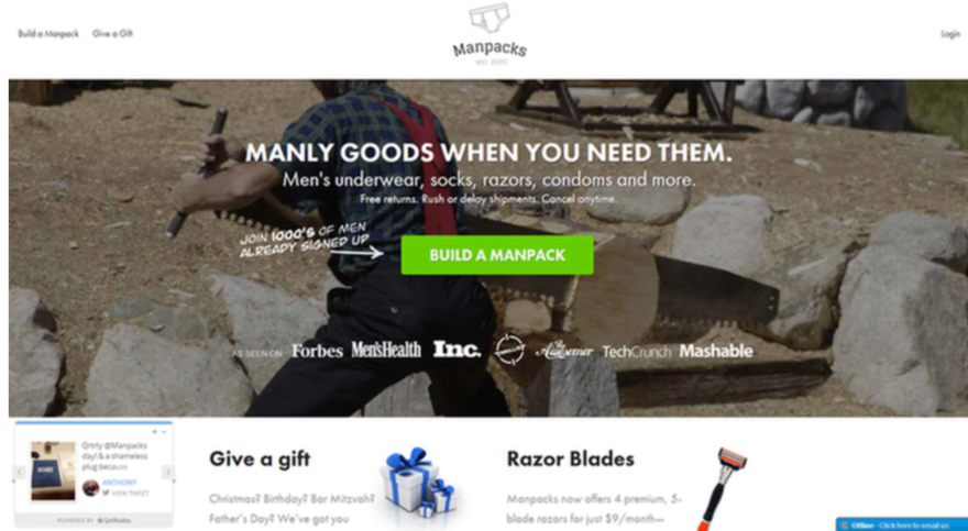
Does this language fire you up and make you want to click? Probably not – it’s not even clear how you should go about getting your hands on the discount! This also highlights the importance of being specific. You need to be crystal clear about what you want your visitors to do, and exactly what they’re going to get out of it.
By using active and specific language instead of doubtful, vague, or passive language, you’re setting the user up to take action themselves – and increasing your chances of getting clicks!
Find out more
Learn more tips and tricks about Writing for the Web in our 19-step guide for creating better online content!
2. Be Direct and Personal
Which call to action are you more likely to click on?
- Get a discount
- Unlock your discount
Hopefully, you’d rather choose the second one, because it’s key to our second step for writing winning calls to action. You should always directly address your users using words such as “you” and “your” – this helps people to feel a personal connection and sense of ownership over whatever you’re offering.
You should avoid general language or referring to your users in the third person – such as “People can get their discount here” – because this prevents your users from connecting with your call to action.
If you want to go a step further in connecting with your users, you can write them in first person – for example: “Claim My Discount!” This creates a much greater sense of ownership and makes users feel as though they have more control over the decision to click.
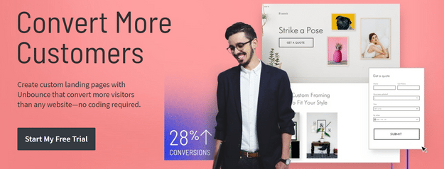
Unbounce found that changing button text from “you” to “me” resulted in a 90% uplift in conversions!
3. Focus On Benefits
When you’re writing calls to action it can be easy to get caught up in what you want out of it. You want people to click, and convert, so that you can reap the benefits – whether that’s more people reading your ebook, or buying your products, or joining your newsletter.
The trouble is, most users don’t care what you get out of it – they want to know what they can get out of it!
This is why it’s important to write benefit-focused calls to action. The first step here is to identify and understand the problem that your users are facing, and how you can solve this problem. You then use this angle to lead your call to action copy.
For example, will your ebook help entrepreneurs double their sales? Or will your product last five times longer than your competitors’? These are the kinds of things to be thinking about when writing your calls to action.
Instant Gratification
Another tactic here is to make the most of people’s desire for instant gratification. This is simple enough to do, by using words such as:
- Now
- Today
- Instantly
- In seconds
And then make sure that you live up to your promise, so that your email or download is sent straight away. If you’re selling physical products, don’t promise that you can deliver instantly, but do send a confirmation email quickly along with delivery information.
Social Proof
Social proof is a phenomenon where people are more likely to do something if they see other people doing it first. It’s a classic case of kids wanting the same toys as they’re friends – as it turns out, none of us really grow out of that phase!
You can use social proof to highlight the benefits of whatever it is you’re promoting, while at the same time encouraging people to engage with your call to action. If you have data about how many people have downloaded your ebook, for example, shout about it in your call to action.
By telling people how many others have already signed up, used, or bought your product, it makes them more likely to trust and be interested in your business.
You can even get a real-life testimonial from a customer and incorporate it into your call to action – or place it nearby so that users see them both at the same time. Testimonials have been found to increase conversion rates on sales pages by 34% – so it’s worth a try!
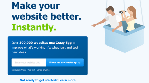
Crazy Egg is a master of creating effective calls to action – this example combines many of the tactics we talk about in this guide, but its use of social proof and instant gratification particularly stand out:
Highlighting the word “instantly” in green plays on our need for instant gratification, and putting the number of websites using Crazy Egg is a prime example of leveraging social proof. This call to action also uses a first person button and clearly shows what the benefit to the user is – to make their website better!
Find out more
Discover how you can create better social proof by checking out our infographic: How to Use Online Reviews to Market to Different Generations
4. Create Urgency and Curiosity
Humans are pretty predictable when it comes to both urgency and curiosity.
When told not to look in a box, we can’t help but take a peek at the first chance. And whether it’s panic buying toilet rolls or rushing to the sales, we also have a strong fear of things selling out before we can get our hands on them.
While both Pandora’s Box and panic buying both have less than ideal effects on society, you can leverage both urgency and curiosity for good with your calls to action.
Creating Urgency
Now, when we say urgency we don’t mean strike fear and panic into the hearts of your audience. Instead, show that there’s a limited time or amount for customers to get their hands on, whatever it is you’re offering.
You can do this by having a countdown timer showing how long is left on the offer, or by actually showing the number of products left available. You should also use urgent language, such as:
- Limited time only
- Selling fast
- Don’t miss out
- Now
- Soon
- Hurry
- Sale ends soon
Be careful of being too pushy – you want to trigger people’s FOMO (fear of missing out) so that they want to get in on your offer. You don’t want to panic or overwhelm them so that they exit your website in a hurry!
Fostering Curiosity
Curiosity is a powerful way to capture attention, spice up your call to action, and boost conversions!
The key here is to use questions. Why are all your plants dying? How can you double your internet traffic? What is the secret to fitness success? Make your users want to know the answer, and make it clear what they need to do to find out, whether that’s downloading your free ebook or signing up to your newsletter.
5. Use Persuasive Language
It’s time to get persuasive!
If you follow the steps we’ve already gone through, you’re already well on your way to creating a persuasive and powerful call to action. You can give it an extra edge by using some persuasive tactics – start off by using power words in your calls to action.
What are power words?
These are words that trigger an emotional response in your readers – you shouldn’t overuse them, but sprinkling them through your copy can have huge effects. Teespring added a few power words to its calls to action and saw a 12.7% increase in conversions!
There are hundreds of power words, but here are a few examples:
- Exclusive
- Savings
- Ultimate
- Sneak peek
- Unbelievable
- Free
- Simple
- Intriguing
- Forbidden
- Successful
You can see how these words could spice up an otherwise boring call to action and catch a reader’s immediate interest. Remember not to use them too much though, or you’ll sound salesy and sleazy.
OptinMonster give us a great example of how to use power words effectively with its homepage call to action:
Words such as “now”, “monetize”, “powerful” and “instantly” are all designed to trigger an emotional response in the reader – and the visual on the right supports this idea of action and change.
Find out more
Persuasive language isn’t just helpful in calls to action – our How to Write Product Descriptions guide shows you how to use these techniques to sell your products too!
6. Keep Calls to Action Short
Short enough to fit nicely into a button, anyway – try to keep your calls to action under 10 words if you can!
Too much copy could bore the user and lose their attention, or confuse them with too much information. You want to pack in the essentials, while keeping it short, punchy, and concise – it’s a tricky game that even the most experienced copywriters still struggle with sometimes!
You just spent five whole sections talking about all the important parts of a call to action – how can I fit all that into 10 words or less?
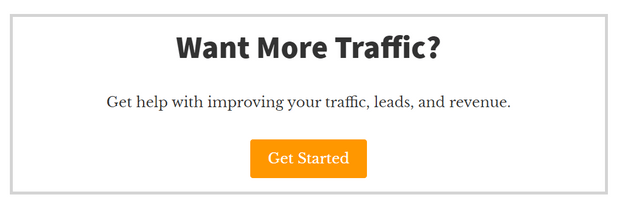
Okay, don’t panic – there are ways to incorporate everything without cramming it all into your call to action. You can place your call to action next to a testimonial, or have the surrounding copy emphasizing the benefits of your product. Here’s what our calls to action look like here at Website Builder Expert:
You can see that the button itself is in first person, uses active verbs, and positive language. But there’s also a little bit of context that allows more time to prepare and persuade the reader to click the button.
7. Make the Most of Colors
Colors are so important when it comes to calls to action. Our advice is to test, test, and test again. Create a red call to action and a blue one, for example, and use a software like Optimizely to see which version people respond to better.
Does it really make that much difference? Yes, it really does!
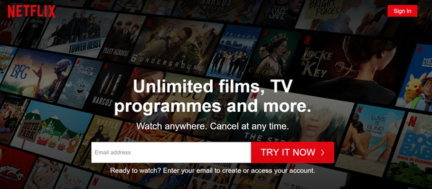
Pick a color that stands out for your button background, and make sure that your button text is easy to read. It’s a good idea to pick a color from your color scheme so that your call to action grabs attention, while still looking like a natural part of the webpage.
Netflix is a perfect example – the bright red calls to action are eye-catching while remaining totally on-brand:
Find out more
Struggling with your color scheme? Check out our guide on How to Choose a Good Color Scheme For Your Website for some expert tips!
8. Think About Size and Position
When you’re designing your call to action, you need to remember that it should be one of the most noticeable things on the page. That doesn’t mean you should make it huge and “in-your-face” – there are some more subtle ways to draw attention to it, including:
- Always placing your call to action above the fold (meaning the user doesn’t need to scroll down to see it)
- Making the main call to action button bigger and brighter than any other button on the page
- Only having a single call to action per page, to avoid confusion
- Using title case within the button itself
You can get more tips on blog formatting here.
Find out more
Need some help designing your website? Check out our handy guides:
- How to Design a Product Page – get expert design tips to boost sales
- How to Design a Website – 8 simple steps for creating your very own website
- CRO Audit: Adding CTAs to your website can really help boost conversion rates
9. Personalize for Your Audience
Personalization is so much more than a buzzword – it’s a game-changer for your calls to action. Why? Because it taps into the individual needs and preferences of your audience. Imagine seeing a CTA that feels like it’s speaking directly to you. You’re far more likely to click, right? That’s the power of personalization.
To nail this, you need to dig deep into your audience’s demographics, behavior, and interests. Are they young tech-savvy entrepreneurs or retirees looking to start a hobby? Knowing this can help you tailor your language and offer in a way that hits home. Conducting market research can be one way to help get to know your audience better!

But don’t just take our word for it. A/B test your personalized CTAs against more generic ones. The data won’t lie, and you’ll quickly see which approach is raking in those coveted clicks and conversions. So, get personal and watch your engagement soar.
10. Use Social Proof
Ever heard the saying, “The proof is in the pudding”? In the world of CTAs, the proof is in the social aspect. Social proof is the psychological activity where people are more likely to take action if they see others doing the same thing. But how can you leverage this in your CTAs?
Start by showcasing positive reviews, testimonials, or ratings. These act like a word-of-mouth recommendation and boost trust and credibility instantly. Don’t stop there, though. Flaunt your numbers — whether it’s the amount of satisfied customers, subscribers, or even social media shares. Not only does this highlight your popularity, but it also implies a broader endorsement of your product or service.
Want to go the extra mile? Feature logos of well-known clients or partners, and include real-life success stories or case studies. These add layers of authenticity and authority that are hard to ignore. And if you can get an industry expert or influencer to back you up, you’re golden.
Remember, the key is to align your social proof with the context of your CTA and what you know about your target audience’s preferences. Get this right, and you’re not just persuading; you’re compelling action.
Find Out More
Check out these Social Proof Examples for more information and inspiration!
What to Avoid When Writing Calls to Action
Now that we’ve walked you through the main calls to action dos, here are the don’ts – we know you’re going to be a pro, so we’ll whizz through them before hitting the recap.
#1. Avoid friction words
Friction words are words that might put the user off such as submit, sign up, buy, or complete – you want the action to be easy, and these words make it sound like work!
#2. Minimize risk
You can do this by offering a free trial or sample, or reassuring the user you don’t need any payment details from them. Don’t badger them for upfront payment or a gazillion personal questions to download your ebook – remember, keep it simple!
#3. Fight the boring!
So many calls to actions just say “Click Here” – you can get ahead of the competition by going the extra mile and putting some effort into enticing your users.
#4. Provide a smooth user journey
If your call to action says “Download Your Free Ebook” you’d better make sure your users end up with a free ebook in their inbox!
#5. Check your links
Broken links are a bullet to the head of any call to action, no matter how well-written or beautifully formatted. Check and double check all your links to make sure they work, and go to the right destination.
How to Write a Call to Action: Summary
For such a small button, calls to action certainly demand a lot of love and attention – but it’ll be worth it when you see the sales, clicks, and conversions come rolling in!
Here’s a quick recap of the steps we’ve gone through to reach this point:
How to Write a Call to Action: 10 Steps
- Use active language
- Be direct and personal
- Focus on benefits
- Create urgency and curiosity
- Use persuasive language
- Keep calls to action short
- Make the most of colors
- Think about size and position
- Personalize for your audience
- Use social proof
We also walked you through the common mistakes to avoid, so that you can get ahead of your competition. Hopefully you’re now feeling like a call to action pro, and are ready to leap into action and start creating some for yourself!
These tips can be applied to more than just written CTAs. Read our article on video marketing mistakes and see how you can improve in this often overlooked marketing format.

2 comments