About Us Page Examples: 14 Inspiring About Us Pages
If you click to purchase a product or service based on our independent recommendations and impartial reviews, we may receive a commission. Learn more
So, you’ve built a great website using a leading website builder and a great business website template – now what? The About Us page will most likely be one of the first pages you’ll design. This is a crucial step, because this is where your potential customers can learn more about you and your business.
A great About Us page can actually make all the difference for your website. This is how you can gain your customers’ trust by telling them more about your story, through impactful words and visuals.
In this guide we breakdown the key features of a good About Us page and give you some inspiring About Us page examples.
Want to write an out-of-this-world About Us page? Then you’ll want to read our comprehensive guide to writing an About Us page .
What Is an About Us Page?
The About Us page of your website is an opportunity for you to tell the story of your business, your values, and your achievements. The way you decide to approach this is very important, as the design, visual aspects, and written content showcases how you want your brand to be seen. This is how you can attract customers to your online store who are actually in your target audience.
Some key elements of a good About Us page include:
- A mission statement, vision statement, and company values
- The company’s backstory
- Content written in the brand’s tone of voice, which should be decided with the audience in mind
- Social proof such as testimonials, reviews, awards, or case studies
- Team information such as people’s roles or personalities
Company Values
The first key thing to include in your About Us page is a clear and concise mission statement. A good mission statement explains the purpose behind your brand and connects with your audience. Look at mission statement examples for inspiration before starting yours.
A mission statement will guide your customers as to whether they think they should shop with you or not. It’s an opportunity to show what’s unique about you and your business. This is also the perfect place to showcase your brands’ vision statement.
Another crucial point is outlining your company values. What do you stand for? What kind of image do you want to portray to your customers? This will show the “human” side of your business, and help make it more relatable. Also, customers will be more willing to trust a company that aligns with their own values.
Your Story
Every single company has a story, so tell yours! Start with the reason behind starting your business, the idea or problem that prompted your first steps, be open about challenges you’ve faced along the way, and pick out some of your favorite moments to share as well.
Your customers will want to know about your backstory, and what made you want to start your business in the first place. Talk about your breakthroughs, your milestones, and your evolution of building your brand. Basically, how your business got to become what it is today. Sharing your company story will help your clients to empathize with you and your business.
Tone of Voice
When telling your story it is important to consider your tone. This should be closely linked to your brand and values (such as using an authoritative, fun, or direct tone), but should also consider your audience and the tone they are most likely to be receptive to.
Social Proof
If you have some, definitely showcase your past achievements or positive reviews. If others have trusted you in the past and were happy about the outcome, new customers are more likely to trust you themselves! Adding testimonials to your website will also help you build your credibility as a whole, and prove that what you are claiming is true.
Introduce the Team
Finally, put a face to the business! Introduce the team – if you have one – and the founder. Some classic ways of doing this is to include a photo of each person, along with their role in the business and a short bio, quote, or fun fact!
Find Out More
- If you want more specific tips on How To Write a Bio for a Website then our step-by-step guide has a full breakdown.
- We crafted a guide specifically to help local businesses. Check out our About Us Page Tips for Local Businesses for more helpful advice.
Inspiring About Us Pages for 2024
With all these tips in mind, you should have all the tools needed to write an About Us page. Here are 15 About Us page examples to give you some inspiration to build your own.
1. Reformation
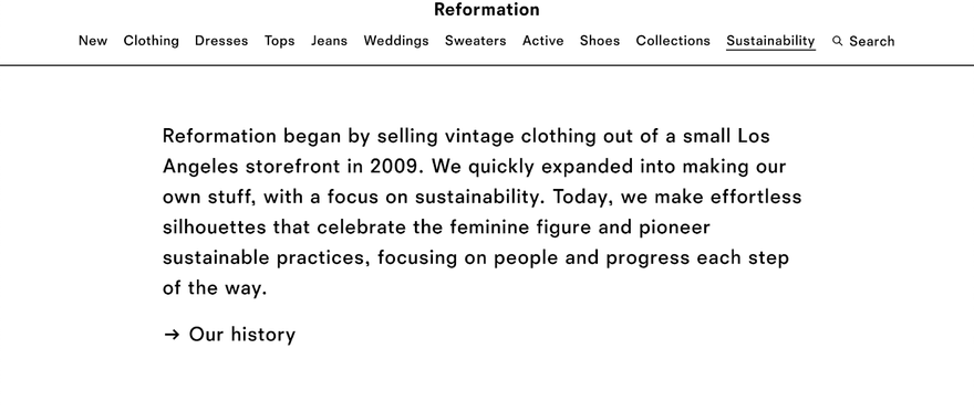
The American clothing brand Reformation chose to put the emphasis on the sustainability aspect of its brand, to set it apart from fast-fashion brands right off the bat. It chose a very minimalistic design and a striking catchphrase: “Being naked is the #1 most sustainable option. We’re # 2”. Reformation decided to focus on the company values to build consumer trust, starting with an allusion to how the idea of the business started.
We love how people-focused this About Us page is, with large images and even a series of videos introducing team members.
Their mission statement:
Reformation’s mission is to bring sustainable fashion to everyone.
Their unique value proposition:
- Sustainable processes
- Putting people first
Company story:
Began selling vintage clothing from a small LA storefront in 2009. Quickly expanded into production. Now pioneer sustainable practices, focusing on people and progress each step of the way.
2. Just Eat
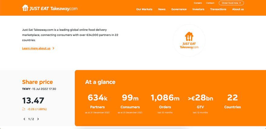
Just Eat decided to focus on its achievements to cement the idea of a reliable brand, backed by statistics. It chose striking infographics to make its numbers stand out, inciting a “wow” effect. Then, it details what it has to offer. Clearly, Just Eat wants to make sure that you pick it instead of another food delivery company, based on its impressive data.
Their mission statement:
Empowering every food moment
Their unique value proposition:
Connecting consumers with over 679,000 partners in 20 countries.
3. Florence Given
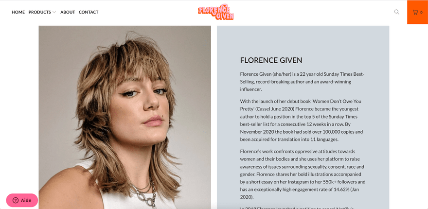
The About Us page for Florence Given’s shop is basically the artist’s bio. Next to a big picture of her, a few paragraphs detail her accomplishments, starting with “best-selling, record-breaking author” and “award-winning”. Then, there’s an emphasis on her values so that the customers know about the meaning behind her illustrations.
Their mission statement:
To inspire as many people as possible to remain curious, question everything and live their most delicious lives possible.
4. Lonely Planet
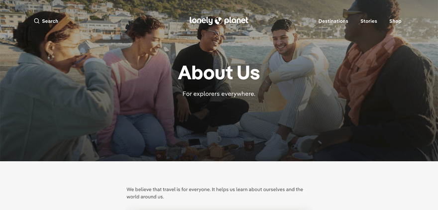
Lonely Planet‘s About Us page focuses mainly on the business’ values. Each and every single one is detailed in a slideshow on the page. The travel guide company doesn’t talk about its background but interestingly decided to mention the impact of Covid-19 on tourism, showing that it is “still on a journey” and that it can evolve alongside its customers’ needs.
Their mission statement:
To help more people from more backgrounds experience the joy of exploration.
Their core values:
- We pursue a vision of the world in which all are welcome. We believe travel can help foster the connection and understanding that makes meaningful moments possible.
- We think everyone deserves to experience the joy of travel. Whatever your background or needs and no matter where you want to go: we are here to empower your journey.
We know travel has a social, economic and environmental consequences. We must equip travelers with the knowledge to make informed choices about their impact, and inspire them to travel with generosity.
Calls to Action:
- Subscribe and get 20% off
- Become a contributor
5. Pick Up Limes
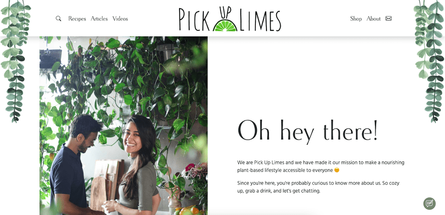
The food blog Pick Up Limes chose an extensive approach for its About Us page, while still keeping a laid-back style. It starts with the detailed story of how the founder decided to create the company, accompanied with pictures to go with the text. Then, a small paragraph with the business’ mission statement, an introduction to the team with their baby pictures and finally, an FAQ. All in all, this is a very complete About Us page that won’t leave you with any question about the company.
Their mission statement:
To make a nourishing plant-based lifestyle accessible to everyone.
Their company story:
- Founder started in 2014 while making transition to vegan lifestyle
- Was working as a dietitian at a hospital in Canada
- Few years later embarked on a 6-month backpacking trip, met Robin and moved to the Netherlands
- Took up hobby of cresting and sharing recipes and built the PUL YouTube channel
- Posted first YouTube video in 2017, after six months the channel blossomed and grew
- 4 years later Robin completed his Ph.D and joined PUL, together greating the app and website you see today.
6. Colourpop
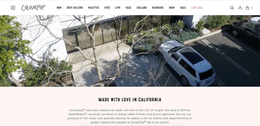
The Colourpop About Us page starts with a 3 minute YouTube video where the two co-founders explain the aim of their company: a high quality cosmetics brand with low prices and good ethics. They then include all the awards they’ve won, and for which products – the links to buy them are included, so the customer can try out an award-winning makeup product for themselves. This shows that your About Us page can be profitable as well as informative!
Their story & values:
- Founded in 2014 by Seed Beauty
- Pride themselves on being wallet friendly and bunny approved
Call to Action:
- Join the mailing list
7. EventBrite
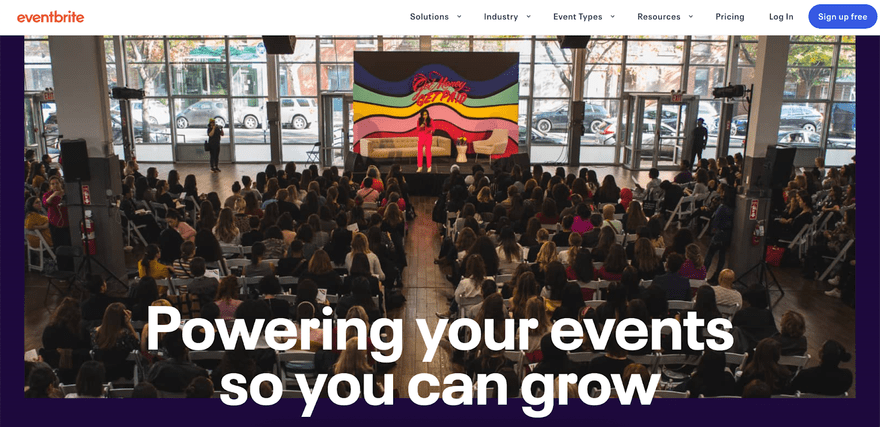
EventBrite’s About Us page is visually very striking. The events company chose eye-catching visuals to explain the concept of the brand with logos, graphics, and a video. It addresses the customer directly and tells them exactly why EventBrite is the perfect choice for them by listing all its services. It also includes positive feedback from previous customers and finishes with its different price packages.
Their unique value proposition:
The all-in-one ticketing and discovery platform trusted by millions of organizers and attendees worldwide.
Their call to action:
Get started on the platform for free.
8. Lyon’s Seafood & Wine Bar
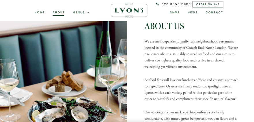
This small London restaurant put all the focus onto its food in its About Us page. Using minimalist and refined visuals, Lyon’s makes sure that the customer is aware that its food is sustainably sourced and that it has an extensive wine list. Without going into too much detail, Lyon’s still gives enough away so that all the relevant information is available.
Their story & values:
- Independent
- Family run
- Passionate about sustainability
Their call to action:
Sign up for their newsletter
9. Moz
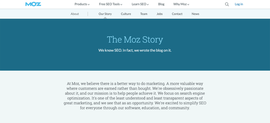
Moz’s approach is interesting, because it explains in detail its whole backstory. It mentions all the different investments it’s received, the different ideas it’s tried, and how it eventually switched back to its original strategy. Moz isn’t afraid of being honest about the ups and downs that it’s faced, which makes it seem more trustworthy and transparent.
Their mission:
Their mission is to help their readers/customers find a more valuable way of marketing where customers are earned rather than bought.
Their story:
- Founded by Rand Fishkin and Gillian Muessig in 2004
- It started as a blog and an online community where SEO experts shared their research and ideas
- Eventually transformed into a small consulting firm before moving on to create market leading SEO tools
- After several series of funding they rebranded from SEOMoz to Moz in 2013 and continued to develop their SEO tools
Their call to action:
Learn more about Moz products.
10. Lingoda
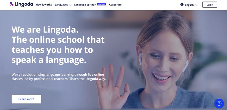
Lingoda‘s About Us page is simple but visually pleasing, using little images to showcase its strongest selling points and a “quick facts” section to display all the important numbers and data. At the end, the online language school includes the company’s story year by year, with its achievements along the way.
Their unique selling proposition:
- Flexible study
- Trustworthy
- High quality level of service
11. Milk Bar
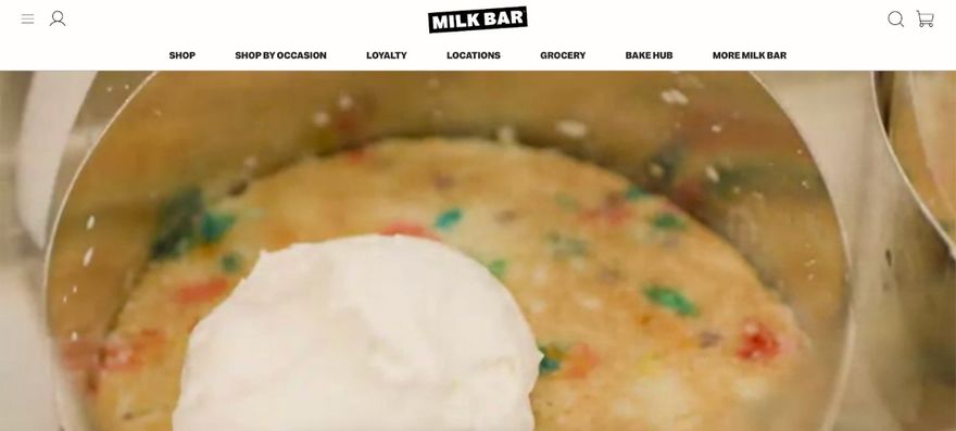
With its About Us page, Milk Bar puts the emphasis on the visuals. The cake company went for a colorful and fun approach, with lots of pictures and videos. It still added a short paragraph on its backstory, a feature in the New York Times, and all the different charities it works with. This creates an immersive feel that also shows visitors the brand’s values in action.
Their story:
- Founded by James Beard on 2014 in NYC’s East Village
- Profiled on Netflix docu-series
12. Yellow Leaf Hammocks
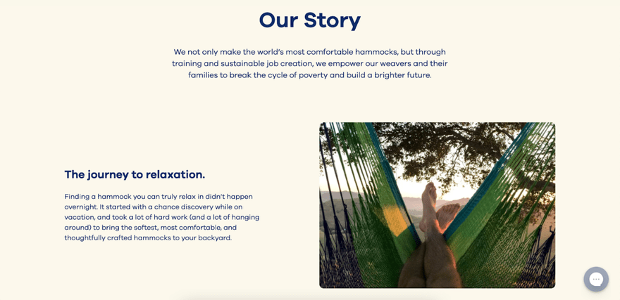
Yellow Leaf Hammocks chose a very humanizing approach to tell its company story. The company tells the story through the people who make its products and how it empowers them. This is done through simple and relaxing visuals, small paragraphs, and pictures. This helps the customers to empathize with the business and its values.
Their story:
- In 2011, while vactioning in Thailand, co-founder Joe discovered the world’s most comfortable hammock hanging outside a hut.
- He purchased as many as he could fit in his backpack and headed home
- Teaming up with his wife, Joe established Yellow Leaf, a curated collection of hammocks
Their call to action:
Shop Hammocks
Their people:
They include profiles of their weavers on their about us page.
13. MailChimp
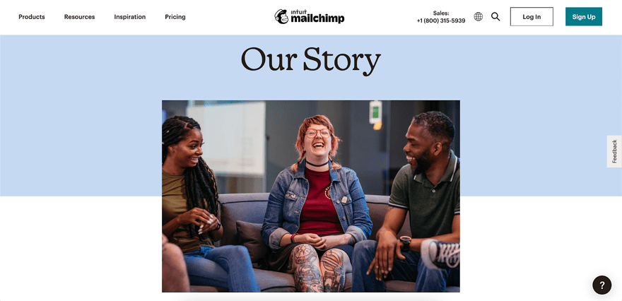
MailChimp used strong storytelling to explain what it stands for. It explains how the company was founded, and how it evolved throughout the years. In its “Culture” section, it also mentions that the company is hiring, which is another possible use for the About Us page. The result is simple but still engaging.
Their story:
- Started 20+ years by Ben Chestnut and Dan Kurzius
- Originally a web design agency called Rocket Science Group
- Focused on corporate clients, but on the side they created an email marketing service for small business
- MailChimp was officially founded in Atlanta 2001
- Continuing to grow over the years, the company was acquired by Inuit in 2021
14. Headspace
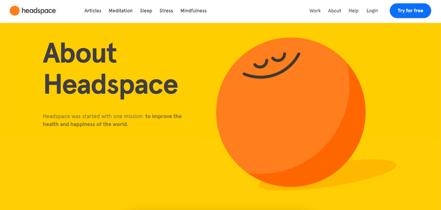
The Headspace About Us page fits the aim of the business: it’s simple, straight-to-the-point, and uses uplifting and relaxing visuals. The meditation company uses small paragraphs with little images so as not to overwhelm the customer with information. It showcases data as a form of social proof, displaying how many people already use its services, and also includes pictures of the team, with a short bio to go with them. The overall impact is professional, yet also friendly and approachable.
Their mission:
To improve the health and happiness of the world.
Their people:
They include profiles of their teachers from around the world and their leadership team.
Their call to action:
Try headspace for free today.
Latest Trends in “About Us” Page Design
Your “about us” page is all about drawing your visitors into your brand story. Leveraging the latest trends can help your page stand out from the crowd and better communicate key messages with visitors.
Here are some of the latest trends to consider:
- Using interactive elements such as video backgrounds, quizzes, and surveys. This approach invites visitors in to physically interact with your page.
- Leveraging micro animations to add interest to the page, catch visitors’ attention and help you better illustrate key points from your brand story.
- Personalizing content, helping your page appeal more to visitors and speak to them on a personal level.
Summary
Writing an About Us page doesn’t have to be a daunting task. It’s the perfect tool to tell your company’s story and convince customers that you’re the right fit for them. The visuals you choose are crucial to convey your brand’s image, as well as to how you want to tell your mission statement, backstory, and values.
Now, it’s up to you to find the right approach and tell us more about you!
For more useful examples, check out our list of good brand strategy examples.
Leave a comment