How to Write an About Us Page: 9 Dos and Don’ts
If you click to purchase a product or service based on our independent recommendations and impartial reviews, we may receive a commission. Learn more
If you’re stressed about how to write an “About Us” page for your website, it probably means you know the importance of having a good one. An “About Us” section is an opportunity to introduce yourself on your own terms. It’s also a visitor’s first encounter with the people and story behind your site, and a strong page will transfer your passion on to your readers.
A good “About Us” page starts with the basics, but quickly moves beyond them. Yes, users need to know who you are and what services you provide. But your page should also acknowledge the softer stuff that people are curious about. An example of this could be your brand’s vision statement.
Think of it like meeting someone for the first time – they’ll want to know why you do what you do, and how you got started in your field. If you met someone at a dinner party who kept droning on about niche industry stuff, you’d probably start planning an emergency exit towards the hors d’oeuvres.
Knowing what to include makes it easier to craft an “About” page that strikes the balance between practical and inspiring – and the good news is that there’s no better person for the job than you. Read on for the essential dos and don’ts, and to see examples of pages that have gotten it right.
What to include in your About Us page
1. The right tone
Tone is an element that should be consistent throughout your “About” page. But don’t worry – you won’t need to dust off any high school English textbooks to get this right! For a professional website, the writing just needs to find a middle ground between knowledgeable and approachable.
Remember that “professional” doesn’t have to mean “boring” – it’s okay for your writing to show some excitement! And don’t overthink it, either. You already know what you’re talking about, so let the information flow as if speaking to a friend and you’ll probably strike the ideal tone.
Reading your new copy aloud is a great way to test for tone. Hearing how the sentences come together will alert you to any unnatural structure or word choices that you wouldn’t actually use in daily conversation.
2. Your company values
Once you have a general tone worked out, reinforce it by introducing your company’s values. If you’re writing a page for a larger organization, you might have some predetermined values or brand guidelines to draw from. But don’t worry if that’s not the case – all you have to do is brainstorm a few keywords that best represent what your business stands for.
Emphasizing a few good values is a great way to organize what you’d like to say on your “About” page, and can make the task of explaining your business seem less daunting. However, it’s important not to select buzzwords just because they sound great, which is an easy trap to fall into: 55% of all Fortune 100 companies list “integrity” as a core value, while 40% cite “team-work.” Worthy attributes for sure, but they start to lose meaning when everyone’s throwing them around.
Instead of going generic, give yourself some time to think about what you’re most proud of, and of what separates you from your competitors. Are you serious about product quality? Do you strive for sustainability in your manufacturing process? This is the time to celebrate it!
3. Visuals, visuals, visuals
Bold text and strategically placed headlines are a good start when it comes to organizing your page, but the best way to catch a reader’s eye is through some well-placed graphics or tables. Studies have even shown that people can recall 65% of visually presented information three days after seeing it.
Don’t sweat it if you don’t think of yourself as particularly design-savvy. There’s plenty of web design software out there that was created to make this task as easy as possible. When it comes to emphasizing visual elements, Squarespace is particularly useful – so if you have a lot of creative work to show off, it’s a great choice.
If you don’t have a lot of creative work to show off, then a nice photo of the office space or a cool graph of last year’s rising sales is more than enough. Adding a visual or two is just a great way to break up the text on your page, and make your content more fun to read.
There are plenty of easy-to-use digital tools that can help you create said visuals. Canva, for instance, is a graphic design tool suited for all (or no) skill levels, where you can make original infographics and logos.
List: the 9 best website builders for artists
Ideal tools for creatives looking to display artwork online
If you’re stuck for ideas, there is one photo that can really make or break your page. Which brings us to…
4. Your team
An “About Us” page should personify your business, so that potential customers don’t view you as some Wizard of Oz-type ‘man behind the curtain.’ Adding a picture and some humanizing background about you and your team offers a great opportunity to connect with your audience and get creative.
The best part of any story is the people, and potential customers will be curious about what drives you as individuals in your industry. Like we said before, no one knows this story better than you, so don’t be afraid to tell it!
You can learn more about How To Write a Bio for a Website in our full guide.
5. A reason to trust you
People coming to your site for the first time are primarily interested in what you have to say – which is why we’ve put so much emphasis on how to go about saying it. But when a new visitor is forming his or her opinion of your business, it helps to provide some outside testimony for validation.
If you were wondering whether a certain restaurant was any good, you probably wouldn’t call them up to find out. Instead, you might turn to TripAdvisor or Yelp reviews. The same principle operates here. Your “About” page is the perfect place to include any positive customer quotes, so that people know they’re getting an honest overview. In an age where 91% of consumers trust online reviews as much as personal recommendations, a little bit of social proof goes a long way.
List: 30 factors that influence website credibility
A helpful list of factors that will boost visitors’ trust in your website
6. A way to contact you
By the time visitors are done reading through your mind-blowing “About Us” page, they’ll be racing to get in touch. Most website builders will easily allow you to stick a “Contact” form anywhere on the page, or you can set up a separate dedicated page and link to it.
There are also plenty of website builders for small businesses specifically, which can be really useful in making every page on your website – from “About Us” to “Contact Us” – feel polished and professional.
List: the 6 best ecommerce hosting providers
Ideal platforms for businesses looking to sell online
Find Out More
- Check out our specific guide, About Us Tips for Local Businesses to help you write the best about us page for your local business!
- List: the best ecommerce hosting providers – deal platforms for businesses looking to sell online
What to avoid in your About Us page
Now that you know what goes into a great “About Us” page, it’s time to talk about the things that are best left out. Read on for the don’ts:
1. Don’t go design-crazy
Layout and design features are meant to supplement your content and make it easier to read. Bad design does the opposite – it distracts readers from the words on the page. Most website builders will have templates that you can work from to avoid this pitfall. Still, make sure you constantly revisit your page with fresh eyes to see if there are any images or special effects that take the focus away from your content.
2. Don’t forget to tell people what you do.
There’s nothing more frustrating than getting drawn in by a well-written “About” page, only to reach the end and realize you have no idea what the company actually does or sells.
More often than not, people won’t want to put in any extra effort to figure out what you do (or why they need your service). It’s well worth placing a few extra-clear sentences at the top of your “About” page to avoid alienating any confused readers.
3. Don’t cram too much onto one page
Your “About Us” page will be one of, if not the, most important page on your site – but that doesn’t mean it should look like the only page on your site. Make sure you only highlight the most essential aspects of your business to avoid overwhelming new visitors with information. The peripheral info can live elsewhere on your site, and you can even provide links to it.
Our favorite About Us pages
Now that you know the do’s and don’ts, take a look at these examples of winning “About Us” pages from all kinds of industries. We’ve organized them based on specific strengths, so you can get inspiration for every aspect of the perfect page.
Best for: storytelling and creativity
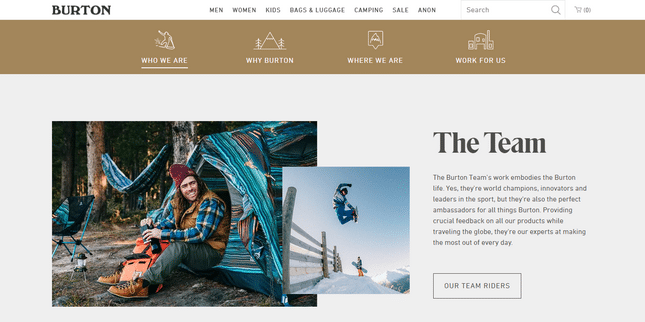
Burton’s “About Us” page does an incredible job of humanizing a large company – in fact, the page is actually titled “Who We Are.” By the time you’re done reading about Burton’s humble beginnings in Vermont and the team’s dedication to snowboarding, you’ll want to get on the slopes yourself.
1.2 Staples
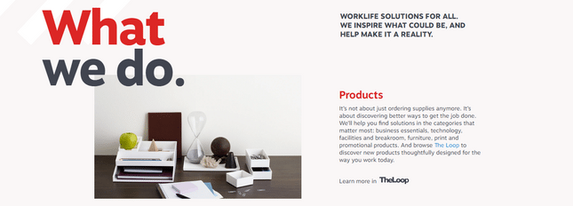
We’ll admit that snowboards are pretty easy to have fun with. That’s why Staples gets extra brownie points for managing to inspire while selling… office supplies. Notice how the company structures the information on its page to keep visitors engaged. Starting with “Our Story” is a great way to share inspiration, and following it up with “What We Do” adds the perfect mix of practicality.
Best for: facts and trust
2. HSBC
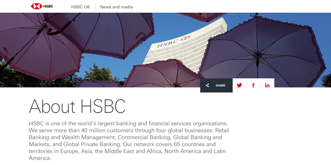
HSBC’s “About” page emphasizes numbers to inspire trust. You can do the same by listing any stats that demonstrate the popularity and reliability of your business. The number of customers you have, or years you’ve been around, are great places to start.
If you think you’ve covered the obvious ones, feel free to get specific. How many fresh pastries does your café bake daily? How many hand-knit sweaters does your chic shop sell in a week? It’s great to get people thinking about all the hard work that happens offline.
Best for: design
3. Jacob Tyler
It might seem obvious that a creative agency would take the cake for best design, but we can all take a few pointers from the sleekness of Jacob Tyler agency’s “What We Do” page. The simple red, white, and black color scheme makes it easy to decide what gets to stand out.
Having links with titles like “Communications” and “User Experience” also allow the page to look neat, without sacrificing further information. This design is proof that Easy to Read + Nice to Look At is a winning combination.
Best overall: Moburst
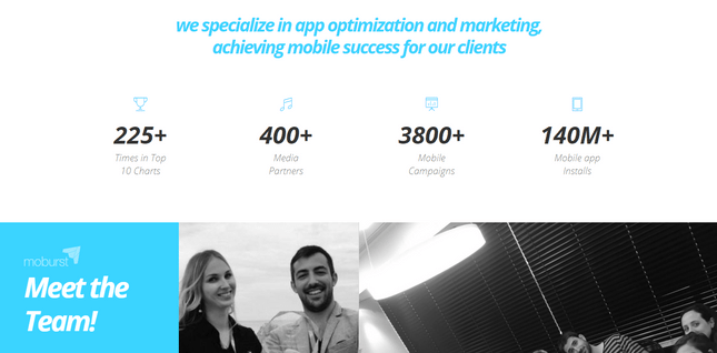
Moburst’s “About” page is proof that creativity and hard stats can actually be friends. This marketing company presents some impressive figures alongside fun team photos and personality-driven founder bios. The end result is a sleek, interactive page that’s exciting to scroll through – but best of all, the detail-oriented writing would be a pleasure to read with or without great design.
How to write an About Us page: recap
With these examples for reference, you’re well equipped to craft the ideal “About Us” page for your business. As you personalize your page, refer back to the six essential elements to include:
- The right tone
- Your company values
- Visuals
- A bit about your team
- A reason to trust you
- A way to contact you
And make sure you don’t
- Go design-crazy
- Forget to tell people what you actually do
- Cram too much onto one page
With these dos and don’ts in mind, we’ll pass you the mic now. So, go ahead… tell us about yourself!


Leave a comment