Lessons From Netflix’s Redesign: A Simplified Approach to the Homepage
If you click to purchase a product or service based on our independent recommendations and impartial reviews, we may receive a commission. Learn more

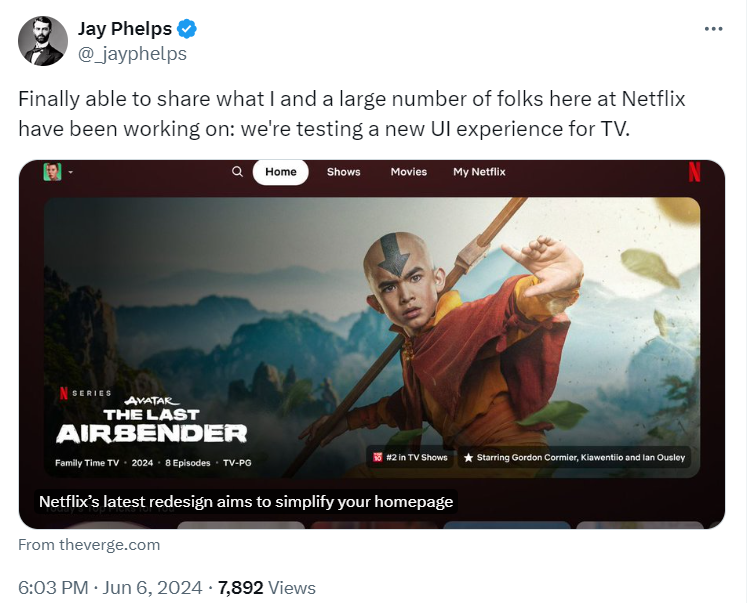
Netflix is testing a fresh homepage design for the first substantial change to its TV app in 10 years. The redesign streamlines the navigation bar and replaces the static title cards with dynamic boxes.
The user experience (UX) of a homepage can be key for how users navigate your site – as well as the all-important first impression you give to your customers.
With millions of streaming customers worldwide, Netflix has deep enough pockets to hire best-in-class UX designers. So, what can your online business learn from the streaming giant’s design choices?
What To Expect From Netflix’s Redesign
If you’re looking to binge-watch a new show, the new Netflix homepage aims to make it easier to find your next streaming obsession. There’s a focus on helping Netflix users to navigate the vast catalog of content, as well as showcasing personalized recommendations.

The planned redesign looks to replace the previous tile format. Instead, you’ll now see interactive boxes that, once hovered over, will display a teaser and basic information, such as genre and number of episodes.
Pat Flemming, the Senior Director of Product at Netflix, explained to The Verge that the company wants users “to have an easier time figuring out if a title is right for them.”
In addition to the change in how content is displayed, Netflix is testing a simplified menu. This previously sat to the left of the screen and included extra items such as “Categories” and “My List.” Netflix is stripping this back to only show a search icon, “Home,” “Shows,” “Movies,” and a new entry, “My Netflix.”
This makes it clear that Netflix is focusing on improving the user experience and journey. It’s an understandable and timely redesign, since the streaming platform looks to explore new content types, such as live fights and NFL games, in 2024.
Design Tips From the Streaming Platform
While Netflix has a team of professionals to hand, that doesn’t mean actioning a site redesign is impossible for the average website owner.
There are plenty of lessons to be learned from Netflix, and I’ve summarized the key points below, which you can replicate when designing your website:
- Simplify your navigation bar – Don’t pack your navigation bar with unnecessary pages and links! Follow navigation best practices to help visitors find what they’re looking for.
- Think about the customer journey – Consider what’s important to your customers and see how you can best serve their needs, from point A to point B. For example, this could mean making it easier to get back to your homepage, or reducing the steps between selecting a product and completing the checkout process. You want customers to enjoy their browsing or shopping experience and return again and again.
- Include dynamic visuals – Netflix is making it easier for customers to browse content and watch teasers, keeping users engaged and on the platform for longer. This can be replicated on your website by adding high-quality website imagery and videos, animated effects, or moving elements.
- Add product descriptions – Whether you’re trying to get users to watch content or encouraging customers to add products to their cart, it’s important to add relevant, easy-to-view product information.. This helps customers make informed decisions.
A small number of Netflix subscribers using smart TVs have been guinea pigs since the end of May, but, as this is just a testing period, more customers can expect to see the simplified homepage over the coming months – if the feedback is positive.
Like Netflix, it’s also important to test any changes you want to make before publishing. Ask your friends, family, colleagues, or total strangers to play around with your website and experience the journey for themselves. This gives you a chance to gather feedback and action changes before officially launching.
If you need a helping hand when designing your website, read our guide on web design best practices to get started.

Leave a comment