10 Essential Website Features for a Successful Website
If you click to purchase a product or service based on our independent recommendations and impartial reviews, we may receive a commission. Learn more
We all want the same thing for our websites – to be unique, memorable, and engaging. With the right website builder and website features to hand, you’ll be able to turn your site from bland to brilliant in a flash.
In this article, we’ll explain all about website features and why they’re so important, as well as share ten of our favorite features to set your site up for success. Let’s dive right in!
What are Website Features?
Think of the best dessert you ever had and the ingredients that go into making it. They’re okay on their own, but you create something wonderful once they’re put together.
The same can be said for websites! Website features – such as navigation, content, and imagery – combine to make the end result: your website. These elements work to entice, engage, and guide your site visitors.
Why Do Website Features Matter?
Your website is usually the first impression your visitors and customers have of your business or brand. It’s a cliche, but what they say about first impressions is true! They count, and they last.
When websites are uninspiring or lack the basic functionality that users expect, they’ll leave and move on to the next.
This means you have to improve your website to get the results you need. Great website features enhance the user experience, up the engagement, and boost conversions.
Find Out More
These website features are most effective when paired with other important factors such as high quality content, robust security, and more. Take a look at our list of Important Things for a Website next, so you can create a well-rounded website!
10 Features of Successful Websites
When you look at these 10 essential website features, you might be tempted to have a quick scan to see which ones stand out to you the most.
They’ll be the things you can do easily and fast. Why wouldn’t you be tempted to go for them?
But it’s really important to know that the more features you have, the better your website will be. Some will be more time-consuming to action, but they’re essential features that users expect.
We’d recommend using this list as a checklist when you work on a new or existing website:
1. Easy To Navigate Menu
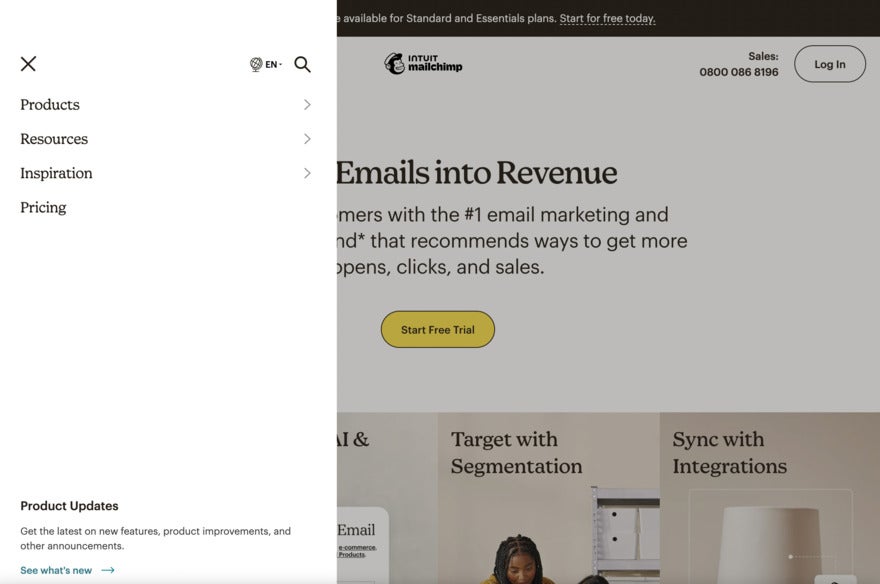
It’s safe to say we take good navigation for granted until we stumble across a poorly-designed website.
Your site needs navigation to take visitors from point A to point B with no confusion. Make the menu as intuitive and easy as possible! A good menu should enhance and streamline the user journey as they travel around your site, ultimately resulting in lower bounce rates.
We recommend keeping things simple – use clear language and make sure to only include the important necessary pages. Don’t overwhelm visitors with hundreds of pages!
2. Include a Search Bar
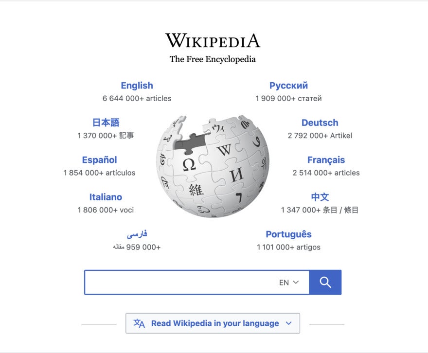
Sometimes visitors know exactly what they’re looking for. They just need to know where it is, and a search bar takes them there in the same way Google does when we want to find something.
A key benefit to including a search bar is that it keeps users on your site – they don’t need to return to a search engine that could present them with an alternative site for their request!
Make sure your search bar is easy to find, though. Users expect them to be visible – we suggest in the top banner of your site, or the top corner via a drop-down vertical menu.
3. Consistently Publish New Content
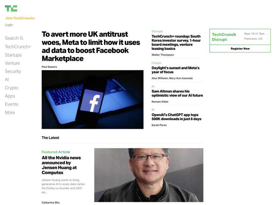
Consistent new content is oxygen for a website – and a blog is the perfect place to put it. Not only does it keep the website fresh, but each piece of content has the potential to bring in new visitors.
There’s plenty of information out there on starting a blog and the best kinds of content to inspire your users. What’s really important is making sure the content you produce is valuable to your target audience – it can also boost your rankings and visibility on search engines.
Consistency is key, so we’d recommend making a content calendar and scheduling posts ahead of time. You don’t have to churn out 1,000-word articles every day – you can do short ponderings, the occasional memes (if relevant to your business), or share content that you find valuable.
4. Make Calls To Action (CTA) Clear
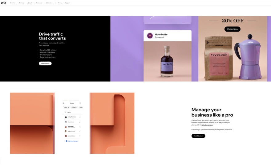
A CTA gives your audience a choice. It encourages them to take a particular action with your guidance – this could be anything from purchasing a product and signing up for a newsletter to downloading resources or requesting feedback.
There are best practices for CTAs – elements like wording, color, and text length all have an impact. We’d recommend sticking to a clear and compelling call to action. Not only will this help you boost conversion rates over time, but it’ll make your CTA more eye-catching. Use active words and always include the benefit to the user to entice them to click.
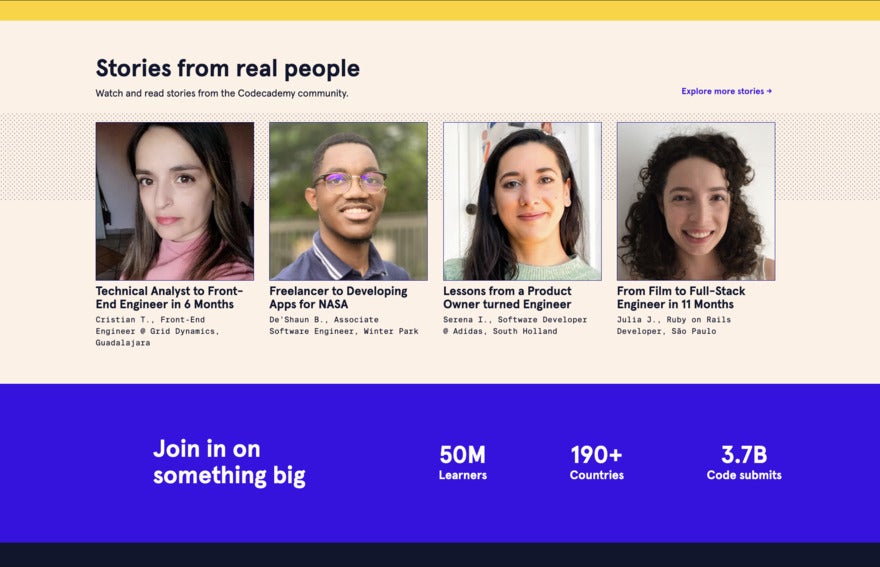
5. Publish Powerful Testimonials
Testimonials not only feel amazing to receive, but they’re social proof to potential users that your product or services deliver what they promise. Customers trust other customers – we all look to reviews and testimonials when checking out a new business.
Not only do testimonials build trust with your visitors, but they can also cut down on hesitant feelings and encourage people to convert.
To see the most success, we’d suggest putting testimonials front and center on your site – you want them to be readily accessible. After all, if a movie gets five-star reviews, you’re guaranteed to see that on its posters and ads!
You can also include pictures or video testimonials where possible because these have more credibility than a simple quote from a stranger.
6. Add Social Media Links to Your Footer
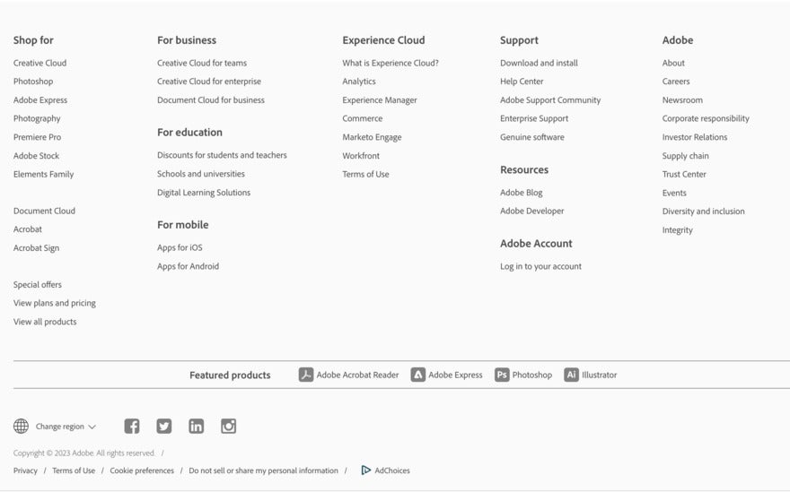
When we’re on a website we love, we usually look for social media links. After all, we want to learn more about the business and follow for updates. So, if you haven’t already set up business profiles across social media platforms – do that now.
Those social media links tempt your users to have a look at how you interact with your community and what else you’re up to. They’re a great way to boost engagement and grow your audience online, and you can connect with more customers on channels they favor.
Most websites include icons for their social media accounts at the bottom of their pages, and that’s usually where users expect to find them.
7. Use a Clean Design
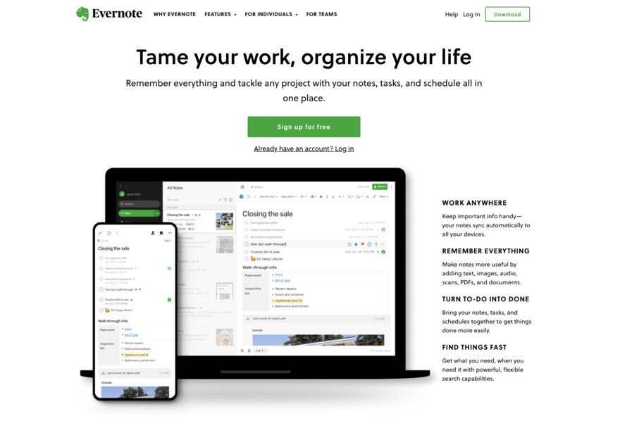
Unless your website has to do with maximalism, less is more in website design. When the page is clean and clutter-free, users are more able to focus on what you’re trying to say.
Simple websites can look better – depending on your brand – and a clean design will help you communicate with your visitors effectively.
To achieve this, stick to a simple color and accessible color palette, choose easy-to-read fonts, and make sure you’re only displaying relevant content across your pages.
8. Ensure Mobile Responsiveness
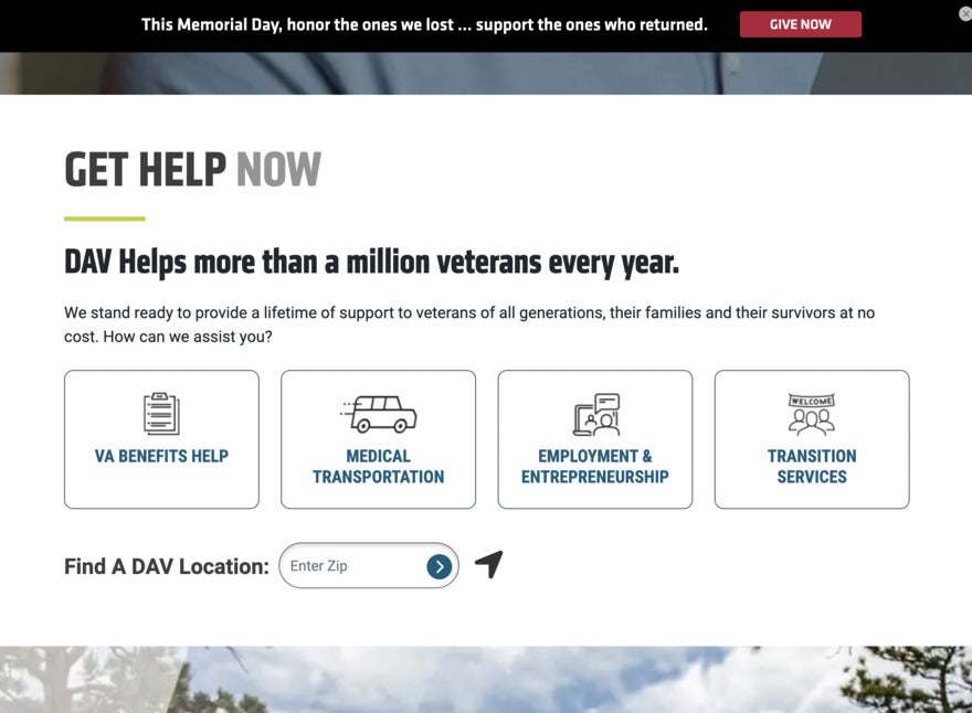
Over 60% of Google searches are done on mobile devices, which means your website needs to be mobile-friendly and quick to load.
You don’t want visitors to have a bad experience with your site – optimize your pictures, links, headlines, and page structure to work well across devices. We recommend choosing flexible templates when designing your website, opting for simple layouts, and testing your site after making any changes.

9. Apply SEO Best Practices
When done right, SEO – which stands for search engine optimization – helps search engines receive and understand your content. It bumps up your website’s visibility on search engine result pages (SERPs), which is essential when there’s so much competition out there.
The higher your rank, the more traffic you’ll receive. So it’s important to implement a good SEO strategy on your website – including best practices such as keyword targeting, writing effective meta titles and descriptions, and building out your internal and external links.
10. Use Powerful Images and Videos
A picture really does say a thousand words. You can communicate messages to your audience in a split second.
Have a good think about what type of visual content can grab the attention of your audience. What visuals say the most about who you are, what you offer, and how you’re different from others? Would your customers appreciate video tutorials on the latest products? When you create visual content, always keep the user and the goal in mind. It’s not just about how it looks, but how it’s serving your users.
Make sure you’re using professional images and high-quality videos that are relevant to your business. Stylish, eye-catching content will build audience engagement and it’s also more likely to be shared on social media!

Find Out More
Did you know that adding videos to landing pages increases conversions by 86%? For more Landing Page Statistics and tips, check out our full guide!
Summary
So there you have it – we’ve now reviewed the 10 essential website features for a successful website, and explained why they’re so important. Let’s recap one last time:
- Easy to navigate menu
- Include a search bar
- Consistently publish new content
- Make CTAs clear
- Publish powerful testimonials
- Add social media links to your footer
- Use a clean design
- Ensure mobile responsiveness
- Apply SEO best practices
- Use powerful images and videos
Remember, in the end, your website isn’t just a calling card. It’s the experience that you give your audience and your potential customers. These website features will support your efforts by improving your site’s visibility, performance, and structure.
Leave a comment