10 Steps to Create the Best Category Page for Your Online Store
If you click to purchase a product or service based on our independent recommendations and impartial reviews, we may receive a commission. Learn more
Without well-organized category pages, your customers might feel lost and overwhelmed when they visit your online store. Often, ecommerce website builders or CMS will have store templates already laid out for you to help create a good ecommerce architecture on your site, but you still need to do some work to make them as user-friendly as possible, such as optimizing or even adding category pages.
Imagine walking into a clothing store filled with endless racks of outfits, shoes, and accessories. Without signs or sections, finding the perfect clothing item would be like searching for a needle in a haystack.
Using category pages streamlines your website’s navigation and provides a curated pathway to help customers find exactly what they want.
With that in mind, this guide brings you 10 steps to help you create the best category page for your online store.
What Is a Category Page?
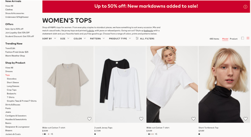
Think of a category page as a unique section in your online store that lets customers find products with ease. While a brick-and-mortar store might have aisles to make the shopping experience straightforward, a category page is essentially an electronic aisle for your website.
Again, taking the clothing store concept, you’d likely have individual category pages named after different types of clothes. These pages aim to function as a guide, leading customers through your website and taking them directly to the products they’re interested in.
By grouping similar items, you’re supporting customers in their product search. It’s an uncomplicated, yet helpful, way to enhance user experience and make shopping on your site simple.
A category landing page is an important component of ecommerce and it’s a necessary feature if you want to see success online. It’s primarily about organization, ease of navigation, and, ultimately, achieving customer satisfaction.

More Information
- Best Practices for Ecommerce Store Success: For more tips on how to optimize your online store.
10 Steps to Create the Best Category Page
Thinking about adding category pages to your online store? Whether you’re using an ecommerce website builder, WordPress, or another CMS for your store, follow these 10 steps to get started.
1. Choose a Layout
The arrangement of your category page is central to the entire process because it sets the stage for your product display. A neat, orderly layout lets customers seamlessly scan for products. For instance, if you’re selling books, you might want to display 20 books per page, arranged by genre or author – this will make it a breeze for customers to search for products.
2. Add Your Branding
Your category page should mirror the brand’s personality, so we recommend you apply your brand’s distinct colors, typefaces, and logo. Uniform branding does more than just boost the visual allure of your page – it fosters a sense of trust and familiarity among shoppers. A brand using a minimalist aesthetic with a monochrome color scheme should reflect the same design on its category landing page for uniformity.
3. Select Your Navigation
Navigation plays a central role in the design of a category page. It aids customers in browsing your site and discovering the products they’re keen on. Think about incorporating elements like breadcrumb trails, menus, and “back-to-top” buttons to enrich the navigational journey.
Having a breadcrumb trail, for example, can help customers understand their current location within your site and easily navigate back to previous sections. Not only does this improve the user experience, but it also keeps a potential customer engaged on your site for longer.
More Information
Read up on these 10 Website Navigation Best Practices to learn more.
4. Determine Your Filters
Filters serve as a tool for customers to refine their product hunt based on distinct characteristics such as size, color, cost, or brand. Implementing suitable filters can amplify the shopping journey by saving customers time and reducing their efforts. Imagine a customer is seeking a large blue shirt priced under $30 from a specific brand. They can pinpoint it effortlessly thanks to well-placed filters.

5. Add Sorting Options
Sorting options give customers the ability to arrange products based on their individual preferences, which can include item prices, popularity, or the highest to lowest price. With this feature, shoppers have the reins to find and sort products more efficiently.
Having sorting options is helpful because it can allow a budget-conscious customer to sort a category page so it only displays the most affordable items at the top. Ultimately, shoppers can cater to their specific needs and budgets, creating a personalized shopping experience.
6. Segment Your Colors
Customer segmentation is the process of dividing your customers into groups based on traits like demographics, purchasing behavior, and interests. Gaining insights into your customer segments means you can customize category pages to cater to the specific needs and preferences of your customer base.
If, for example, you have a section of eco-friendly products on your site, shoppers who want to buy more sustainable items will look for these options. Having a category page dedicated to sustainable items will go down well with customers, meeting their needs and helping to foster loyalty and repeat business.
7. Offer a Personalized Experience
There’s nothing quite like personalizing your service. It helps your pages go beyond the ordinary and helps your business connect with shoppers in a wide variety of ways. This might include showcasing product suggestions influenced by a shopper’s recent browsing history or adding personalized messages and offers to the page. A tailored experience instills a sense of value in customers and increases the chances of boosting their interaction with your store.
Take a customer who’s an avid gamer – a personalized greeting followed by recommendations for the latest genre of games they like will help make their shopping experience feel more personal and engaging if they’ve previously played with those types of games.
More Information
Learn How To Create a Personalized Online Shopping Experience in our full guide.
8. Optimize Your Listing Information
The details you provide for each product on your category page can sway a customer’s purchasing decision. Write clear and concise product descriptions, titles, and prices. Additionally, think about emphasizing key attributes or special deals to capture interest. Tell a story with your listing information!
One way to do this is by writing clear titles with a brief description that sums up the product. For example, “Women’s Breathable Running Shoes” coupled with a concise description and a competitive price can attract a customer’s attention.
9. Carefully Select Images
Images hold a strong position in shaping a customer’s shopping journey, especially when it comes to product pages. Eye-catching and attractive visuals captivate customers and give them a more immersive experience of your offerings. Make sure images are sharp and truthfully depict your products so they resonate with your brand’s aesthetic. Go for high-resolution images and try to keep sizing small so they don’t slow down website speed.

10. Decide Between Infinite Scroll or Load More
Infinite scroll and “load more” are two functionalities that dictate the loading of products on your category page. Infinite scroll spontaneously loads additional products as customers navigate downwards on the page, whereas “load more” encourages customers to press a button to reveal more products.
Both come with their advantages and disadvantages! While infinite scroll provides a seamless browsing experience, “load more” gives users more control and can be beneficial for sites with heavy traffic to prevent slow loading times.
Creating Category Pages: Summary
Crafting the optimal category page for your online store requires smart planning and implementation. If you want to create a category page, we recommend you complete the following steps:
- Choose a layout
- Add your branding
- Select your navigation
- Determine your filters
- Add sorting options
- Segment your customers
- Offer a personalized experience
- Optimize your listing information
- Carefully select images
- Decide between infinite scroll or load more
These 10 steps, which we’ve discussed in detail, will help you create a category page that’s both visually appealing but also offers a seamless and delightful shopping journey for your customers.

Leave a comment