FAQ Page Examples: 9 Most Inspiring FAQ Page Designs
If you click to purchase a product or service based on our independent recommendations and impartial reviews, we may receive a commission. Learn more
When building a website, it’s easy to get hung up on those big, staple pages. A website builder or CMS will often provide these core pages in your template already. You end up investing lots of time and energy into your homepage; your About Us page; and your Contact Us page.
But in directing your attention to these (admittedly crucial) pages, other key elements of your website can fall by the wayside.
We’re talking about your FAQ (Frequently Asked Questions) page. An FAQ page provides your brand with an opportunity to answer your audience’s biggest questions – showing you value their custom, boosting confidence in your services, and directing them to other important sections of your website.
The only issue? FAQ pages can be tricky to structure, design, and write.
Where do you even begin?
Well, the nine FAQ page examples we’ve curated below are a start. Each FAQ page example we’ve listed here contains a blend of clever copy, strategic design, and a layout built to signpost the user – quickly, and with minimal fuss – to the information they desire.
Ready to get inspired by the best FAQ page examples in 2024? Read on!
1. Lyft
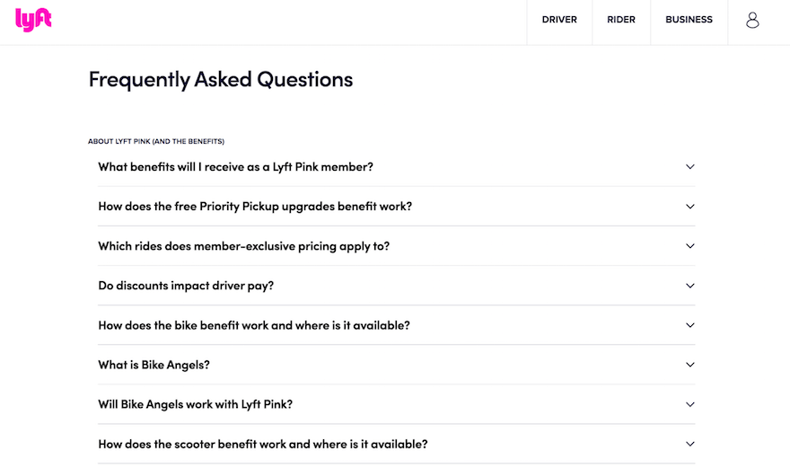
Lyft, a popular San Francisco-based ride-sharing app, keeps its FAQ page simple and stripped-back – prioritizing functionality, first and foremost, but never quite sacrificing flair.
Lyft’s FAQ page utilizes several mini-menus with collapsible items. By only displaying FAQ content once clicked, Lyft keeps its lists streamlined – and prevents users from getting distracted by answers to questions they’re not actually interested in asking.
Lyft also separates its mini-menus into different categories. By segmenting lists under different overarching topics – ”Plan selection”, “Payment and plan management”, and “About Lyft Pink (and the benefits)”, Lyft adds another layer of navigation: helping its visitors gravitate straight towards the answers to their most pressing queries.
2. WhatsApp
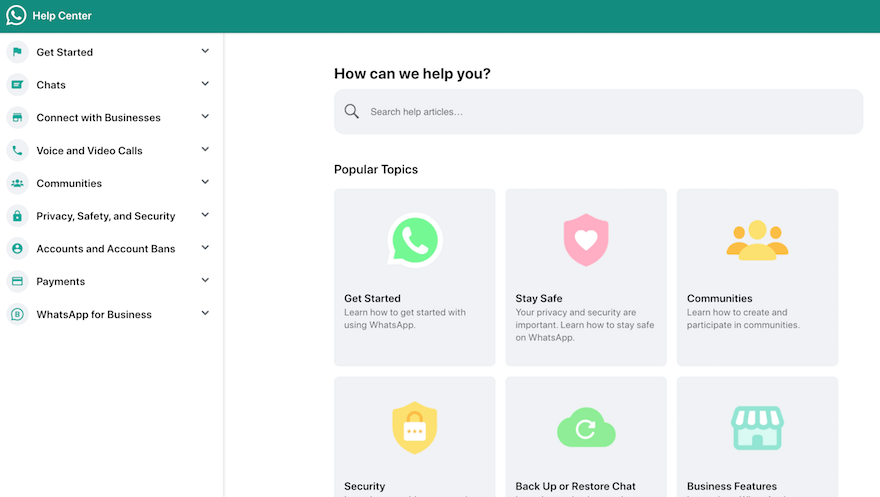
As the second-most used messaging app in the US, WhatsApp needs no introduction. But all those users (WhatsApp is relied on by 26% of American chatters) mean a lot of questions – and that means a robust FAQ page is a must.
WhatsApp’s FAQ page’s intuitive navigation tells us exactly where to find what we need: with a vertical sidebar menu, a search bar, and a neat grid of information all combining for an oddly soothing, reassuring effect.
Like Lyft, WhatsApp’s FAQ page separates its structure by specific topics and themes. It also uses icons to great effect – melding a mixture of color, copy, and design to help its readers process the page’s information quickly and effectively.
3. McDonald’s
Another name that scarcely needs to be introduced is global fast food giant McDonald’s.
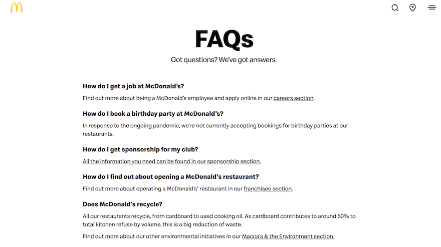
Visually, there’s not a huge amount to look at – like Lyft, McDonald’s’ FAQ page channels a minimalist, monochromatic charm – but it’s the copywriting that interests us.
McDonald’s’ FAQ page is written in a chatty, conversational tone, that – while friendly – never crosses the line into unprofessional, or inappropriately informal. One example? The FAQ page’s cheeky, pithy tagline – ”Got questions? We’ve got answers”.
Better still, McDonald’s – as you’d expect it to – clearly has a good grasp of Search Engine Optimization. The restaurant chain’s FAQ page contains links to several other key pages on its site, for its set of distinct audiences – including franchisees, sponsors, and customers.
This type of internal linking (as you can find out in our guide to the basics of SEO) is excellent for helping search engines locate and understand your web pages’ content – so, like McDonald’s, it’s worth doing this right.
Do so, and Google won’t just be liking your site. It’ll be lovin’ it!
4. Shopify
Shopify is a popular ecommerce website builder that empowers businesses large and small to build a website – and then start selling through it. Of course, Shopify needs to practice what it preaches – meaning its own website needs to be beautiful, too.
We reckon it is – and its FAQ page is “Exhibit A”.
Shopify’s FAQ page utilizes a bold title and iconography, with clearly signposted categories telling its users where to go for the information they seek. What we particularly love, though, is how Shopify uses copy to reassure its readers that they’re in the right place (and, if they’re not, direct them to where they want to be.)
One example of this is in Shopify’s FAQ page’s opening paragraph. It states “if you’re new to Shopify or looking to replatform your business, this guide will help you learn more about the platform and its features”. The copy below reads: “Already have a Shopify store? Get detailed product information in our Help Center”. Through this, Shopify speaks to multiple segments of its customer base – helping ensure they’re on the most relevant page for them.

5. Spotify
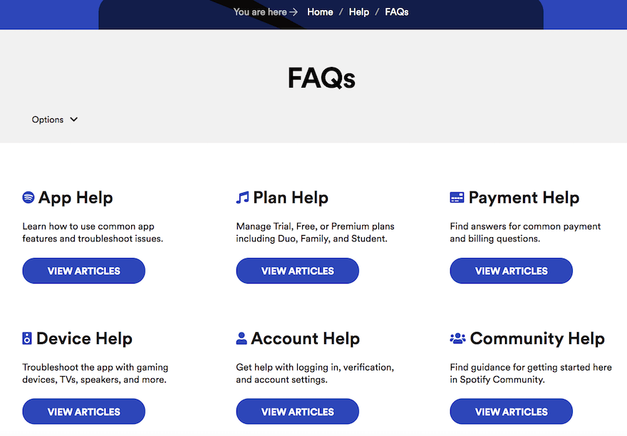
Music streaming subscription service Spotify’s FAQ page hits all the right notes.
Arranged in a grid-like format that’s as easy to use as it is on the eye, Spotify’s FAQ page groups its huge suite of support articles by topic: using a mix of icons, color, and bold headlines to guide the user, hand in hand, to where they want to be.
As for the page’s best design feature, our pick of the bunch has to be those big, purple CTA buttons. Gorgeous!
6. Dropbox
While an FAQ page’s primary focus is informational, there are no rules against adding a dash of the commercial, too – as Dropbox’s FAQ page demonstrates to great effect.
A large, full-width header – set against a black background for contrast – invites the user to “Try for free”. A CTA before we even get the questions could be a little overbearing, if executed poorly. But Dropbox’s FAQ page’s pared-back, unobtrusive design language means we accept it and will likely click on that CTA to score a good deal!

7. Starbucks
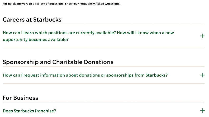
How many words of plain black text does the average internet user read every day? We’re betting a lot – so why not change things up, and incorporate different font colors and styles?
Starbucks’s FAQ page gives it a go, and the results – an eye-catching, engaging list of collapsible, categorized FAQs – speak for themselves. Starbucks juxtaposes black text with its signature green – staying in line with its own iconic brand, and ensuring users remember exactly whose FAQ page they’re browsing.
Starbucks also splits its FAQ page out into store-related inquiries, career opportunities, charitable donations, common queries, and business-related questions – making it simple for each segment of its audience to get straight to the information they need.
8. Airtable
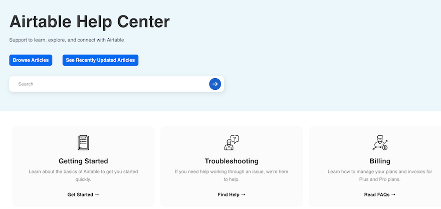
Airtable’s FAQ page is a stylish blend of classy color, clean design, and clever functionality.
A button allows you to toggle between all articles and recently updated articles – ideal for helping Airtable’s customers stay abreast of the latest developments in the San Francisco-based cloud collaboration service’s world.
A search bar makes it easy to kickstart a customized search, while – just below – a horizontal triptych breaks Airtable’s support options into “Getting started”, “Troubleshooting”, and “Billing”. Further down the page, Airtable breaks its assistance offerings into a whopping 16 different categories to help its users quickly sift through and select the content most pertinent to them.
9. YouTube
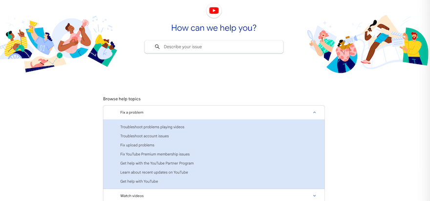
We couldn’t wrap up a list of the best FAQ page examples without mentioning video-sharing behemoth YouTube – especially when its FAQ page looks this good.
YouTube’s FAQ page merges pretty much every principle we’ve already discussed above.
Vivid, colorful iconography? Check. Questions ordered by topic? Check. Collapsible question mini-menus? Check! An easy-to-use search bar? You get the idea…
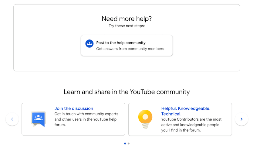
Scroll down, and YouTube’s FAQ page (hosted by Google, which owns it) also has a quick link to YouTube’s help community – allowing the searcher, if they can’t find the answer to their question in the FAQs above, to put it to the YouTube community. It’s an awesome way of adding extra value to searchers while encouraging new users to join up and engage with YouTube’s thriving online community.
Summary
We rounded up, reviewed, and raved about the top nine FAQ page examples on the internet. So what did we learn? Well for starters, the best FAQ pages tend to have:
- Collapsible menus
- Categorized content
- Clean, lean navigation (grids and sidebars are a must)
- Conversational – yet professional – copy
- Bold, clickable CTAs leading to additional help and support articles
- Search bars
- Multiple color combinations and eye-catching iconography
However many of these principles you manage to integrate into your own business’s FAQ page, don’t stress. The main goal of an FAQ page (as the name suggests) is to answer the frequently asked questions from your customers. If you do that – and do it in a way that’s easy to read, understand, and navigate – your FAQ page has every chance of turning out fine.
And who knows? Someday we might be writing about your brand’s FAQ page!
Leave a comment