I Found the Best Squarespace Templates in 2024: Here Are the Top 14
If you click to purchase a product or service based on our independent recommendations and impartial reviews, we may receive a commission. Learn more
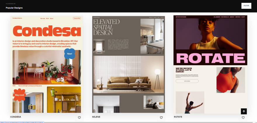
At the time of writing, Squarespace has 420 templates for users to choose from. These are split across eight key categories, from portfolios to membership websites, which makes finding your perfect design much easier.
The question is, are these templates really as good as everyone makes out? I certainly think so – our testing showed that Squarespace had the best designs overall, beating out competitors like Wix and Weebly.
There’s no doubt that Squarespace’s templates are good, but you might be unsure about which one is best for you. And that’s where I come in. I’m going to show you the best Squarespace template for 14 different kinds of websites, so that by the end, you’ll be ready to start cultivating a unique look and layout that’s true to your business.
1. Nevins: Best for Portfolios
Why I recommend this template
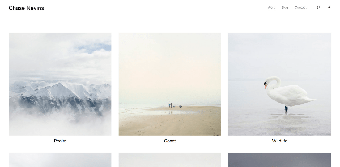
I chose Nevins as Squarespace’s most impressive online portfolio template because of its clean, modern, and minimal aesthetic.
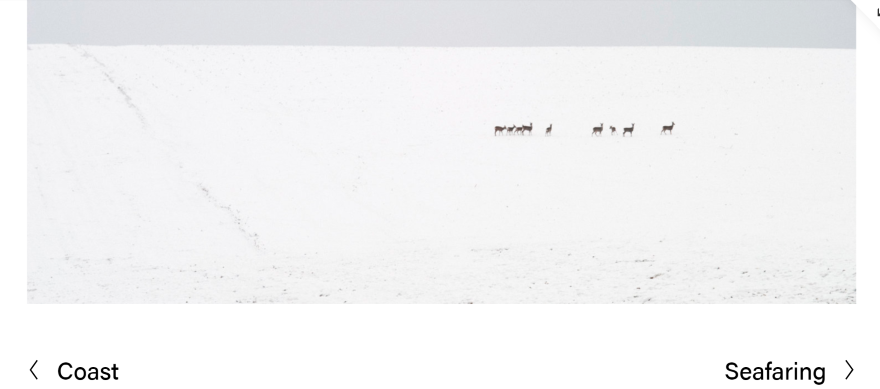
The last thing you want for your portfolio is a cluttered design, and with the Nevins template, there’s no chance of overcrowding your site. It puts your work at the center of attention, while setting a professional tone for your website with plenty of white space.
I particularly liked the fact that it automatically includes a blog page for you to further engage your visitors, and keep your website up to date with fresh content. The built-in social media icons and contact page are also perfect for making it easy for clients to get in touch.
2. Elliott: Best for Photography
Why I recommend this template
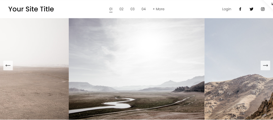
I love the full-sized, slider gallery on Elliott’s homepage – it creates an immediate wow factor, and makes sure your photography is the first thing visitors see while giving them the opportunity to browse some of your best works.
The navigation bar is kept simple at the top of the screen, making it straightforward for users to look through all of your photography. If you need to add additional pages, you can neatly display them in the “+More” dropdown button too.
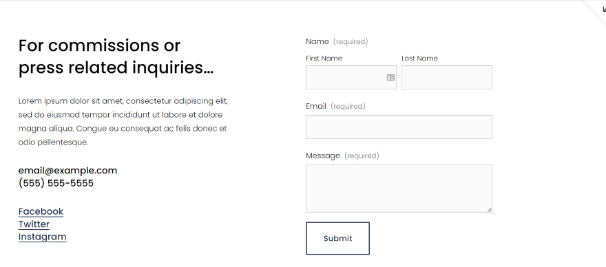
This template comes with both a built-in “About” and “Contact Us” page, which is helpful if you’re building your online profile and want visitors to get to know you – or even reach out – after viewing your photography website.
3. Zaatar: Best for Online Stores
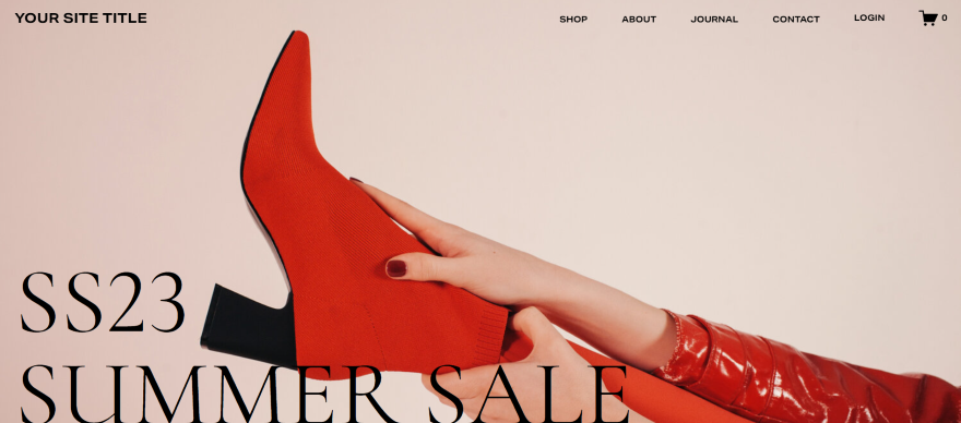
Why I recommend this template
If you need Squarespace for ecommerce, then Zaatar is a stylish, modern template for online stores that can be easily customized to suit a range of styles. It makes use of multiple images sizes to make products really pop, and it keeps customers scrolling down with its clean layouts.
This template automatically includes a “Shop Now” call to action on its homepage to hook customers in straight away, as well as a “New In” products section so you can show off your latest releases. With a dedicated “About” page and built-in blog, the Zaatar template has everything you need to grow your store.
Considering you can expect an average return of $42 for every $1 you spend on email marketing, I especially liked the inclusion of a newsletter “Sign Up” call to action on the homepage – Squarespace obviously understands the importance of email lists and newsletters for growing businesses!

4. Paloma: Best for Blogs and Podcasts
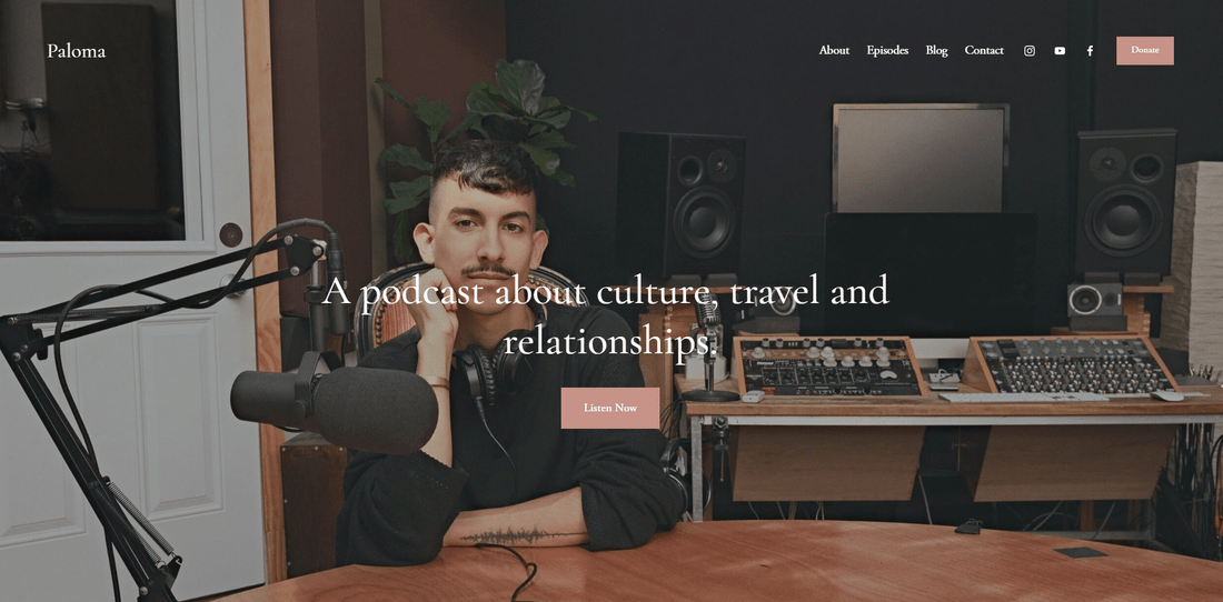
Why I recommend this template
I love the full-screen image that welcomes you onto Paloma’s homepage, but the real reason I chose Paloma lies a little further down the page. First, a built-in “Latest Episodes” section makes it easy for listeners to catch up on your latest podcast episodes, while a generous “About” section helps new visitors get to know you.
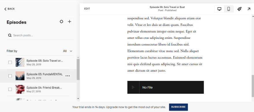
This template comes with everything you need when creating a podcast website – I especially liked the inclusion of a built-in blog, as well as a dedicated episodes library. The social icons include YouTube for easy linking to a video channel, and the “Donate” button is perfect if you’re starting out and in need of funds.
This template uses full-screen images and designs with easy-to-navigate grid sections to keep things organized without sacrificing creativity. A “Listen Now” call to action and a separate “Contact” page completes the podcast package.
5. Almar: Best for Professional Services
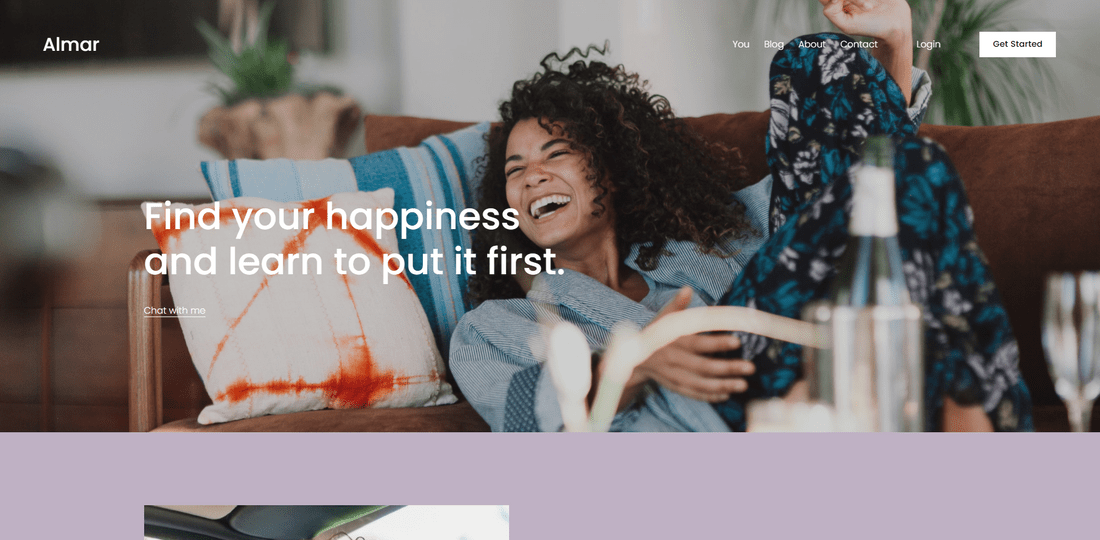
Why I recommend this template
Almar is perfect for professional service websites – not only does it look the part, with large strips and banners breaking up the page, but it also comes packed with features. It balances images with text, and has plenty of opportunity to provide social proof to potential clients.
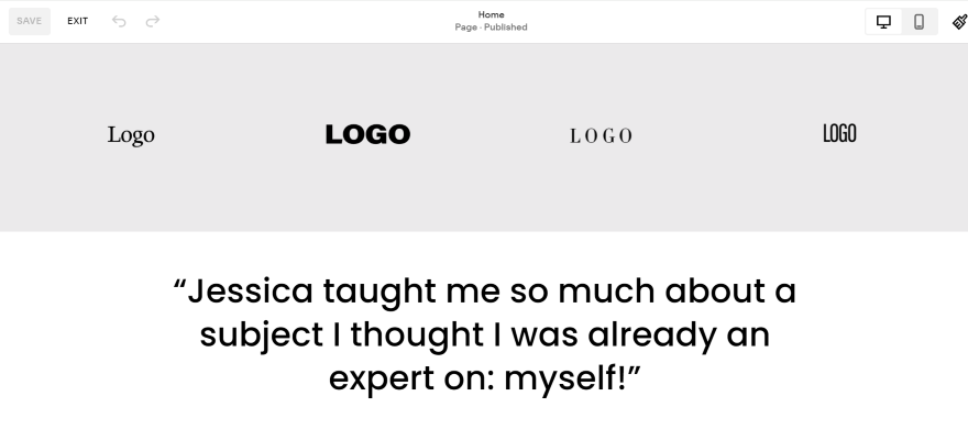
This template includes testimonials, newsletter sign-up, a blog, a place to list awards you’ve won, and plenty of calls to action. My favorite feature was the Squarespace membership area, and the ability to book appointments directly through the site. It even features a logo banner on the homepage, so you can show off the other brands you’ve worked with.
The overall design is simple yet bold, with large image headers and text snippets. When using Squarespace, Almar can easily be customized either to suit a fun brand, or to reflect a more serious tone depending on the images and colors you choose.
6. Colima: Best for Local Businesses
Why I recommend this template
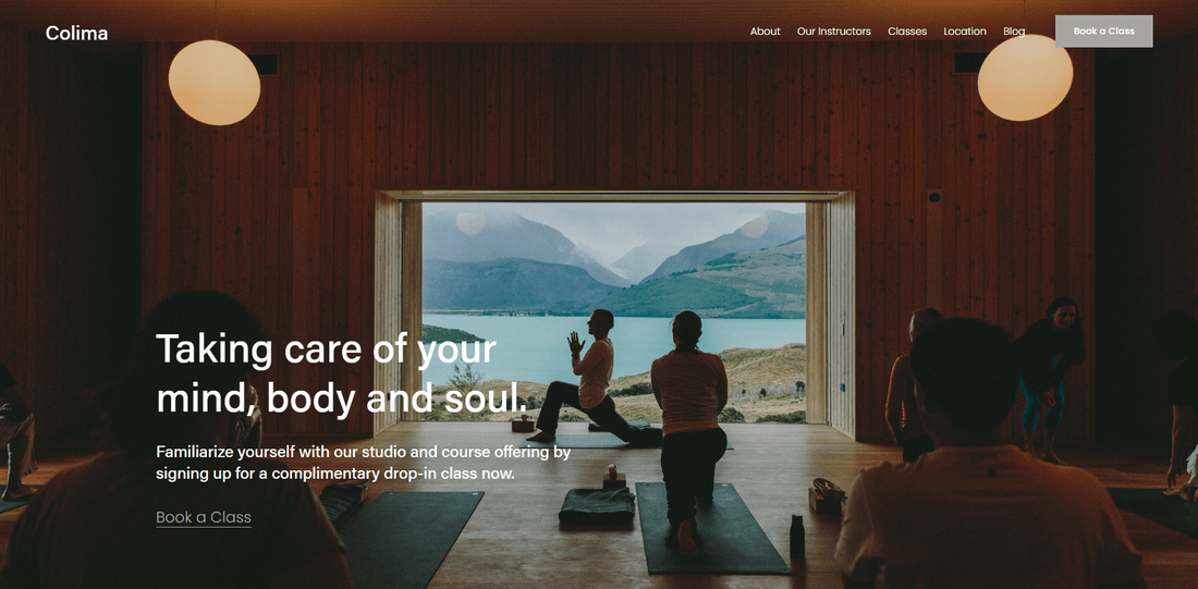
The Colima template caters specially to local businesses, and has the features to support them too. I liked the emphasis on connecting clients with businesses – the “Our Instructors” and “About Us” pages are both designed to build a relationship with the visitor.
The design itself is neutral and professional, yet welcoming, with lots of large images paired with text to convey information. Testimonials and a newsletter sign-up put the relationship with clients at the forefront of this template.
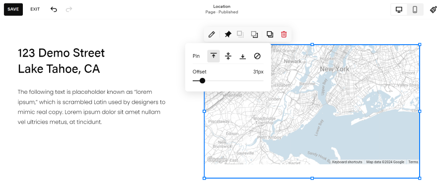
One of the key things that stood out to me was Colima’s “Locations” page, which comes with a built-in map to help visitors find your business. This is a very informational template – the main call to action comes in the form of “Book a Class” buttons, which can be repurposed for any type of appointment you may need.
7. Lusaka: Best for Community and Non-Profit
Why I recommend this template
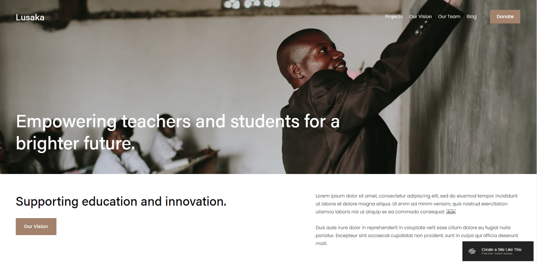
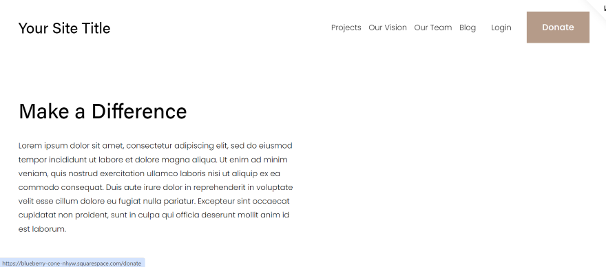
It’s a sad truth that community and non-profit websites are often pretty dated and, well, boring in terms of design. But Lusaka proves that you can be serious and stylish, with large images and plenty of white space that draws attention to your on-site messaging.
Whether your visitors are looking to donate or learn more, Lusaka caters to their needs, with dedicated pages for your projects, mission statement, team gallery, and blog. Clear headings and large images encourage visitor engagement throughout.
I liked the balance of images and text in Lusaka – this layout lets you highlight your messaging with examples that visitors can resonate with. I particularly liked the fact that Lusaka comes with both a testimonial banner and a contact form on the homepage.
8. Ocotillo: Best for Events

Why I recommend this template
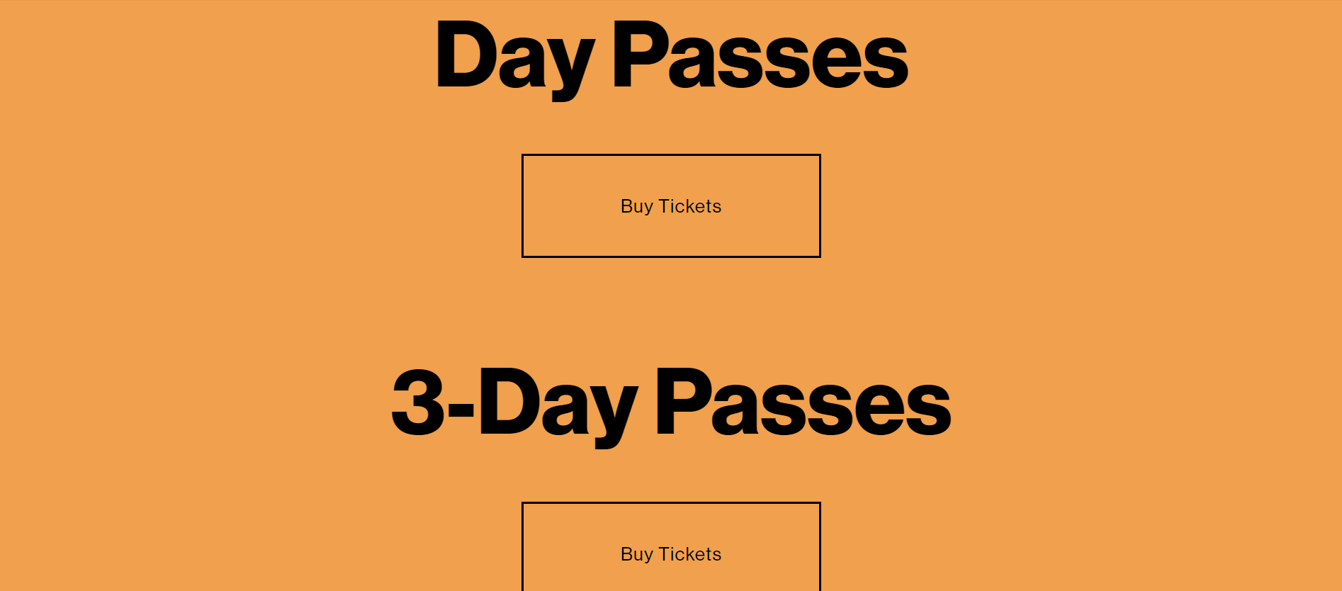
I chose Ocotillo as the best Squarespace template for events because of its big, bold layouts – large headings, colorful backgrounds, and huge calls to action really bring the fun, and are sure to get visitors excited for your event. (Don’t love the orange? Don’t worry – you can change that!)
Ocotillo keeps it simple with a page for the program, line-up, and buying tickets. The homepage features a large banner explaining the essence of the event, and a run-down of the dates and line-up. There’s a large “Buy Tickets” call to action at the very bottom, too.
The secret of Ocotillo’s success, however, is its “FAQ” page. This is an awesome feature for any events website to have, so I recommend you make the most of it.
Bonus Template!
If you just need a website for guests to RSVP to your own personal event – a party, for example – rather than buying tickets or viewing line-ups, check out the Wycoff template. This one-page wonder has everything you need for a personal event, including an RSVP form!
9. Soria: Best for Weddings
Why I recommend this template
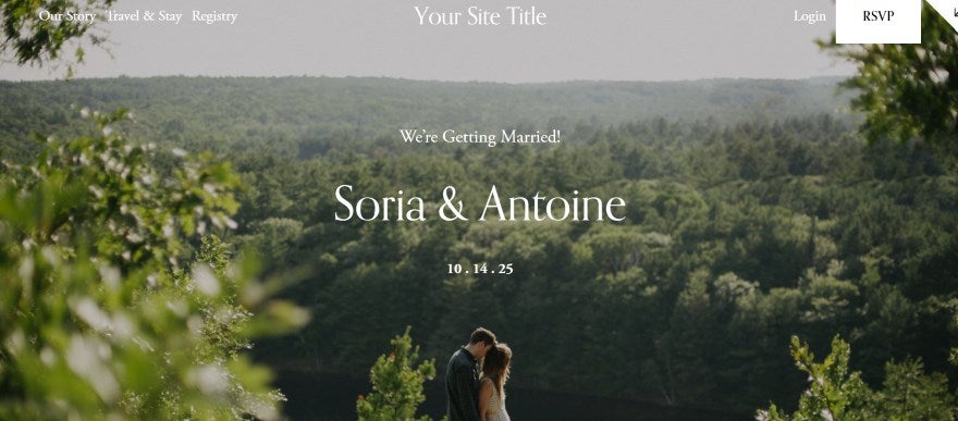
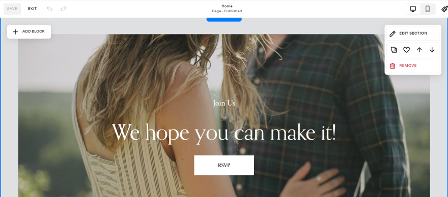
A wedding is often one of the biggest days of a person’s life, so it’s only natural to want to choose a suitable template to match the importance of the situation. I picked Soria as the best Squarespace template for a dream wedding website because it brings an elegant feel, with plenty of photos and a mix of layouts.
I especially liked how the template included all of the key details for guests. This includes a built-in map, information on key timings, and pages for lodging recommendations, a registry with a link to potential gifts, and the couple’s story
Soria also features a lot of large images, interspersed with banners and text boxes so you can tell your story and give guests key information. There’s plenty of white space throughout, so it never loses that classy aesthetic.
10. Vandam: Best for Musicians and Bands

Why I recommend this template
The Vandam music website template got me pretty excited. It has everything you could need to promote music, from “Listen Now” SoundCloud calls to action to a built-in merch store.
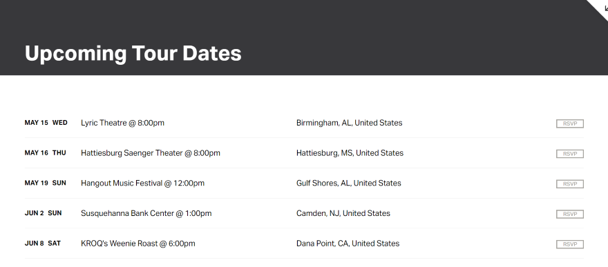
Other cool features include a “Tour Dates” page and a “Press” coverage page, both of which also feature on the homepage. Though this template features a muted gray and white color palette, you can easily liven it up with your own color choices.
11. Auburn: Best for Restaurants
Why I recommend this template
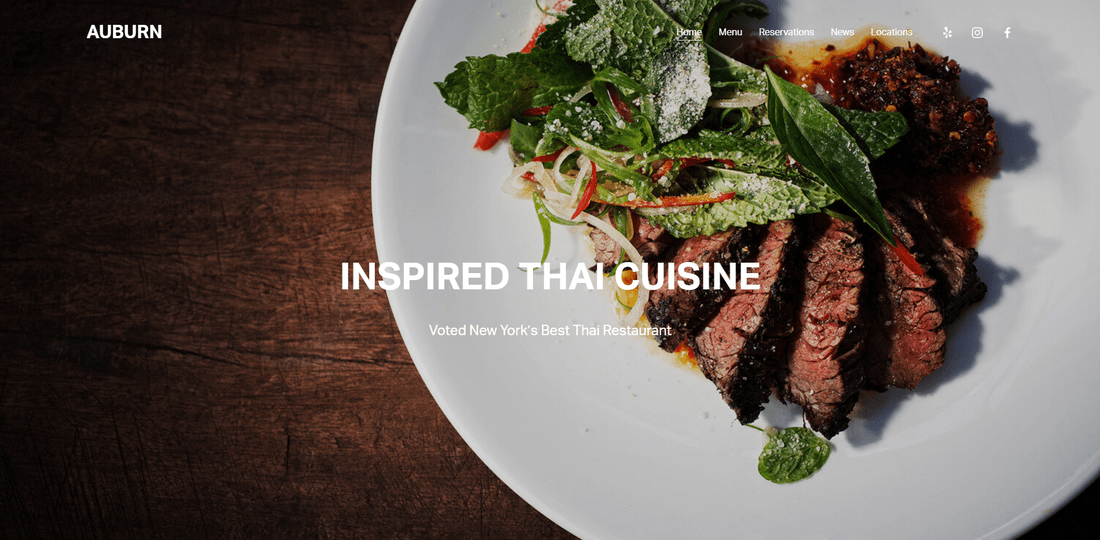
Restaurant websites have pretty specific needs, and Auburn ticks all the boxes. It’s a feature-rich template that comes with menu, reservations, news, and locations pages built-in. The social icons are also tailored to restaurants, with links to Yelp, Instagram, and Facebook.
Although there’s no dedicated gallery page, I found plenty of image spaces to show off your food, location, and team. Large image headers top each page, and the homepage is especially visually pleasing, broken up by full-width images and large headings.
Altogether, Auburn’s design creates a bold, modern aesthetic that feels professional – and, most importantly, useful – to its visitors.
12. Noll: Best for Personal Sites and Online CVs
Why I recommend this template
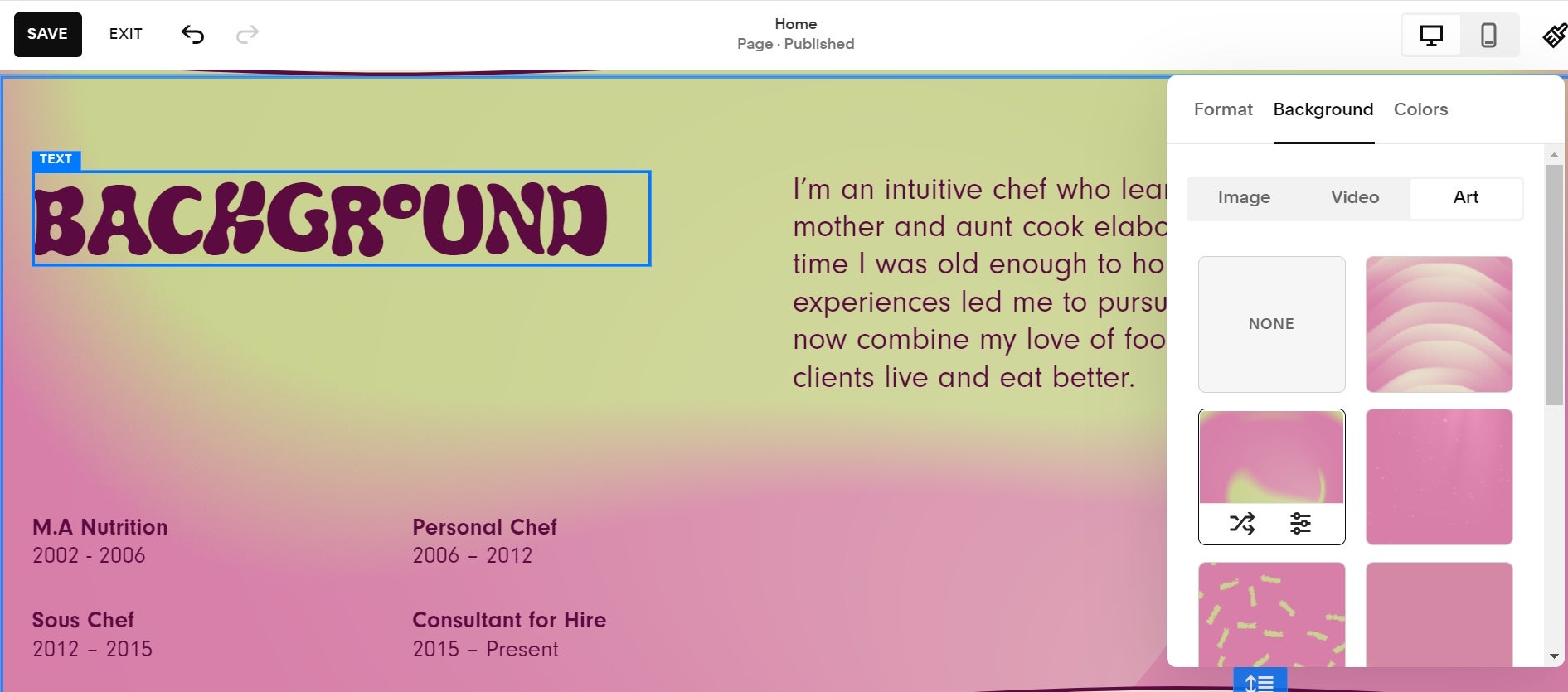
Say goodbye to boring CVs – Noll is the perfect Squarespace template to use when making a personal website or online resume that actually has some personality!
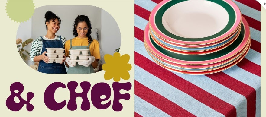
Though the backgrounds are colorful, the text is still easy to read, and there are plenty of large images to show off any professional photos and keep visitors’ interest for longer. I love how the contrasting calls to action instantly catch your eye and pop.
Noll doesn’t overcomplicate things either – a “Get in Touch” page completes the template, giving users the opportunity to reach out to you.
13. Cailles: Best for Real Estate and Properties
Why I recommend this template
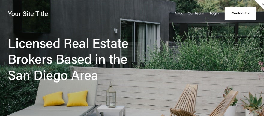
Though Squarespace has specific designs for hotels and even property listings, I chose Cailles as the best Squarespace template for real estate agent websites because of everything it has to offer. It’s a very visual template, and its structure delivers key information in a digestible format.
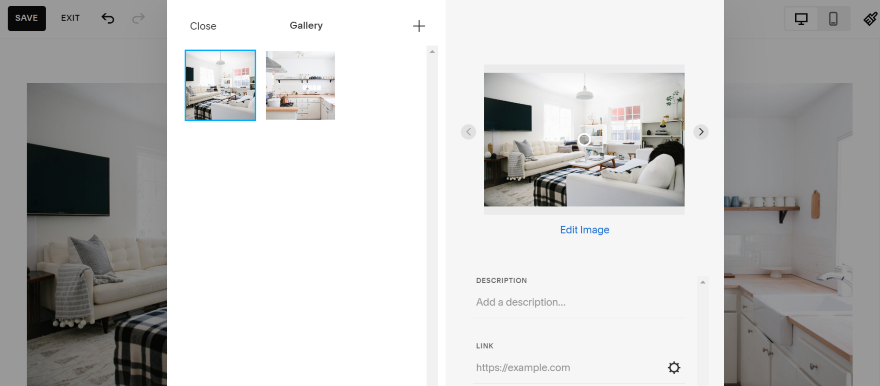
I like that the homepage gives plenty of space to featured listings – the size of the images highlights the small details, and is designed to help visitors picture the property. The “Schedule a Viewing” calls to action and newsletter sign-up both encourage engagement from visitors too.
Other features in the template include an “About” page and an “Our Team” page, which helps to build trust with potential clients. The “Contact Us” page has a built-in form where visitors can book viewings for the properties listed on the website.
14. Zorayda: Best for Launch Pages
Why I recommend this template
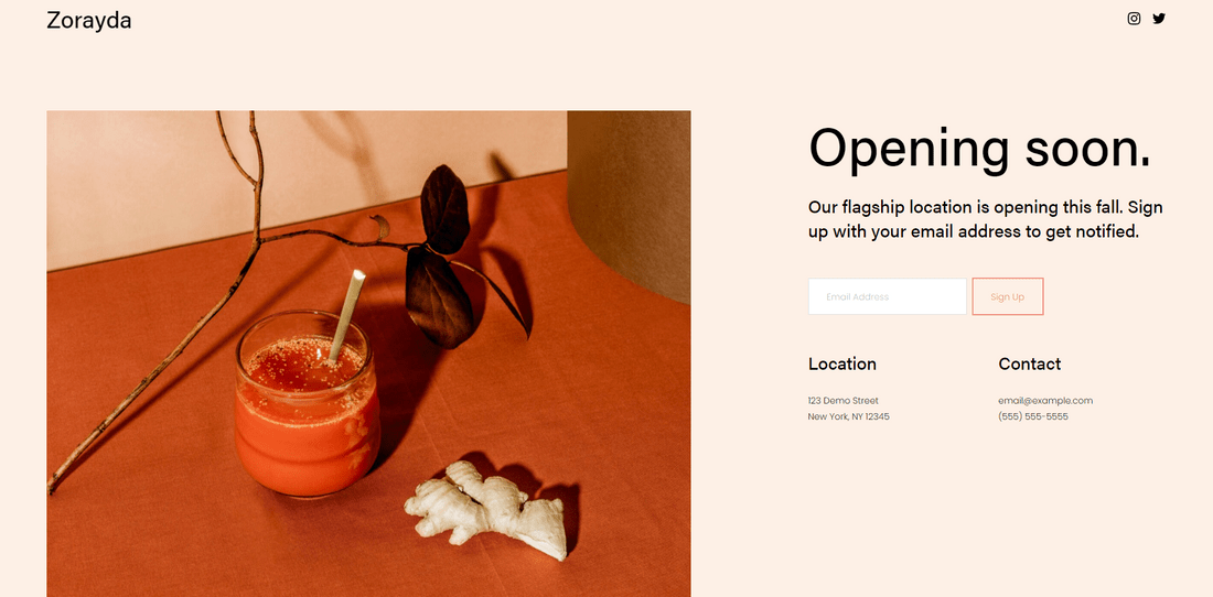
Squarespace has launch page templates for different industries, so you can scroll through to find one that suits you best. My top pick, however, has to be Zorayda. While Squarespace’s full-page image backgrounds are visually stunning, it can make text harder to read – what I loved about Zorayda was how clear and digestible it is, thanks to its neutral background.
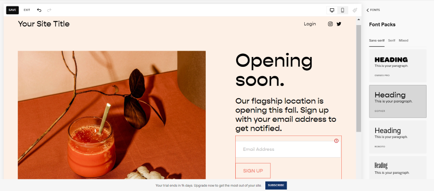
This homepage layout packs a lot into a single page – a nice large image, text, an email sign-up form, and location and contact details. The top right corner has social icons for Instagram and Twitter. All these features are designed to help visitors find you before your full website even goes live.
I think making the phone number clickable is a particularly attractive feature – this lets visitors click on your number and phone you directly. You can add your own branding through the colors and image you use, without worrying about cluttering your site or confusing visitors.
How to Choose a Squarespace Template
You now know the best Squarespace templates for each category in the Squarespace library – but how do you choose the best template for you?
#1. Browse and Preview (Then Preview Again!)
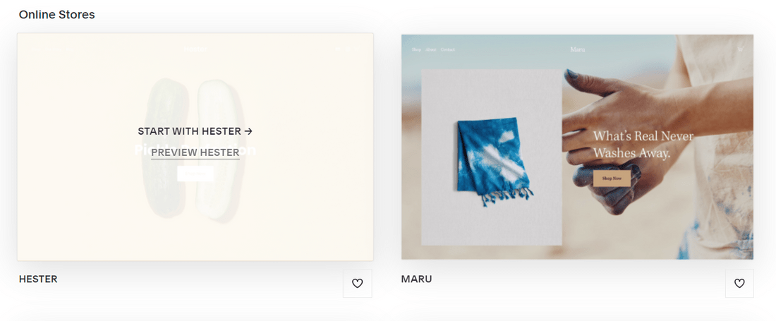
One of the key steps to choosing the right Squarespace template is to make sure you know what it really looks like. To do this, hover over your chosen design and click Preview:
You can then scroll through to preview the template and how it displays on different screens by toggling between the device icons in the top left-hand corner. You can then preview a full demo site of the template, by clicking on the View Demo Site link in the top right-hand corner:
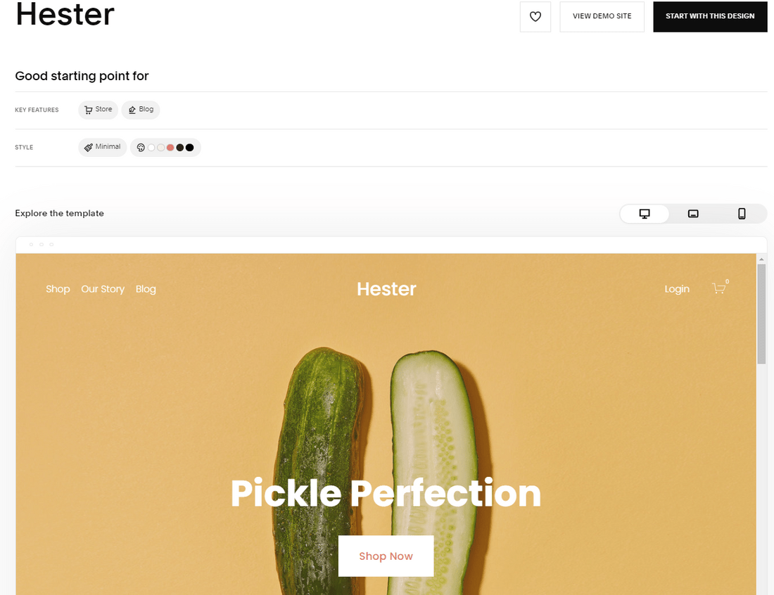
This gives you a full picture of exactly what the template looks like across different devices, and all the pages, layouts, and features contained in the template. You can preview all of Squarespace’s designs – you don’t even need to create an account!
#2. Think About Features
Depending on your industry, you’ll need to find the right features your website needs – for example, restaurants may need a reservation booking system, while a wedding website usually requires an RSVP form. Compare different templates to find one that has the best combination of features for your individual website.
Don’t worry if your template doesn’t have all your dream features already included – you can always add more as you build, especially if you make use of Squarespace’s plugins – but it’s a good idea to start with a template that already has the basic tools you need.
#3. Compare Designs
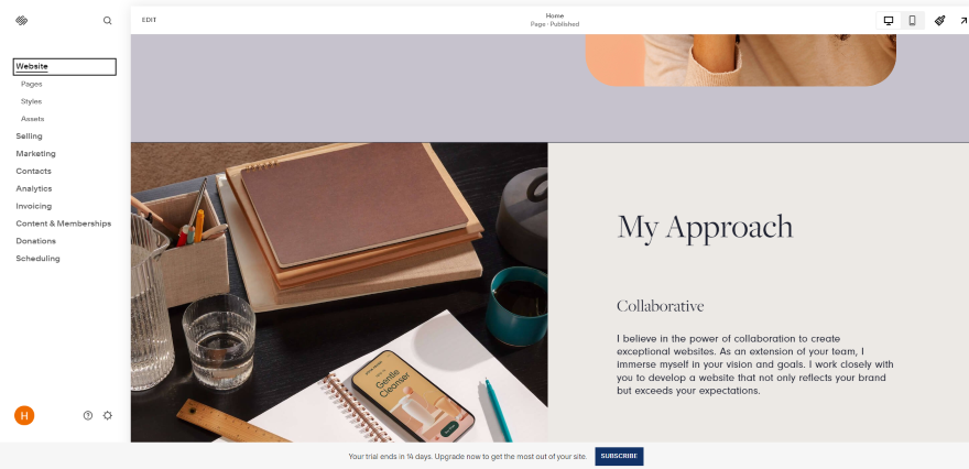
You can customize your template to match your own branding while you design your website, so don’t worry if you don’t love everything about your template’s design – you’ll want to put your own twist on it, after all.
Still, it’s best to choose a template that you like the look of. Otherwise, you’re working against your template, which will make life much harder. So, when you’re viewing a template, think about the design elements:
- Layout – do you like the overall structure and layout of the template? For example, full-screen image backgrounds versus grid galleries.
- Colors – do you like the tones and colors in the design? Do the calls to action stand out? What sort of vibe do the colors create – fun, serious, or minimal?
- Text – is there a lot of text? Do you need a more image-heavy design? And do you like the way that text is presented?
Curious to see what other platforms are up to? See our best website builder list (with recommendations that also offer aesthetic templates).
38 comments